Introduction
Nowadays, when VoIP technology is developing more than ever to achieve the best possible quality of long-distance communication and to reduce the costs of telecommunication services, there is a need for making more simple and more user-friendly communication tools. The gloCOM Web represents one of the solutions for those needs.
Although the Bicom Systems company has applications such as gloCOM Desktop or gloCOM GO, the idea for creating this kind of communication tool is the result of the need to reduce memory usage and performance of our devices such as computers and mobile phones. Also, one of the main ideas for creating the gloCOM Web is increasing mobility. It means that users can stay in touch with their colleagues all the time, no matter where they are and whether their devices are at their disposal or not.
Even though the gloCOM Web cannot entirely replace products like gloCOM Desktop or gloCOM GO, it represents a valuable solution for the situations mentioned above.
Unlike the other two gloCOM products, the gloCOM Web does not require download and installation, and to use it, all that the user needs is a computer, a good internet connection, and one of the browsers supported by the gloCOM Web.
The list of the browsers supported by the gloCOM Web is as follows:
- Google Chrome
- Mozilla Firefox
- Microsoft Edge
- Safari
The gloCOM Web allows users to make a call, start a conference, send messages, and much more. So let’s get started!
Working with gloCOM Web
Before the user starts their work within the gloCOM Web app, they need to point their browser to the appropriate IP address (e.g., http://192.168.1.1/webapp). The browser will automatically redirect to the gloCOM Web login screen.
On the login screen, the user can choose whether they want to use the Password Login or the Single Sign-On (SSO) Login method.
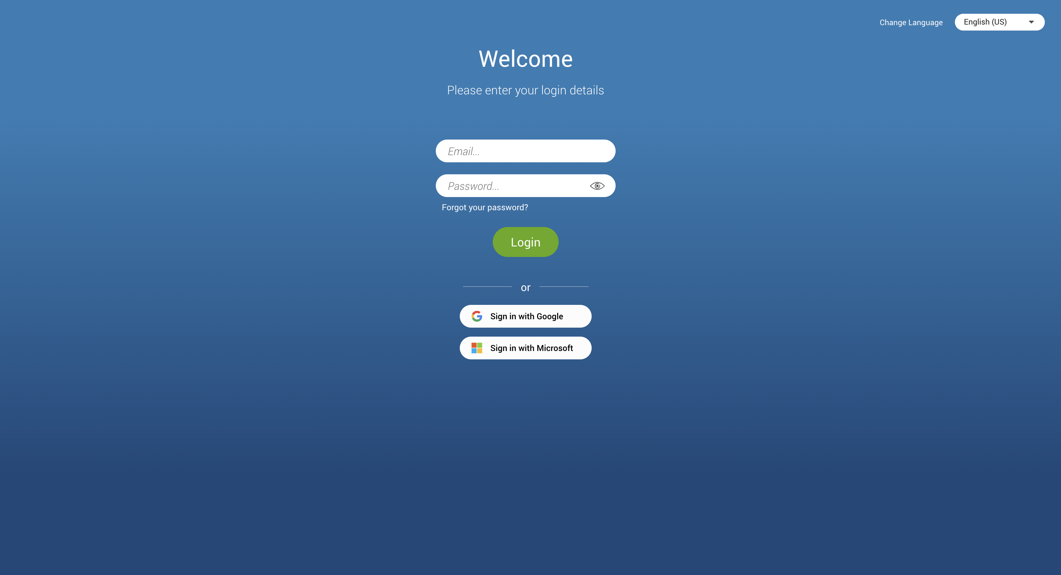
Log In
To start using the gloCOM Web, the user needs to provide their account details.
Account details:
- Email: Provide the e-mail address assigned to the user’s Extension.
- Password: Enter the password created during the gloCOM Web first-time login.
Additional options
- Forgot your password: If the user forgets their password, they can recover it by clicking the Forgot your Password link. They will receive a password recovery link via e-mail. Additionally, if they have multiple gloCOM accounts associated with their e-mail, they will be asked to specify the Extension number for the desired account during the password recovery process.
- Show Password : Shows/Hides the password.
- Change Language: Allows the user to change the language used throughout the app.
Password Login
In the case of the Password Login method, the user needs to provide their email and password. They must ensure they have received their account details from their system administrator or account manager.
The received details must include:
- E-mail address: for example test@testmail.com
- User password: for example 93sU2e_2%
After entering the e-mail address and password, click the Login button. The gloCOM Web will try to connect to the specified server with the user’s account details.
In case the user’s account details are incorrect, an orange warning will appear:
Login Failed: Username or Password is incorrect.
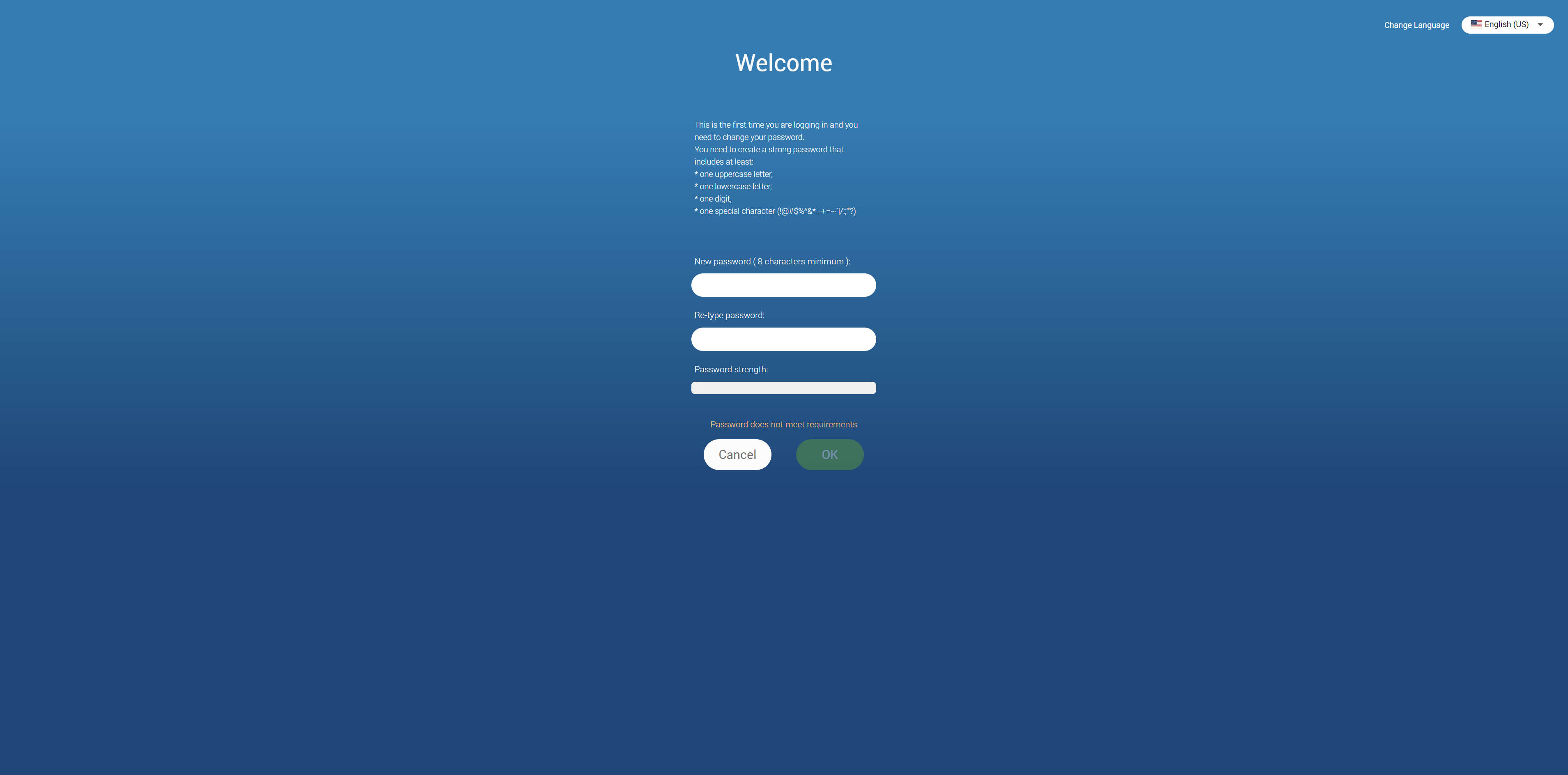
Otherwise, the browser will redirect to the first-time login screen, notifying the user to change their password since they are using their gloCOM account for the first time.
The password must contain at least eight characters and must meet the required pattern. Users are required to change their password on login, and once it is changed, it is unknown to all administrators of the system.
The list of allowed special characters that can be used when creating a password is !@#$%^&*_-+=~`|/:;”‘?.
If the user is already using one of the gloCOM products, clicking the Login button will redirect the browser to the gloCOM Web home screen.
Multiple gloCOM accounts can have the same e-mail.
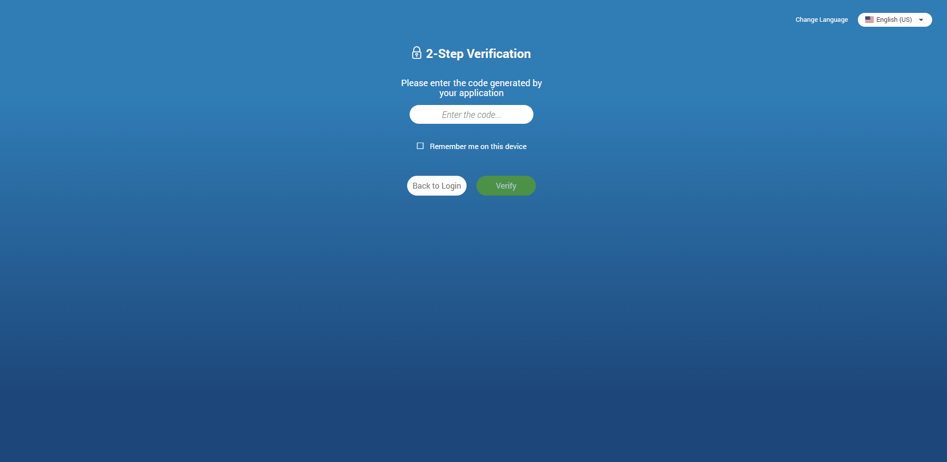
Two-Factor Authentication (2FA) on Login
2FA is an additional layer of security used to ensure that users trying to gain access to an online account are who they say they are. First, a user will enter their username and password. Then, instead of immediately gaining access, they will be asked to provide a code generated by the authenticator app to proceed with the login.
To set 2FA up, log in to the app, navigate to Online Self Care, click the 2-Step Verification button, and follow the instructions.
In case the user has not set up 2FA and 2FA has been enforced on the server side, the following message will be displayed after clicking the Login button: “2-Step Verification needs to be configured on Online self care to proceed with login. Configure it now.“. Otherwise, the user can access the app by entering their username and password.

After setting 2FA up, on the next login, the user will be asked to provide the code generated by the authenticator app in order to proceed with the login. Also, users can check the “Remember me on this device” option so they do not have to enter the 2FA code every time they try to log in.
When logging out from the app, a confirmation dialog pops up with the following message: “You are about to log out. Please be aware that your 2FA token will be removed, and you will need to enter a new 2FA code the next time you log in.“
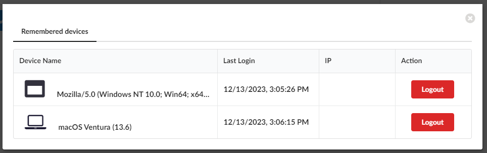
Clicking the Remembered devices button within Online Self Care displays a list of all of the user’s currently logged devices. Clicking the Logout button will log the user out of the desired device.
Older versions of the app do not support 2FA.
2FA verification can be reset through Online Self Care. Also, it can be reset by the server administrator.
Single Sign-On (SSO) authentication
The gloCOM Web app supports authentication via any Single Sign-On (SSO) provider configured on the PBXware backend, providing a unified and secure login experience.
Please note that in order for this feature to be available, it first has to be enabled in a license.
The SSO feature cannot be combined with 2FA.
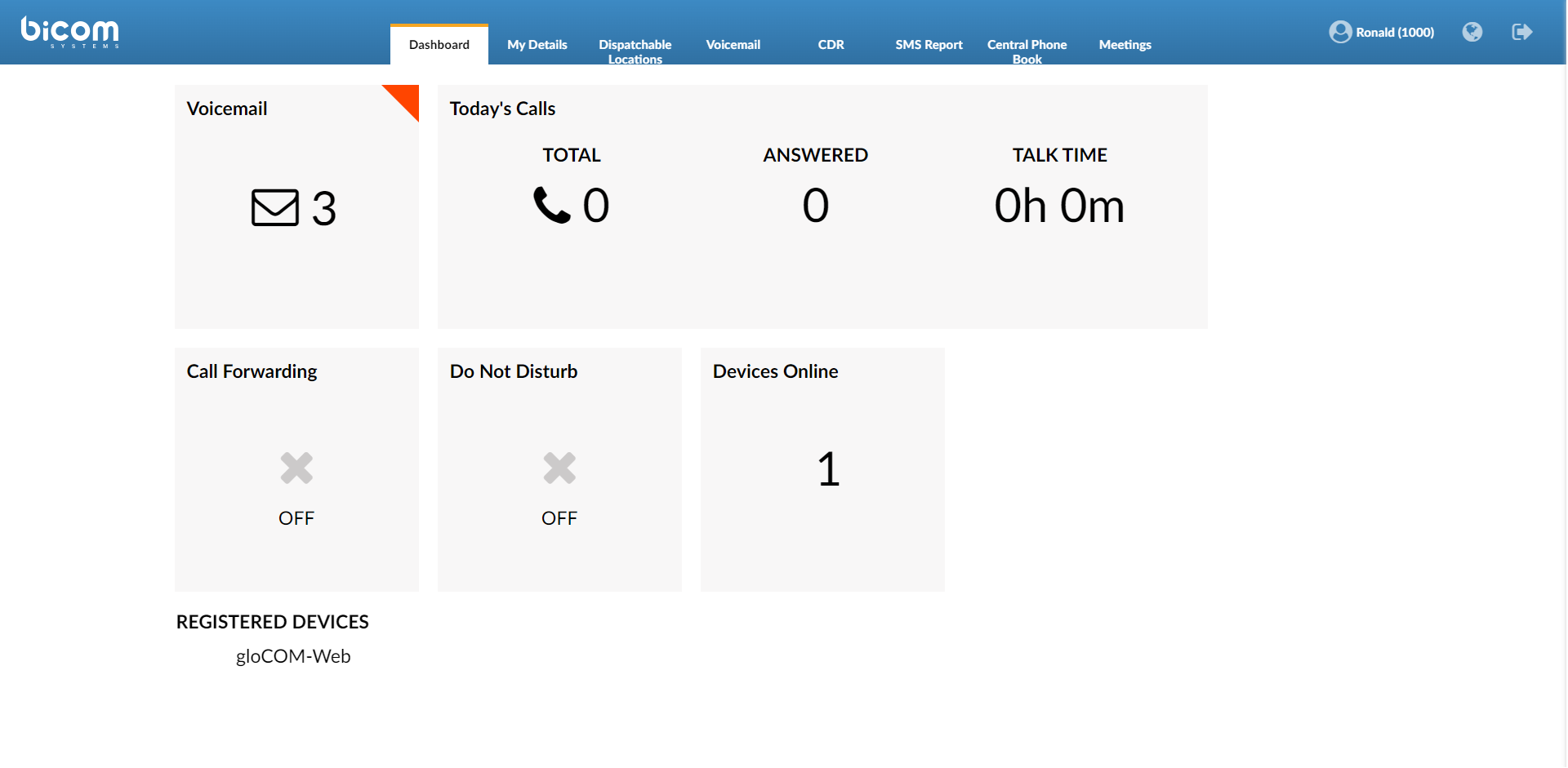
Home Screen
Once the user has successfully logged into the gloCOM Web, the browser will display the gloCOM Web home screen. The home screen gives users easy access to various options, such as Dialer, Chat, SMS, Conference, Meeting, and much more.
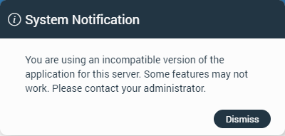
System Notification
System notification provides the user with some important information about the system. For example, the user is using an outdated version of the application.
The notification will be shown every time the user logs in to the application. To dismiss the notification, click the Dismiss button.
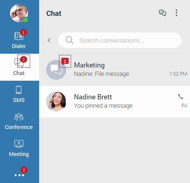
Navigation Bar
The navigation bar is on the left side of the screen.

The user’s avatar image is at the top of the navigation bar, with the online status at the bottom right of the avatar.
- Avatar Image: The avatar represents the user’s profile picture and can be updated at any time. Clicking on the avatar opens a pop-up menu with options. Selecting Personal Information navigates to the Personal Information screen, displayed in the center of the window. Users can upload a new picture through a file picker or reset the avatar to the default image. When uploading a new picture, cropping and zooming tools allow users to adjust the image precisely. After editing, clicking Save updates and displays the new avatar.
- Status Icon: Represents the user’s current status that can be changed at any time. Clicking on it brings a pop-up menu, where the user can choose between Available, Busy, Do not Disturb, Away, or create their own status by clicking the Custom status… label.
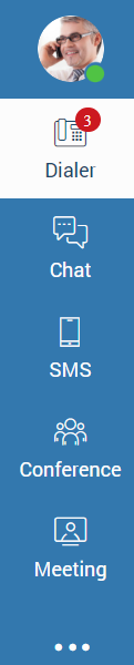
Dialer, Chat, SMS, Conference, Meeting, and Three Dots Menu options are positioned below the avatar image.
The next list shows the meaning of these options:
- Dialer: Opens a Dialer screen in the middle of the window.
- Chat: Opens the Chat conversation list and selects the first conversation from the list or the last selected conversation. The first conversation from the list will be selected only if there is no previously selected conversation.
- SMS: Opens the SMS conversation list and selects the first conversation from the list or the last selected conversation. The first conversation from the list will be selected only if there is no previously selected conversation.
- Conference: Opens a Conference screen in the middle of the window.
- Meeting: Opens a Meeting screen in the middle of the window.
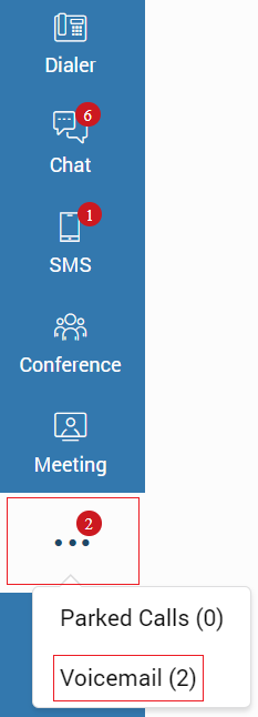
- Three Dots Menu: Contains a Parked Calls and Voicemail option.
The bottom of the navigation bar contains the Help, Preferences, Logout button.
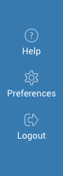
The next list shows the meaning of these options:
- Help: Opens a Help screen in the middle of the window.
- Preferences: Opens a Preferences screen in the middle of the window.
- Logout: Log out the user from the gloCOM Web.
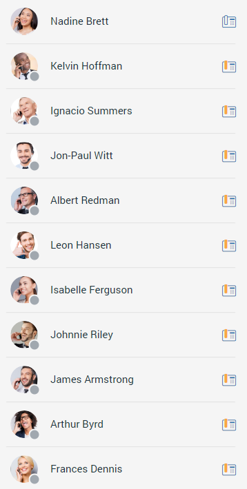
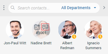
Contact List
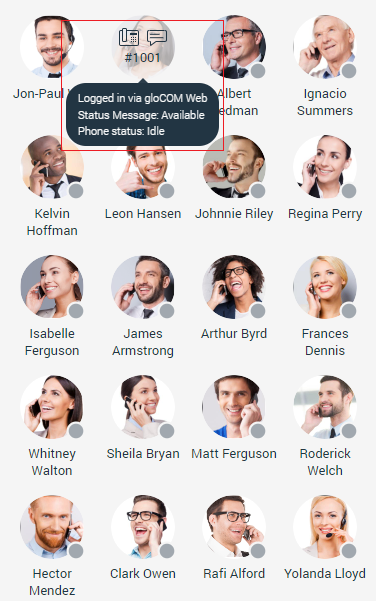
The contact list is on the right side of the screen. It allows the user to see which of their colleagues are currently available, busy, or away from the desktop.
The contact list can be in two modes: Grid View and List View.

Extensions with Inactive or Suspended status in PBXware, will not be shown within the contact list.
The user can start a call or a chat conversation while hovering over the contact (only in Grid View). Also, while hovering over the contact, the user can see the status message, phone status, and which devices the contact is currently using.
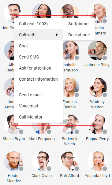
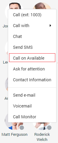
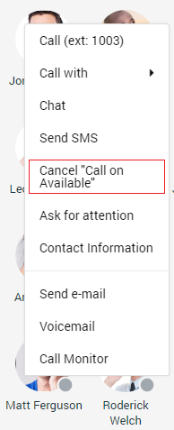
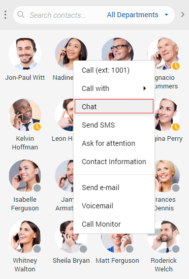
Right-clicking on the contact brings a drop-down menu with additional options.
The extensions with the Show in Desktop/Mobile App option on the PBXware set to No or Not Set will not be displayed within the contact list. Also, they cannot be searched through the contact or conversation list, but the user can still receive a call or message from these extensions.
The next list shows the meaning of these options:
- Call: Place a phone call.
- Call with: Allows the user to select which device they want to use for a call (Softphone/Deskphone).
- Chat: Start a chat conversation or open the existing one.
- Send SMS: Start an SMS conversation or open the existing one.
- Ask for Attention: Allows the user to ask the other side for immediate attention. (Not available for group conversations.)
- Contact Information: Displays information about the contact.
- Send e-mail: Send an email.
- Voicemail: Leave a voicemail.
- Call Monitor: Allows the user to monitor calls in real-time for any contact listed within the Call Monitor list in PBXware Enhanced Services. Right-click on the contact that is on a call and select Call Monitor from the drop-down menu.
Call Monitor must be enabled by your administrator within the PBXware Enhanced Services.
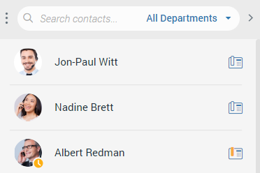
The search field is above the contact list. It allows the user to search for a specific contact by entering the contact’s name or extension number. Also, it is possible to filter contacts by the department. Filtering contacts by departments allows the user to search through departments using the up and down arrow keys on the keyboard or entering the department’s name inside the search field above the department list.
Clicking the Bicom Systems logo redirects to the Bicom Systems official page.
The Backspace arrow key on the keyboard deletes character by character, and the ESC key deletes the whole term written inside the search field.
In case of mistyping inside the search field, the user gets the message: No results found.
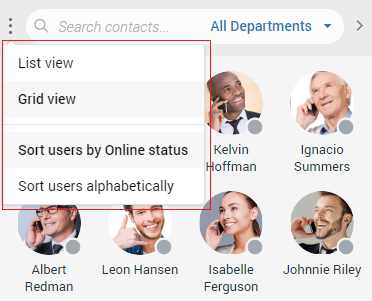
There are three dots next to the search field. Clicking on them brings a drop-down menu where the user can choose between Grid View and List View. Also, they can choose whether they want to Sort users by Online status or Sort users alphabetically. Furthermore, on the right of the search field is an arrow that allows the user to collapse/expand the contact list.
Additionally, the user has the ability to resize the contact list instead of collapsing it. This way, the user will keep their contacts visible and still get extra space in the middle of the screen.
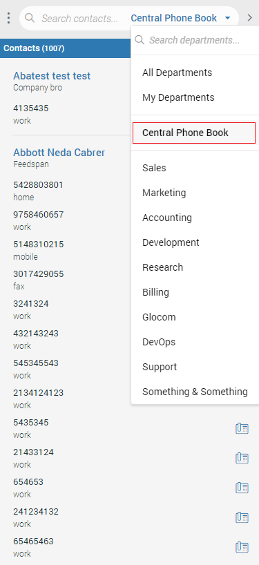
Central Phone Book
The Central Phone Book is a centralized list of contacts managed by the PBXware administrator. It is shared across all gloCOM Web users. Select the Central Phone Book option from the drop-down menu above the contact list to access your Central Phone Book contacts.
Users can use the search contact field to find a contact by their name or number. Click on the phone icon next to the contact’s number to initiate a phone call. Right-click on a contact to open a context menu with additional options.
Besides contacts managed by the administrator, each user can manage their personal list of contacts. This personal contact list is private and visible only to the user, and can be managed through Online Self Care by clicking the Central Phone Book tab.
Here, users can see all their Personal Phone Book contacts, add new contacts, import/export contacts, or download a CSV template. To remove a contact, click on the X button on the right side of each contact.
After closing the Online Self Care window, the user needs to click the Sync button to refresh the contact list if necessary, so the modifications made in the Online Self Care can be synced inside the gloCOM Web.
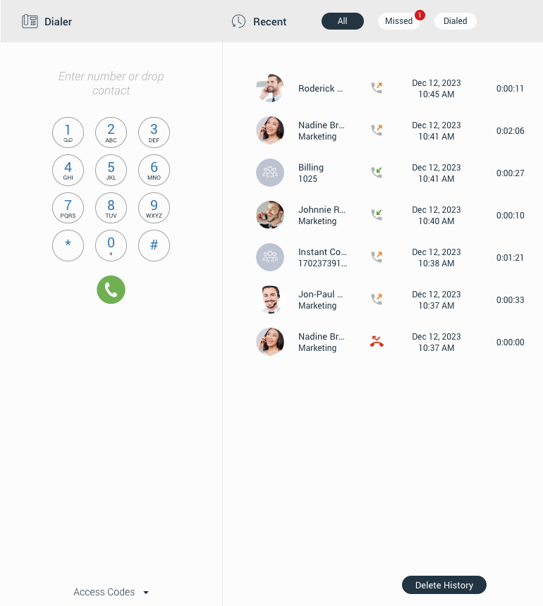
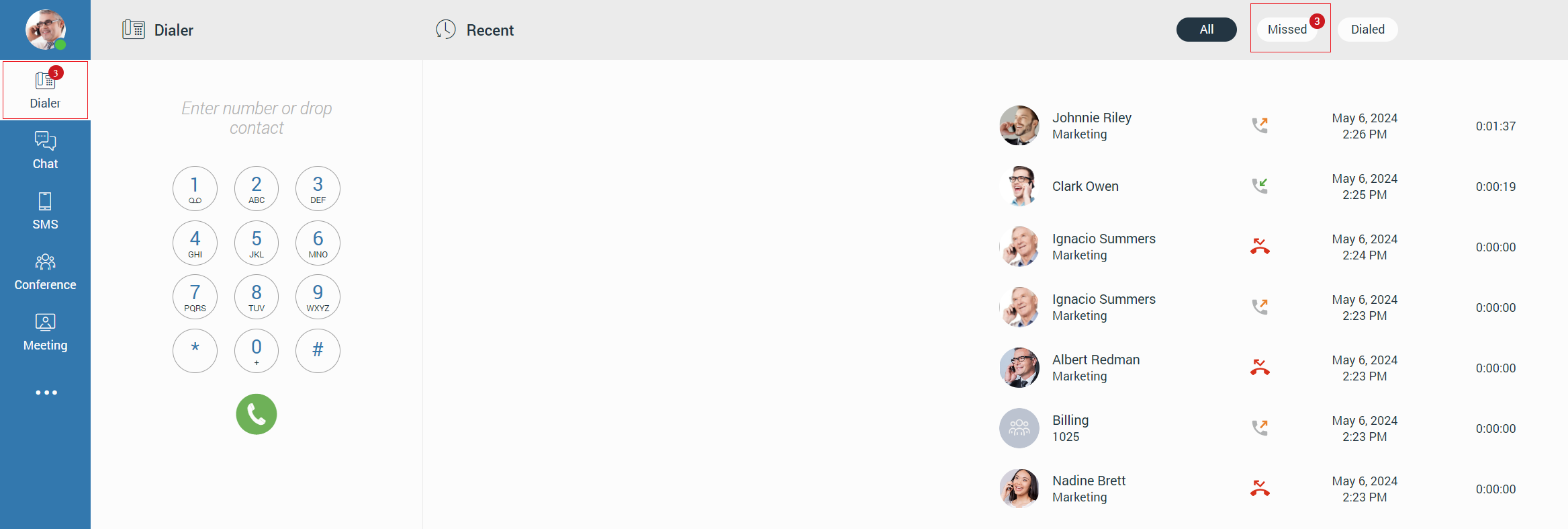
Dialer
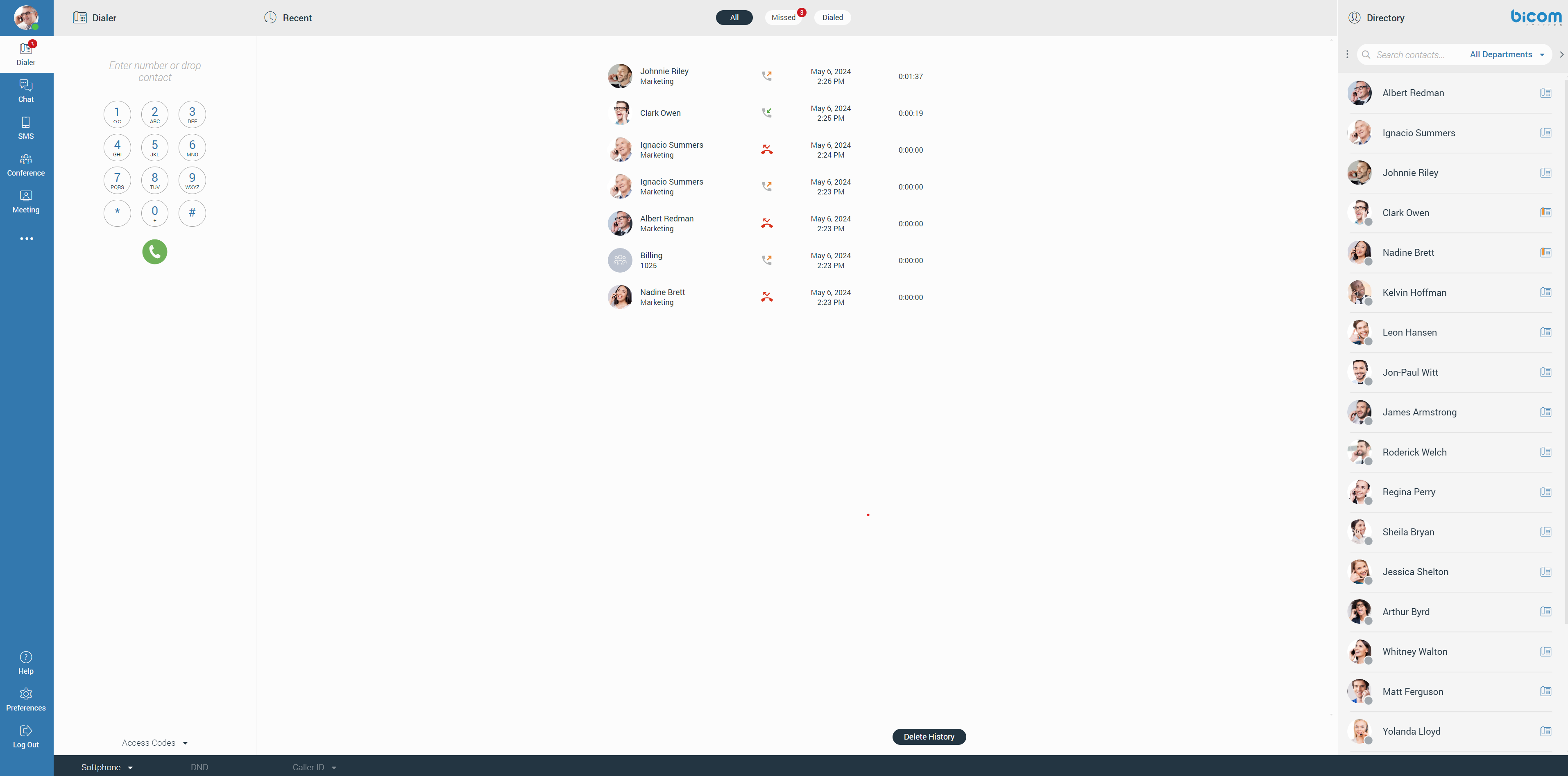
The first thing that catches the user’s attention after they successfully logged in is the Dialer positioned in the middle of the screen. It contains two sections: a Dial-pad and a Recent calls section. Dialer allows the user to place, receive, and see recent calls.
gloCOM brings a unified call history between gloCOM Desktop, gloCOM GO, and gloCOM Web. Call history is stored for up to a month on the server and synced between all user devices. It means that the user will be up to date with their recent calls all the time. The application makes sure that the user’s call history is synced on every login and that they have recent calls available on their device. During the sync, there is an indication inside the Recent call list. It informs the user that the sync is currently in progress.
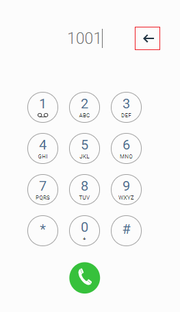
The user can place a call by entering the number using a dialer dial-pad, keyboard, or dropping a contact into the predicted area.
Immediately after the user starts entering numbers, a backspace arrow appears on the right side of the dialer input, allowing them to delete the entered number. Also, the number can be deleted using the Backspace key on the keyboard.
If the input field is in focus and there is no entered number, hitting the Enter key twice in a row on the keyboard will call the last called number. Also, double-clicking the green handset gives the same results.
When a user presses and holds down any key within the Phone Dialer except 0, it will display the pressed number or sign. However, when the user presses and holds down the 0 key, it will display the + (plus) sign.
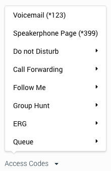
The Access Codes allows the user easy access to some of the most used access codes.
The second part of the dialer is the Recent calls section. It enables the user to see all their calls missed or dialed and their conference calls.
The recent call section provides information like:
- Caller’s Avatar (if any)
- Caller’s Name
- Type of call (Inbound/Outbound call)
- The date and time of the call
- Duration of the call
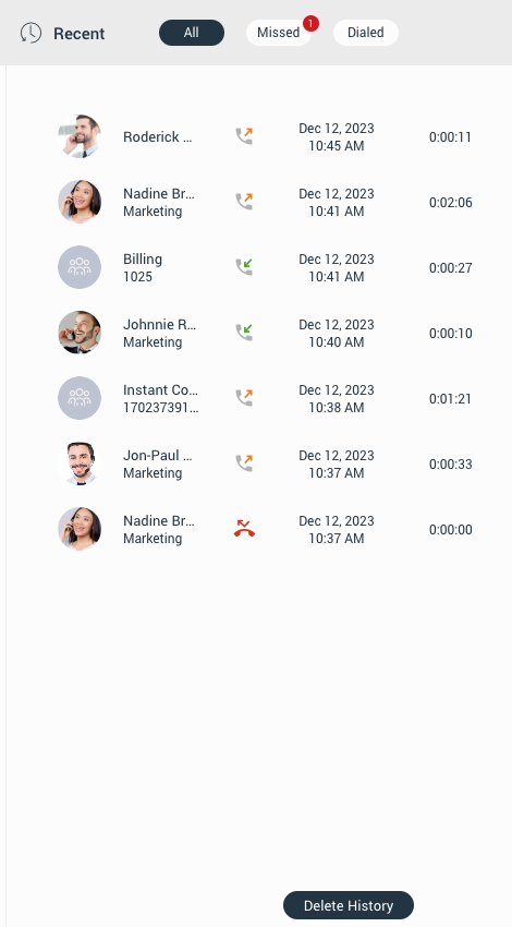
Also, hovering over a call displays additional options (start a call and start a chat conversation).

Notifications for all missed calls will be displayed as a red badge with the number that represents the total number of missed calls, as shown in the picture below.
Placing Phone Call
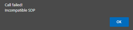
Before placing a call with gloCOM Web, the user extension must have enabled WebRTC and Opus codec on their PBXware system. Also, TLS settings must be enabled on the PBXware system. Otherwise, if they try to start a call with these three options disabled, a pop-up message will appear displaying the following message: “Call failed and Incompatible SDP”.
Once these three conditions are satisfied, a call can be placed or received without any problems.
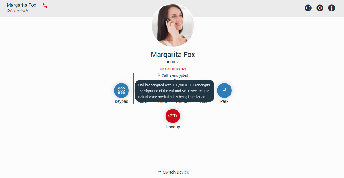
All calls are encrypted, and there is an indicator during an ongoing call that notifies the user about encryption. Hovering over the indicator, a tooltip pops up with the following message: “Call is encrypted with TLS/SRTP. TLS encrypts the signaling of the call, and SRTP secures the actual voice media that is being transferred”.
The rule above does not apply to calls placed from other devices since we do not know whether the other device (from which the call was placed) uses TLS encryption.
Dial entering the phone number
- Use the Dialer keypad or keys on the keyboard to enter the phone number you want to dial.
- Click the Dial button to place a call.
Dial with Drag and Drop
- With the mouse, click and hold any contact from the contact list then, drag the contact from the list to the dialer area, and drop it.
- Click the Dial button to place a call.
Dial from the Chat
- Open the chat conversation. Click the Dial button inside the context bar on the top of the chat or click the more options and place a call by selecting one of the two offered options: Call and Call with.
Dial from the Contact List
If the user wants to place a call from the contact list, they can do it in more ways than one:
- By hovering a contact and clicking the phone image (Grid View only)
- Right-click the contact and select one of the two offered options: Call and Call with.
- Click the phone icon (List View only)
Dial from the Conversation Sidebar
- Click the Dial button inside the desired chat conversation while hovering over it.
Call on Available
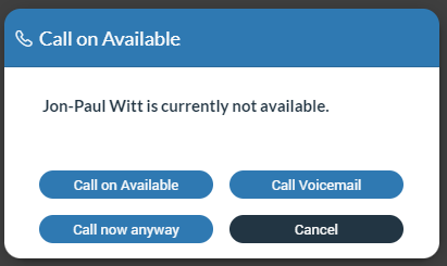
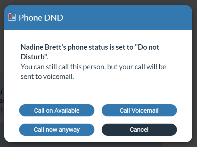
Call on Available represents some kind of reminder, so the user does not forget to call their colleagues after they become available. For example, if the user tries to reach their colleague while they are on a call (one-to-one, conference, meeting call), or their presence status is set to Do Not Disturb, after pressing the Call button, a modal dialog pops up with four possibilities:
- Call on Available: Selecting this option will remind the user to proceed with the call after the other party becomes available.
- Call now anyway: Selecting this option will proceed with a call.
- Call Voicemail: Selecting this option will call the other party’s voicemail directly.
- Cancel: Selecting this option will cancel the Call on Available procedure.
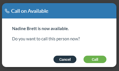
Assume that the Call on Available procedure is activated. After the other party becomes available, the user will be presented with a modal dialog asking whether they want to place a call or not.
Furthermore, the Call on Available procedure can be canceled anytime. To do this, right-click on the contact within the contact list for which the Call on Available procedure is activated, and from the drop-down menu, select the Cancel “Call on Available” option.
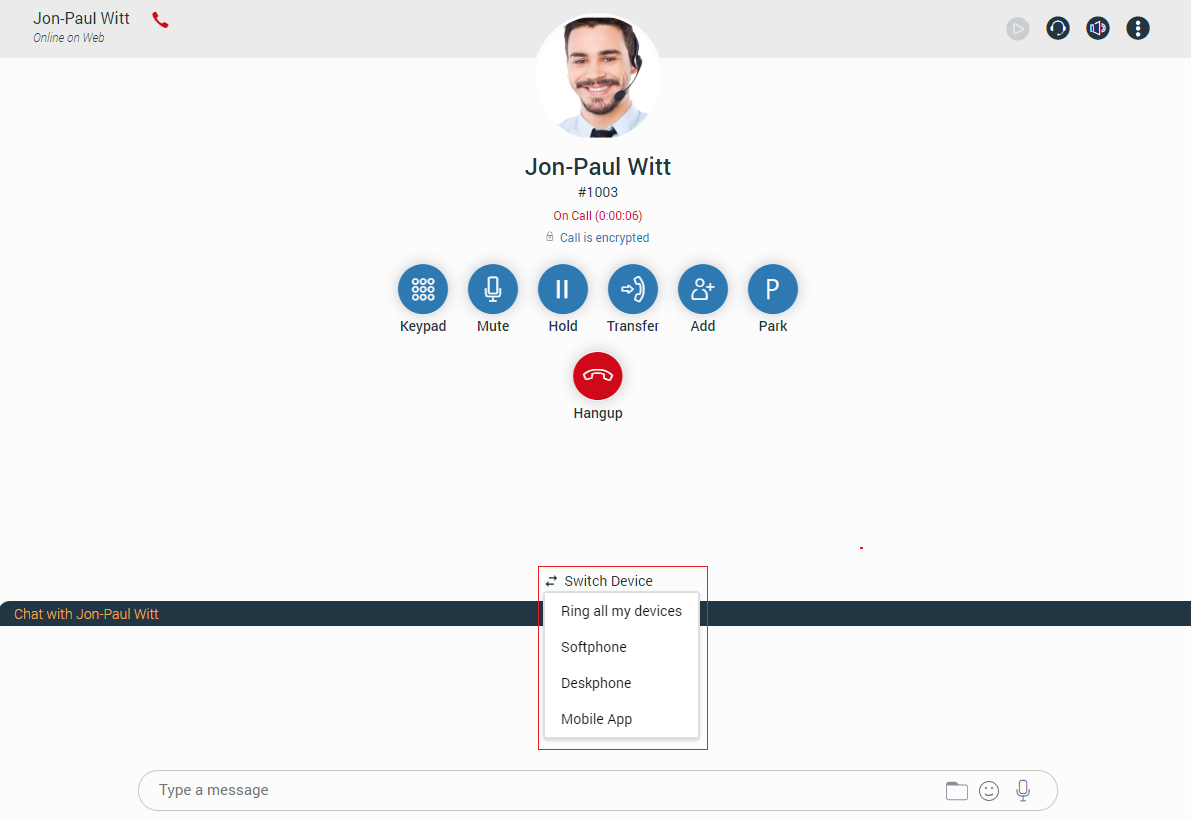
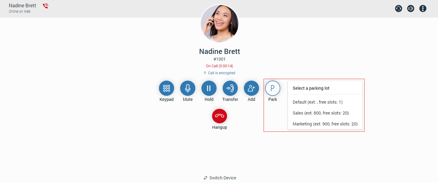
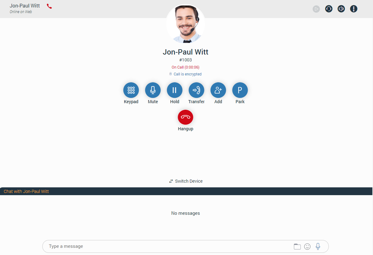
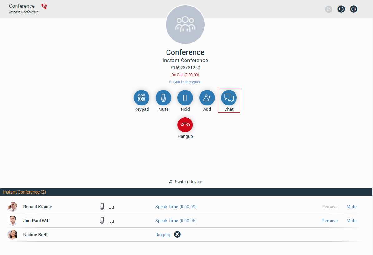
Live Call Screen
There are various options that users can use during a live call.
The live call options list:
- Keypad: Brings up a keypad.
- Mute/Unmute: Allows the user to Mute/Unmute themselves.
- Hold: Allows the user to put the other side on hold in case they have another call.
- Transfer: Allows the user to transfer the call to someone else in three ways:
- Regular transfer – Transfer without annunciation.
- Supervised transfer – Transfer with annunciation.
- Voicemail transfer – Transfer the call to voicemail.
- Add: Allows the user to make a conference call from the regular call by adding more participants to the existing call.
- Park: Allows the user to park a call so someone else can pick it up.
- Hangup: Allows the user to terminate a call.
- Switch Device: During a live call, the user can use the Switch Phone button to initiate ringing across all their registered devices or a specific device (softphone, desk phone, and mobile app), so they can continue the call on another device. A perfect example would be switching from the desk phone to the mobile phone when they need to leave the office but would like to continue the call. The same applies to conference calls.
- Transfer a call using drag and drop: During a live call, the user can transfer the call by dropping it onto the desired contact inside the contact list. While dragging, a transfer indicator will be displayed. Both transfer types, Blind and Supervised, can be used. The user can select which one they want to use while hovering over the contact. Transfer using the drag and drop option does not apply to conference calls.
Additionally, the user can add the contact into the call by dragging and dropping them, which starts a dynamic conference automatically.
For the Safari browser: To enable ringtones for incoming and outgoing calls, please navigate to the Safari menu, click on Preferences and choose the Websites tab. Next, click on Auto-play on the left side of the window. On the right side of the window, you should see the listed websites. Click on the gloCOM Web website, and change this setting from Never Auto-Play to Allow All Auto-Play.
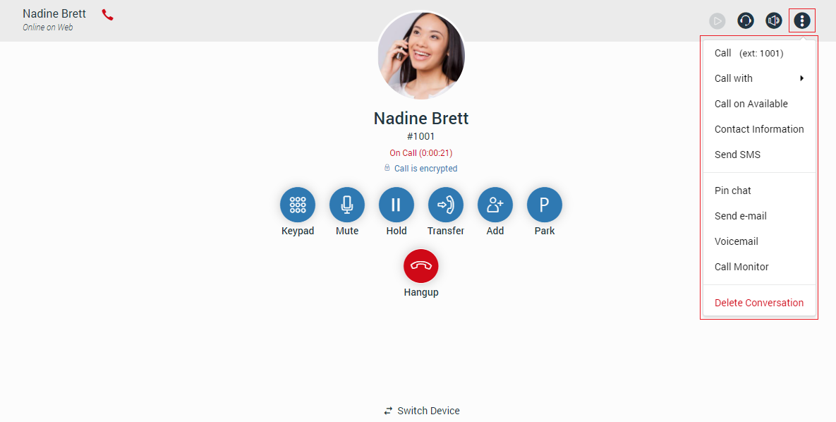
On the right top corner of the context bar, there are four additional options.
The next list shows additional options:
- Record: Allows the user to record a call (If enabled).
- Audio: Allows the user to change their audio devices like a microphone, speaker, and ringing devices.
- Volume: Allows the user to adjust their speaker volume.
- Options: Opens a drop-down menu with next options:
- Call
- Call with
- Call on Available
- Contact Information
- Send SMS
- Pin Chat
- Send e-mail
- Voicemail
- Call Monitor
- Delete Conversation
Also, the screen displays called party’s name, avatar picture, number, and call duration. Furthermore, the user has the ability to chat with the called party during a live call.
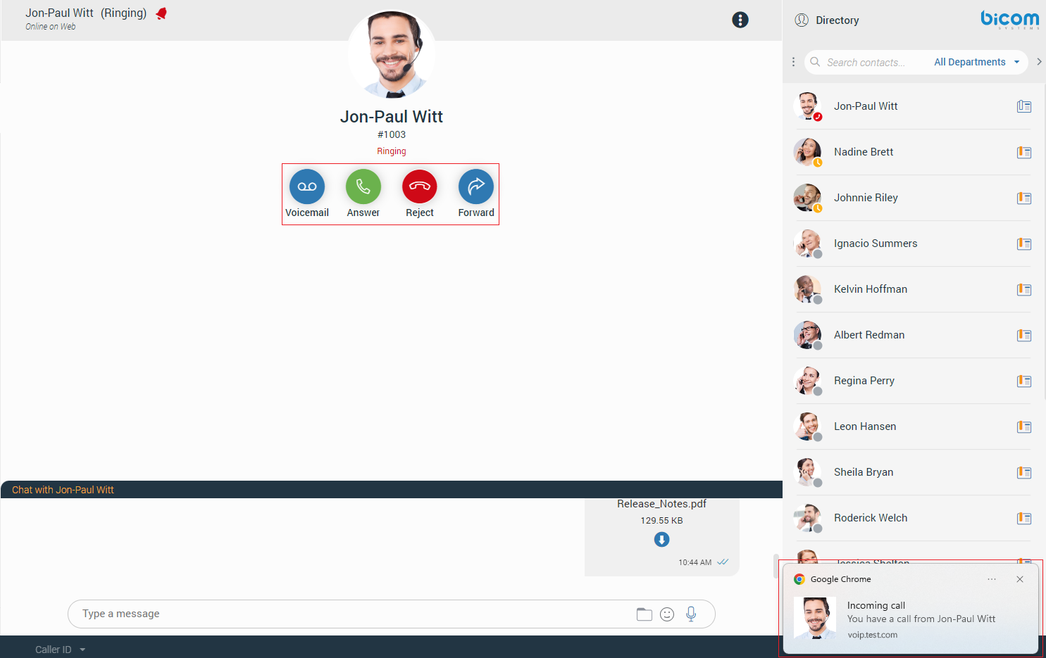
Receiving a Call
There is more than one way to answer the incoming call:
- Click the Answer or Reject button within the call toast to answer or reject the call. The call toast will be displayed in the bottom left corner, and it will only be displayed if the contact from whom the call is coming is not selected.
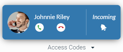
- Or, click on the contac from whom the call is coming within the sidebar conversation/contact list or call toast to bring up the ringing phone screen with the following options at the front of the application:
- Voicemail: Allows the user to transfer a call to the voicemail.
- Answer: Allows the user to accept the call.
- Reject: Allows the user to reject an incoming call, which will be automatically forwarded to the voicemail.
- Forward: Allows the user to forward the call to someone else.
The call will be transferred to the user’s voicemail if the user does not take any action within 32 seconds.!
Call Parking
Call Parking
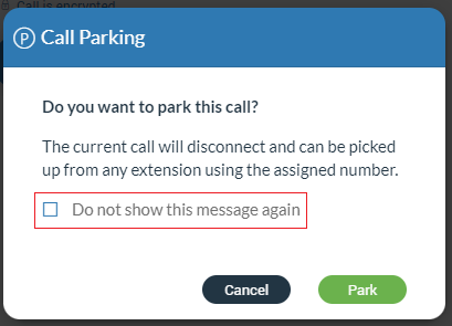
The Call Pakring option allows the user to park a call so someone else can pick it up. The user can park a call by clicking the Park button and selecting a parking lot from the provided list.
After the parking lot is selected, a confirmation dialog will appear. This dialog can be prevented from appearing again by checking the “Do not show this message again” option.
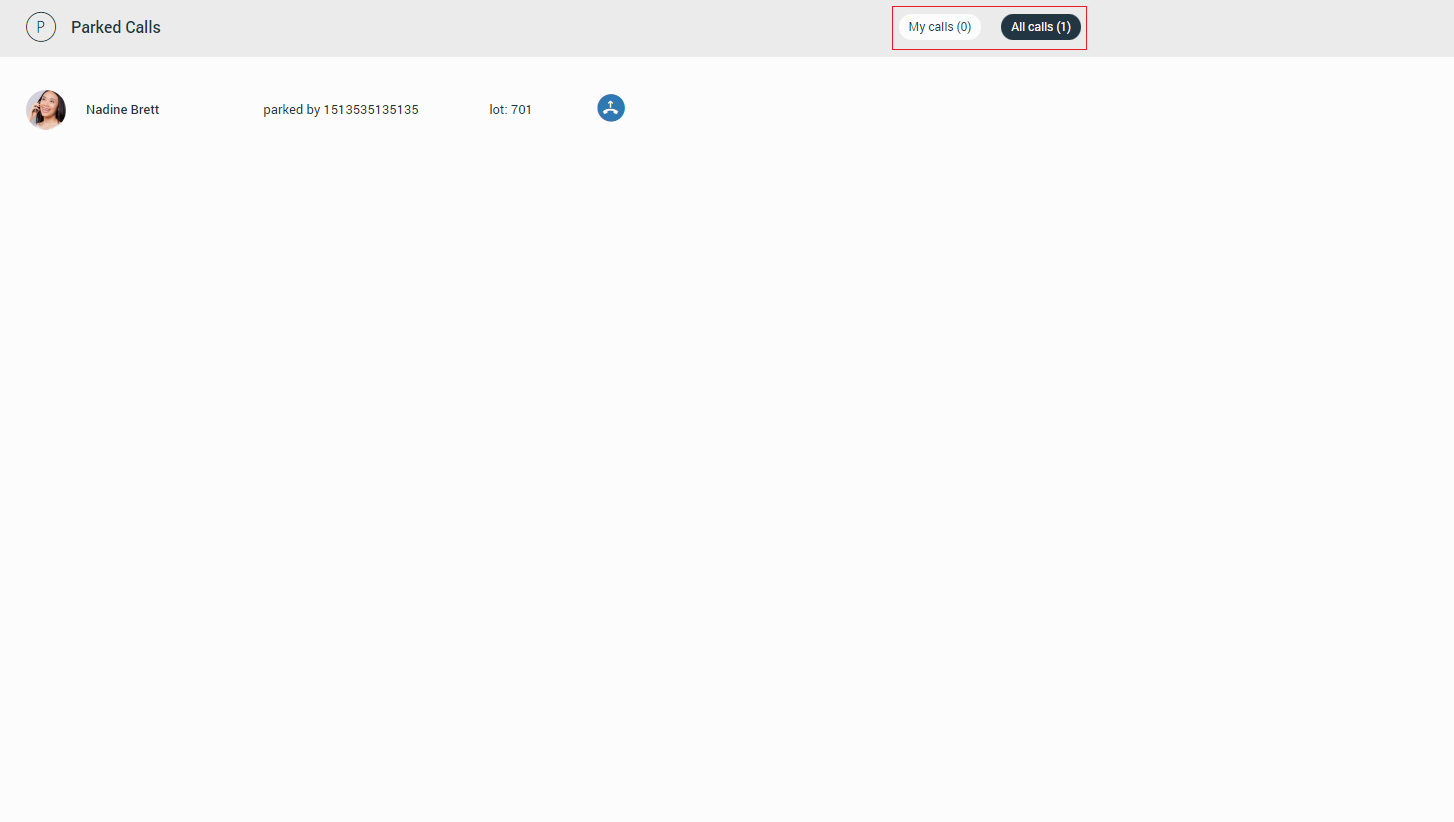
Parked Calls
Once a call is parked, it can be picked up by clicking on the additional options in the navigation bar and then selecting Parked Calls or dialing the parked extension.
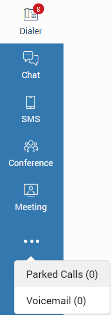
In the Parked Calls section, users can filter calls by clicking the My Calls or All Calls buttons.
Conversation List
Next to the navigation bar is a list of all users’ conversations divided into two types: Chat and SMS conversations, sorted by their most recent activity. These conversations are persistent, meaning they appear on the list even after users restart the application. To remove the conversation permanently, users need to delete it.
By default, lists are hidden and will appear after clicking the Chat or the SMS button within the navigation bar.
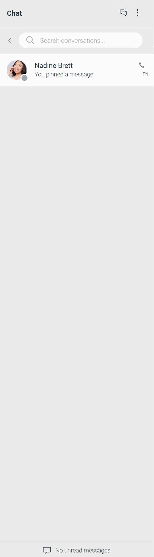
Chat Conversation List
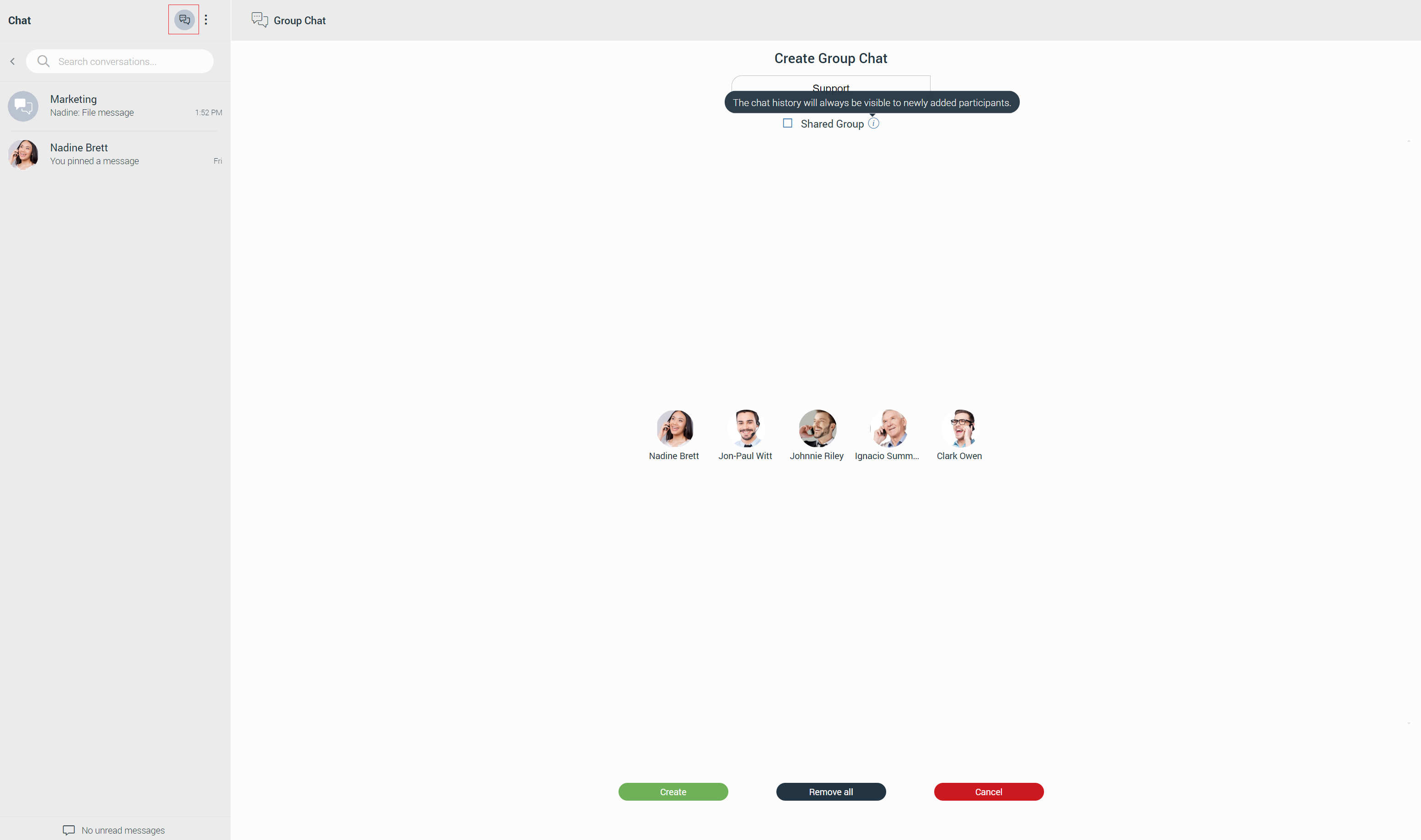
The chat conversation list includes the Create Group Chat, Threads, Options buttons at the top and the search field, which allows users to filter conversations by name and extension number.
Next to it is an arrow that allows users to collapse (expand) the conversation list to get more space for a section in the middle of the screen. Additionally, users have the ability to resize the conversation list instead of collapsing it. This way, they will keep their conversations visible and still get extra space in the middle of the screen. Below the search field, users can find all their conversations.
Finally, the unread messages indicator is positioned at the bottom of the list, informing users of unread messages.
The Create Group Chat button allows users to create group chat conversations.
When the Options button is clicked, a drop-down menu with two options appears: Show closed chats and Close all chats.
- Show closed chats: Allows users to have an overview of all closed conversations. Any closed conversation can be returned to the active conversation list by clicking on it, clicking on the Move to active chats button at the right side of the conversation, or selecting the Move to active chats option from the drop-down menu.
- Close all chats: Allows users to close all their conversations without having to close them one by one. Any activity within the closed conversation will return the conversation back to the active conversation list (any new messages, new participants added, calls, etc.). This way, users never miss the latest messages and events. Users can find any closed conversation using the search field above the conversation list or selecting the Show closed chats option within the three dots menu next to the search field.
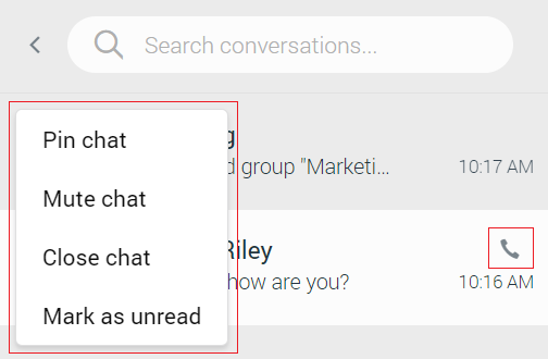
To close the conversation, the user needs to hover over it. The three dots will appear at the top left corner of the hovered conversation. Clicking on them brings a drop-down menu with additional options. Select Close Chat from the drop-down menu to close the conversation. This way, the user can keep visible only those conversations they are interested in currently.
Also, a conversation with a user that has been deleted from PBXware will be marked with a prefix (Deleted). The user can no longer send messages to this conversation, but it is still useful because of the chat history and all existing messages with that user before deletion.
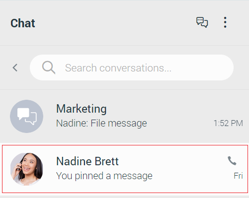
Hovering over the conversation displays additional options. On the left side, there is a three dots menu that contains the Pin/Unpin Chat, Mute/Unmute Chat, Close Chat, and Mark as Read/Unread options. On the right side, the user can find the Call option.
- Pin/Unpin Chat: Allows the user to pin the most important conversations at the top of the conversation list. The last pinned conversation is always at the top of the conversation list. The user can unpin conversations the same way as they pin them. Also, they can be unpinned by clicking on the pin icon
 that appears for pinned conversations. The user can rearrange pinned conversations as per their needs, using drag and drop. This way, they can define priority for pinned conversations.
 - Mute/Unmute (Group chats only): Allows the user to stop receiving notifications for a group chat. It could be helpful if there are too many exchanged messages that distract the user. They can unmute the group chat in the same way as they muted it or by clicking on the speaker icon
 that appears for muted conversations.
 - Close Chat: Allows the user to close the desired conversation.
- Mark as Read/Unread: Allows the user to explicitly mark the conversation as Read/Unread. If the user marks the conversation as unread, the unread indicator will show up for that conversation. It informs the user to look at this conversation again and take some actions if needed. Any action inside the chat conversation with unread status will remove the unread indicator. Also, opening the conversation or explicitly marking it as read will remove the indicator.
- Call option: Allows the user to place a call.
For each one to one conversation within the conversation list, the user can see:
- Contacts’s avatar with his/her status icon
- Contacts’s name
- Last message in the conversation
- Time of the last message in the conversation
- Number of unread messages (if any)
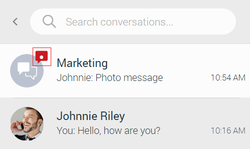
For each group conversation within the conversation list, the user can see:
- Group chat icon
- Group name
- Last message in the conversation
- Time of the last message in the conversation
- Number of unread messages (if any)
While in search mode conversation list will change its items according to the searched term.
Unread Messages Indicator
At the bottom of the conversation list is an unread messages indicator. It informs the user if there are currently unread messages. It is helpful in cases where the user has scrolled down and does not see their most recent conversations or when they are in search mode.
If there are unread messages, the label and the icon are emphasized in orange to draw the user’s attention.
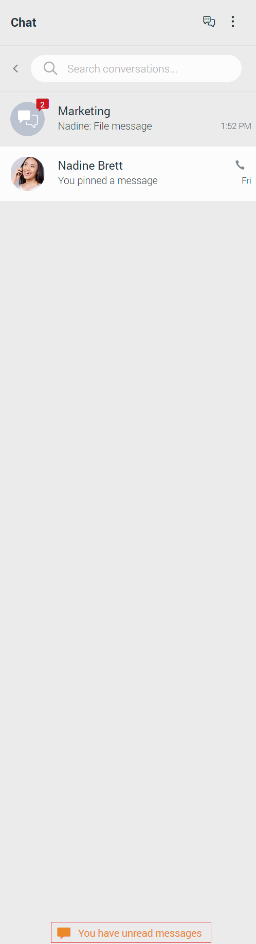
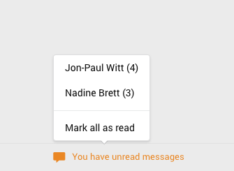
Click the label to open up a menu showing a list of all conversations with unread messages indicating the number of unread messages in the parenthesis. Also, there is an option to mark all messages as read.
Marking all messages as read will effectively send seen to all those conversations even though the user has not read those messages yet. Click any other option besides Mark all as read opens the selected chat conversation. It can be used as a quicker way to find conversations with unread messages instead of looking for them in the conversation list.
If there are no unread messages, the label is not emphasized and serves only as an indicator, without any functionality.
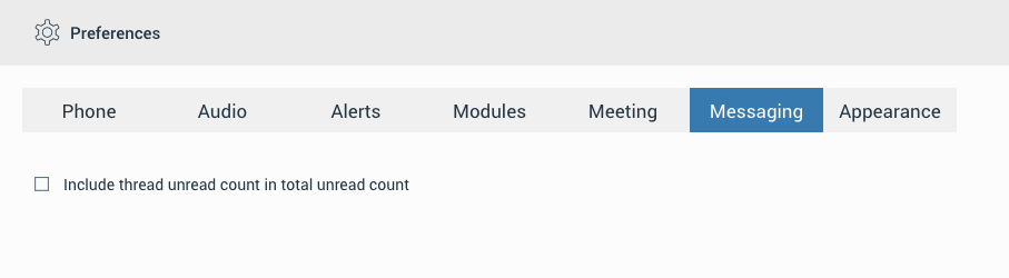
Users can also enable the Include thread unread count in total unread count option in the preferences.
This option integrates the thread unread count in total unread count. It ensures that users are promptly notified of all unread messages, whether they are in the main chat or in threads, thus improving user experience and message visibility.
When this option is enabled, unread threads will be added to the Conversation List unread messages indicator menu. From there, users can Mark all threads as read or open a single thread that contains unread messages.
Chat Notifications
Notifications for all unread messages will be displayed as a red badge with the number that represents the total number of unread messages, as shown in the picture below.
SMS Conversation List
The SMS conversation list contains the search field, which can be used for filtering the existing conversations or starting a new one in case the user enters the contact’s number. To collapse the conversation list, click on the arrow positioned on the left side of the search field. To create new SMS conversations, click the Create new SMS button at the top right of the conversation list.
Below the search field is a list of all user’s conversations sorted by their most recent activity.
The associated SMS number (or the alert message) is displayed at the bottom of the list. What will be displayed depends on whether the SMS option is enabled or not.
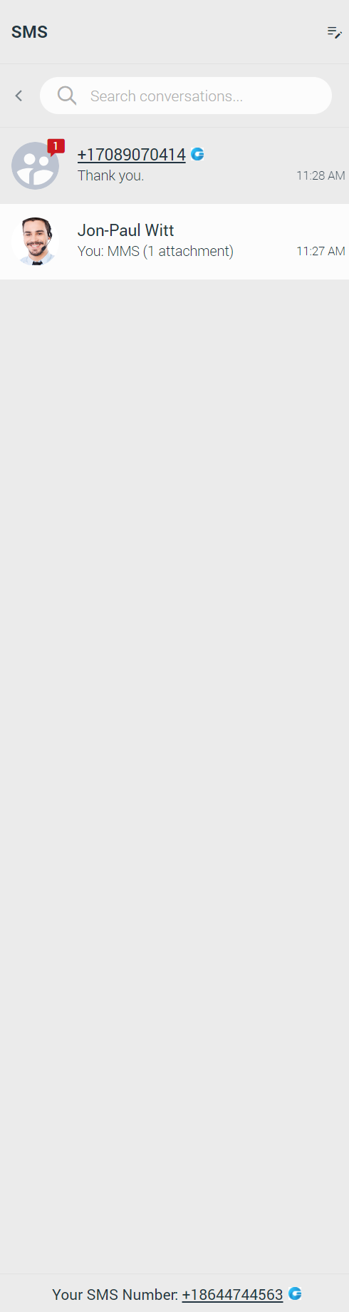
If the user has associated an SMS number with their Extension, the SMS number will be displayed. It means that they can send/receive SMS/MMS messages.

Suppose the SMS number is not associated with the user’s Extension. In that case, the alert icon will be displayed with the message, “No SMS number assigned”. The SMS/MMS messages cannot be sent or received.

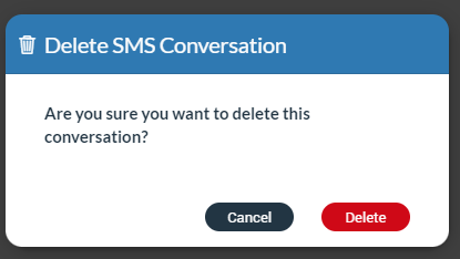
To delete an SMS conversation, hover over it and click on the three dots button in the upper left corner of the hovered conversation.
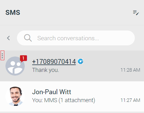
Selecting the Delete option will open a modal dialog with the following message “Are you sure you want to delete this conversation?”. Click the Delete button to delete the conversation or the Cancel button to cancel it.
Bottom Bar
The bottom bar allows the user to specify which type of phone device they want to use (Softphone/Deskphone/Mobile app), enable/disable DND (Do not Disturb), and Caller ID, which allows the user to hide Caller ID for all calls or to hide Caller ID for next call only.

If DND is activated, the DND button within the bottom bar will be colored in red.
Furthermore, the Dialer icon within the navigation bar and the contact list should look as shown in the picture.
The DND modal dialog will appear if the user calls an extension that has DND activated.
By default DND and Caller ID options are disabled. To use these options, please contact your administrator.
Conference
The conference is a part of a gloCOM Web where the user can place conference calls with more than one participant (external or internal).
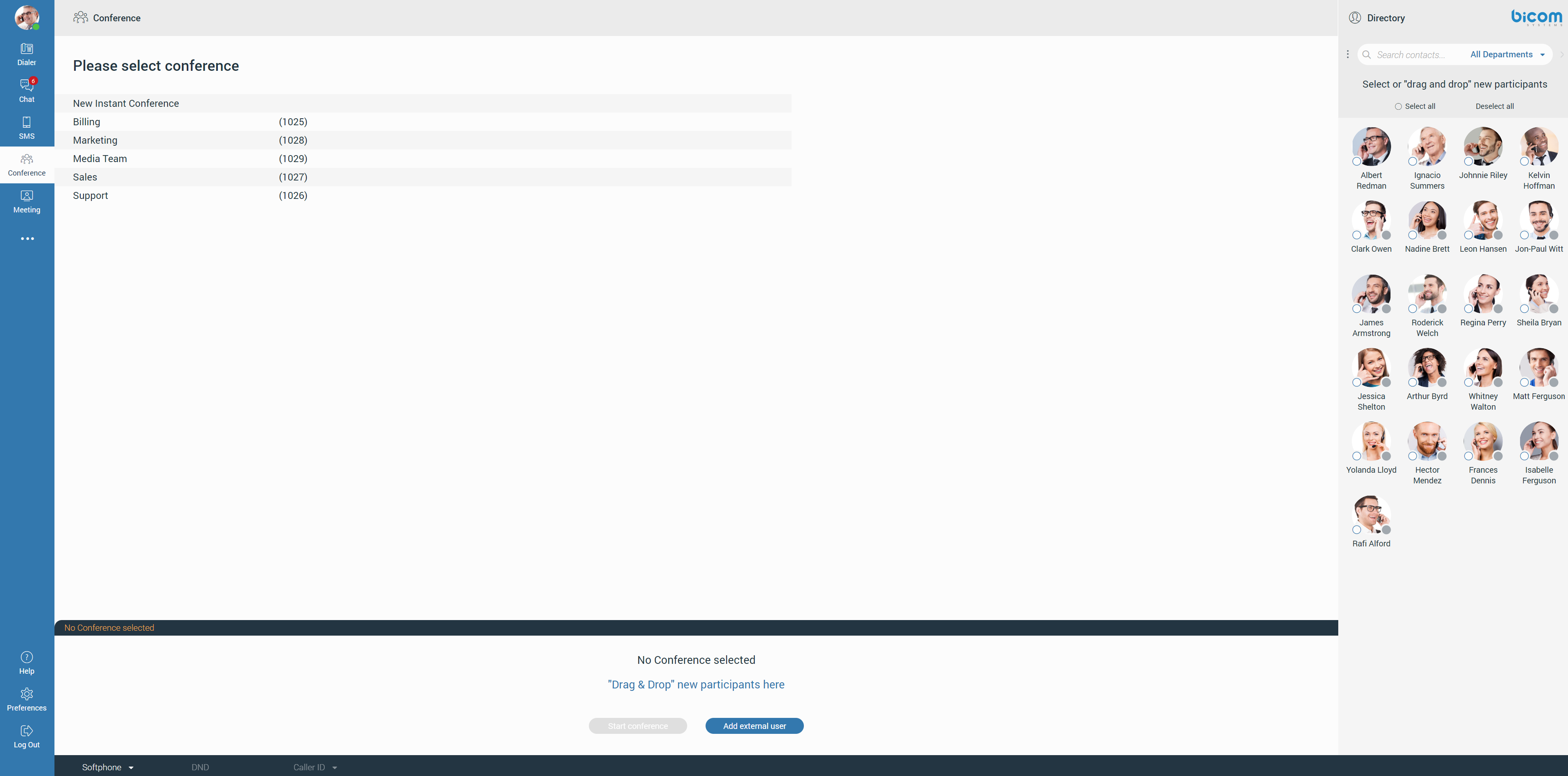
There are two types of conference calls:
- Instant conference (Dynamic conference): The user can create a conference call by adding one or more people to an ongoing call or through the conference section. With this option, the user can add contacts or any number available from their contact list. If the user missed the conference call, they can still join it from the Recent Calls, provided that a conference call still exists, by clicking on the Dial button.
- Static conference: The user can join predefined conference rooms and add other participants. There is a conference number next to the conference name within the conference list for the static conference call.
Placing a Conference Call
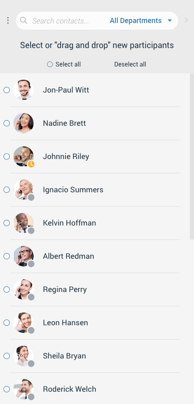
Clicking on the Conference icon within the navigation bar, the conference section will open. To place a conference call, the user needs to select participants from the contact list. The user can choose participants by clicking on them or dragging and dropping them into the participant list.
Additionally, the user can select them using the Select All radio button above the contact list or by entering the external number. The user can filter contacts by using the search field or filtering them by the department.
Next, select the conference from the conference list that is placed next to the contact list. Below the conference list is the participant list. It allows the user to see all chosen participants and to remove them from the list. While hovering over them, the blue cross will appear. Click it to remove the desired participant from the participant list. Press a Deselect All button to remove all participants from the list.
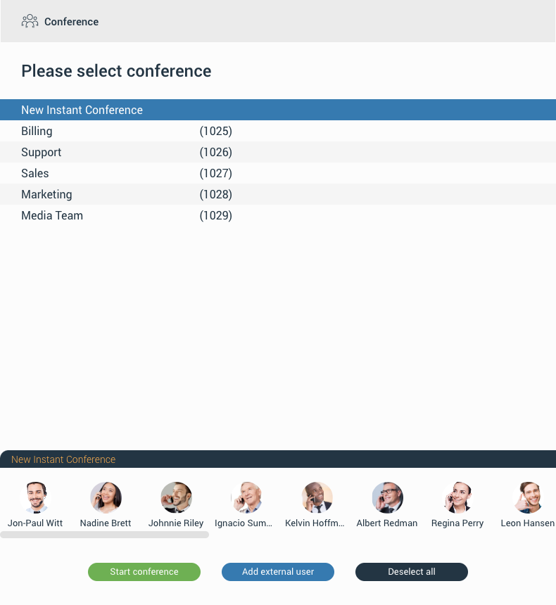
To start the conference, click the Start Conference button. This button will be disabled in case there is no selected conference. Also, a conference call can be started without pre-selected participants, which can be added later.
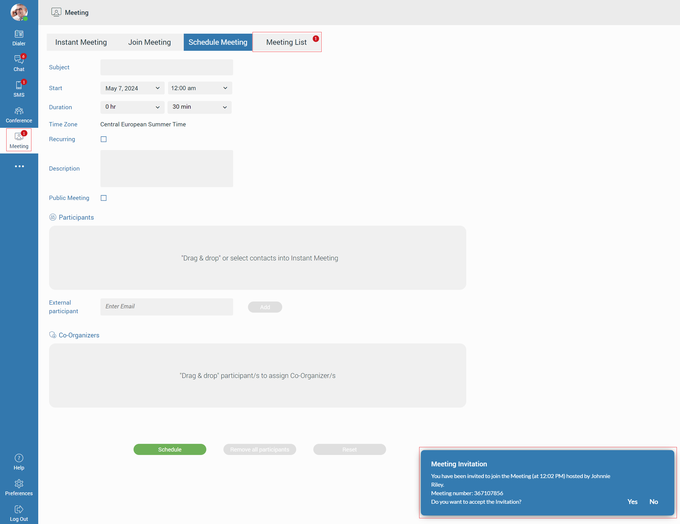
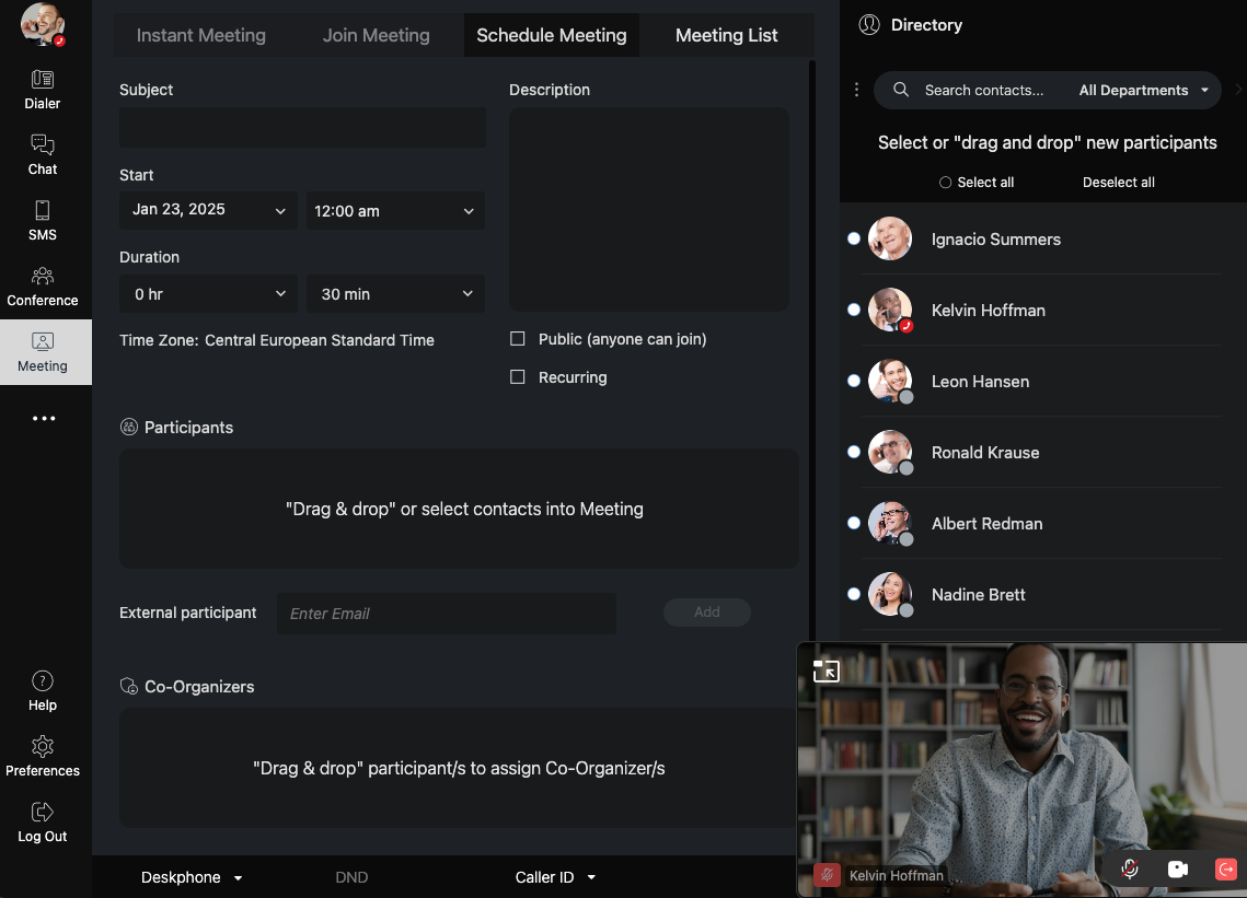
Meeting
The meeting is a part of the gloCOM Web, which gives a user the ability to organize an instant meeting, schedule a meeting, or join an existing meeting. To access the meeting screen, click on the Meeting icon within the navigation bar.
The meeting screen contains the following tabs: Instant Meeting, Join Meeting, Schedule Meeting, and Meeting List.
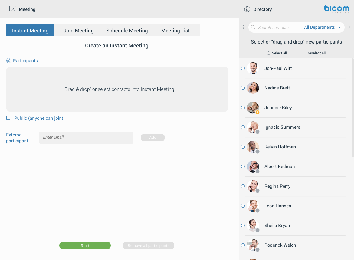
If the meeting is disabled on the license, all meeting tabs except Join Meeting will be disabled, and the following message will be displayed: “No meeting license, please check with your admin. You can still join a meeting with a meeting number, but you can not start, schedule, or view meetings.”
Instant Meeting
Instant Meeting is the first screen presented to the user after clicking the Meeting icon within the navigation bar. It contains the participant list in which the user can add participants by clicking on them within the contact list, selecting them all by pressing the Select all radio button above the contact list or dragging them to the participant list.
Additionally, it is possible to add an external participant to the meeting by entering the participant’s e-mail.
Removing participants from the participant list can be done by hovering over them within the participant list and clicking on them, or clicking on them within the contact list. Additionally, the user can remove participants by pressing the Deselect all radio button above the contact list, or pressing the Remove all participants button to remove all participants from the participant list.
While creating the Instant Meeting, the user can decide whether they want to make a private or a public meeting. In the case of the private meeting, only called parties can join the meeting. Otherwise, anyone can join the meeting.
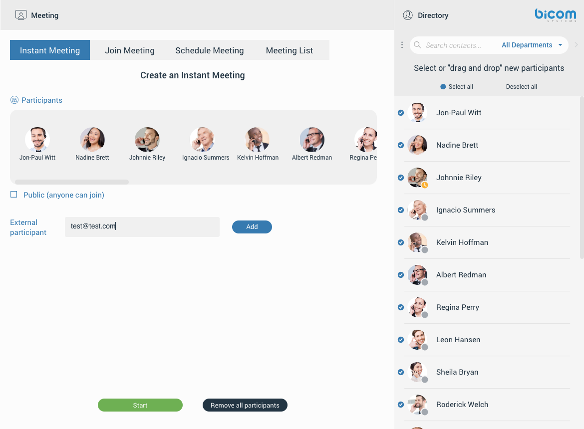
After selecting participants and choosing whether the meeting will be private or public, pressing the Start button starts the meeting in the new window displaying the gloCOM Meeting Web app page.
If the user uses the gloCOM Desktop and the gloCOM Web simultaneously, while starting a meeting via Web, the meeting will be started automatically within the gloCOM Desktop app.
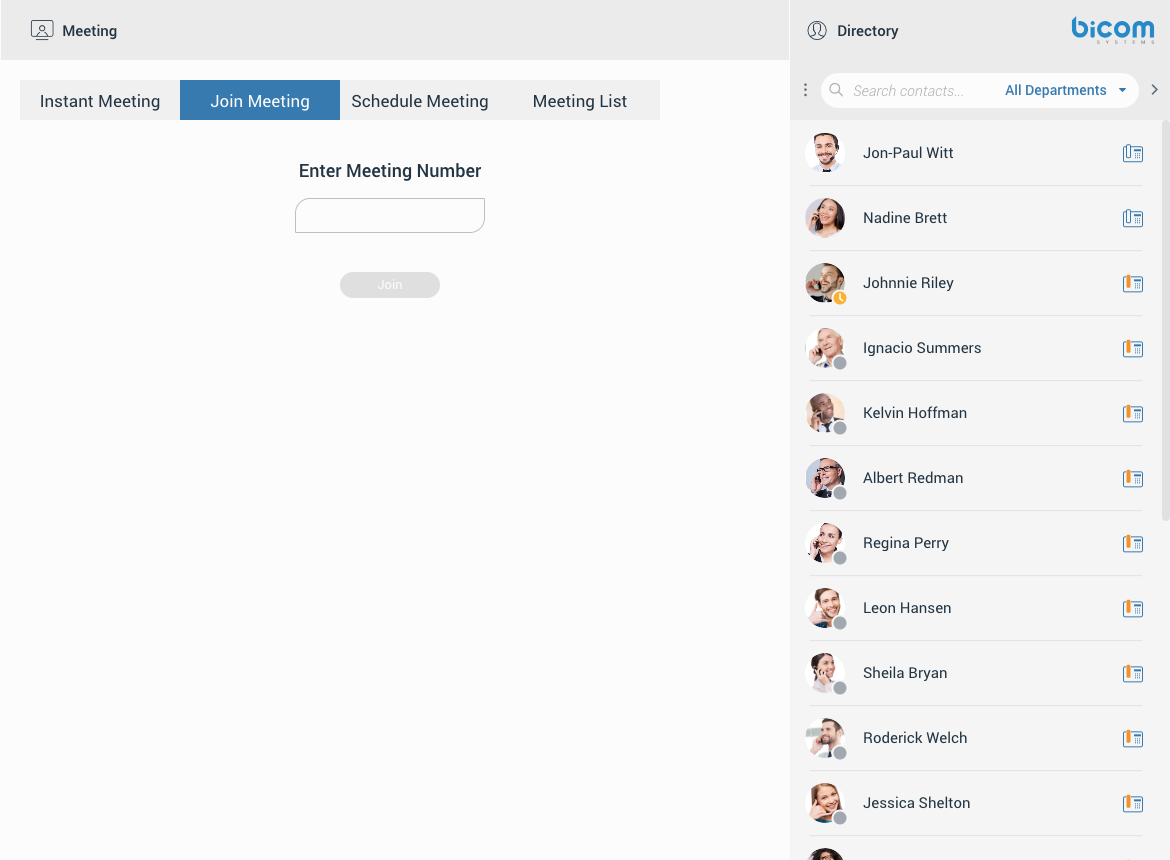
Join Meeting
Join Meeting gives the user ability to join the existing meeting by entering the meeting number. After entering the meeting number and clicking the Join button, the meeting will be opened in the new window displaying the gloCOM Meeting Web app page.
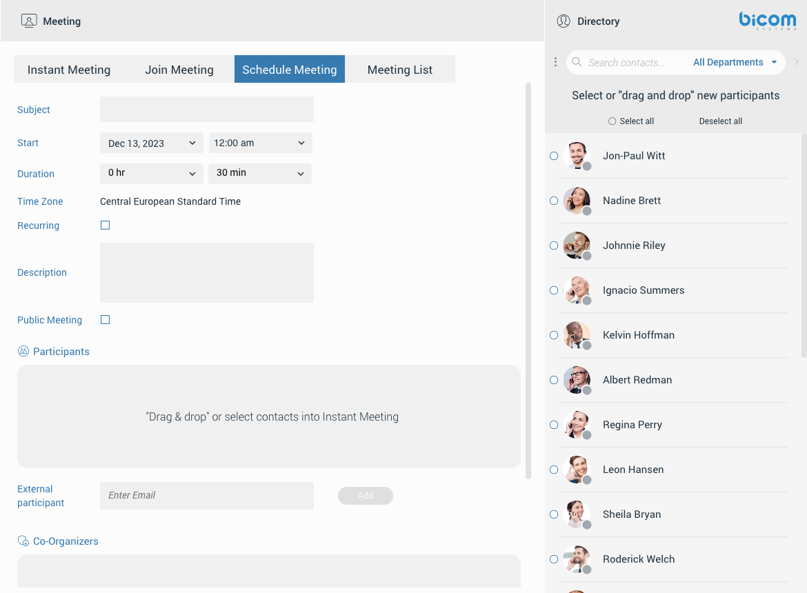
Schedule Meeting
Schedule Meeting gives the user ability to schedule a meeting beforehand.
While scheduling the meeting, the user needs to provide information such as:
- Subject: Provides information on what the given topic for the meeting is. (It must be filled.)
- Start (date or time must be in the future):
- Date – Provides information on which day you will have the meeting.
- Time – Provides information on the time of day it will occur.
- Duration: Provides information on how long the meeting will be.
- Time Zone: Provides information on the time zone your meeting will be scheduled in.
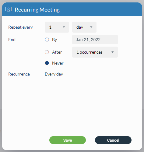
- Recurring: Provides information on whether the meeting is recurring or not (If it will repeat, e.g. every Thursday at 3 pm) and how long it will recur for (e.g. stop after ten meetings).
- Description: Provides the user to describe a meeting in a few sentences.
- Public Meeting: Provides the user with the ability to make a public meeting so anyone can join the meeting. Otherwise, only called parties can join the meeting.
- Participants list: Provides information on who is supposed to attend the meeting. (The user can add participants as described before in the Instant Meeting section.)
- Co-Organizers list: Provides information on who is Co-Organizer of the meeting.
A recurring meeting is a meeting that will repeat every set time (every day, week, or month), e.g. every week on Tuesday, you have a sales meeting. You may edit recurring meetings to suit your needs if you need to reschedule.
At the bottom of the screen, there are three buttons as follows:
- Schedule: Clicking on it schedules a meeting if everything is filled correctly.
- Remove all participants: Clicking on it removes all participants from the participant list.
- Reset: Clicking on it resets all meeting settings.
Scheduled meetings will be displayed within the Meeting List under the Scheduled subtab.
The user can edit Scheduled meetings from the Meeting List screen by pressing the Edit button.
After pressing the Edit button, the Scheduled Meeting screen will be open, where the meeting can be edited. The user can save the changes by pressing the Save button. Pressing the Cancel button discards all changes.
Co-Organizers
As a Co-Organizer, the user has the ability to start, edit scheduled meetings, add/remove participants, and assign new Co-Organizers.
External participants cannot be assigned as Co-Organizers.
Assigning participants to Co-Organizers can be done by dragging and dropping them from the contact list to the Co-Organizers list or by clicking the three dots button next to the participant within the participant’s list and selecting the Assign Co-Organizer option.
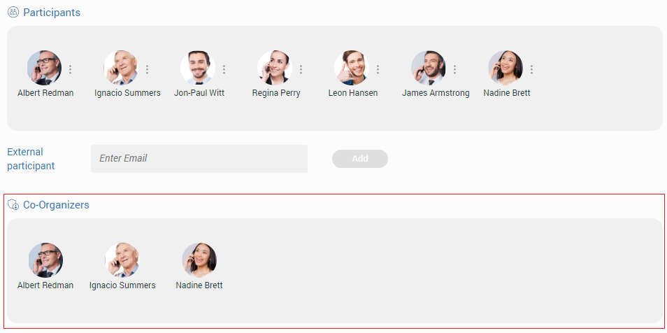
Removing the Co-Organizer from the Co-Organizer’s list can be done by clicking on them within the Contacts/Participants/Co-Organizers list or by clicking the three dots button next to the participant within the participant’s list and selecting the Remove option.
The Co-Organizer cannot remove other Co-Organizers, which can only be done by the meeting administrator.
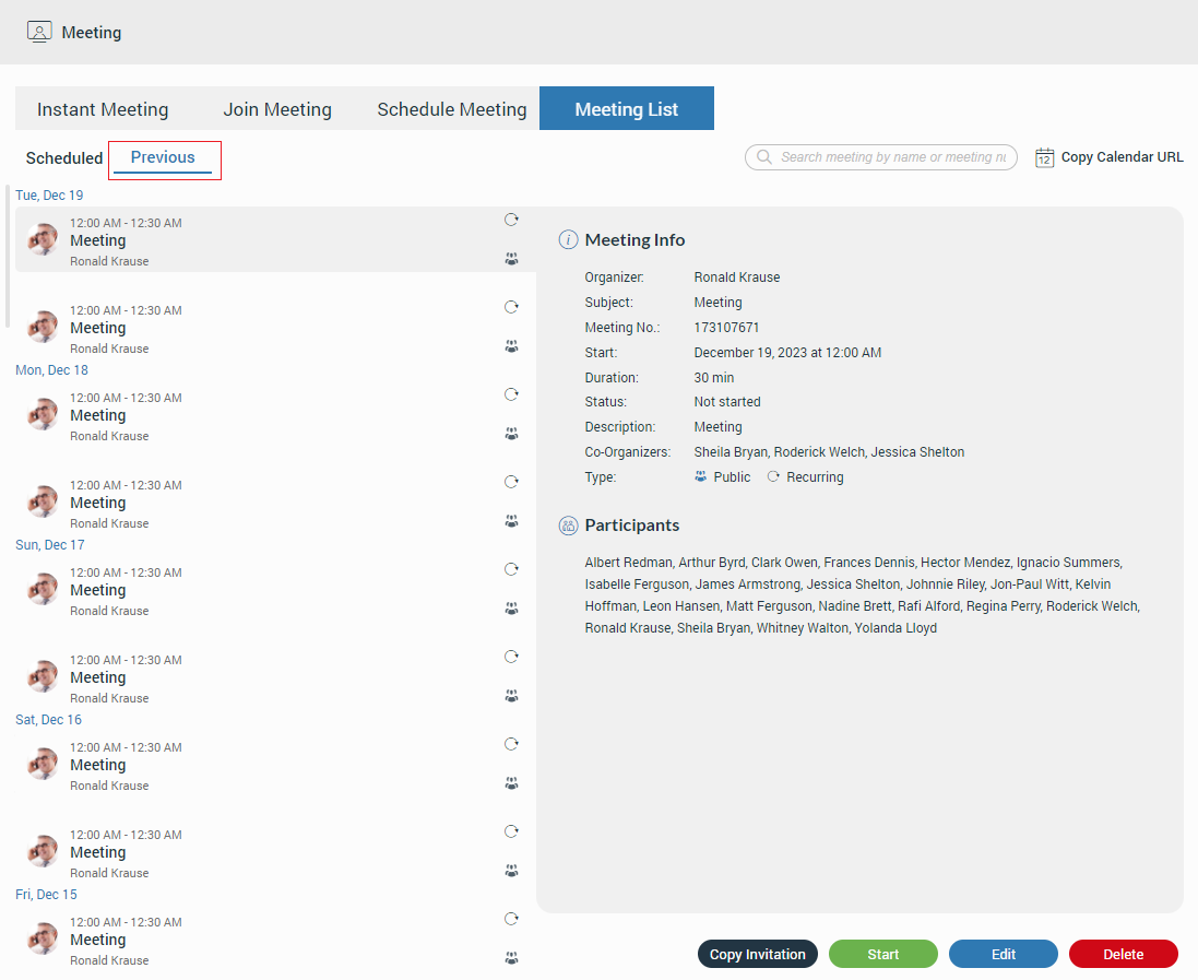
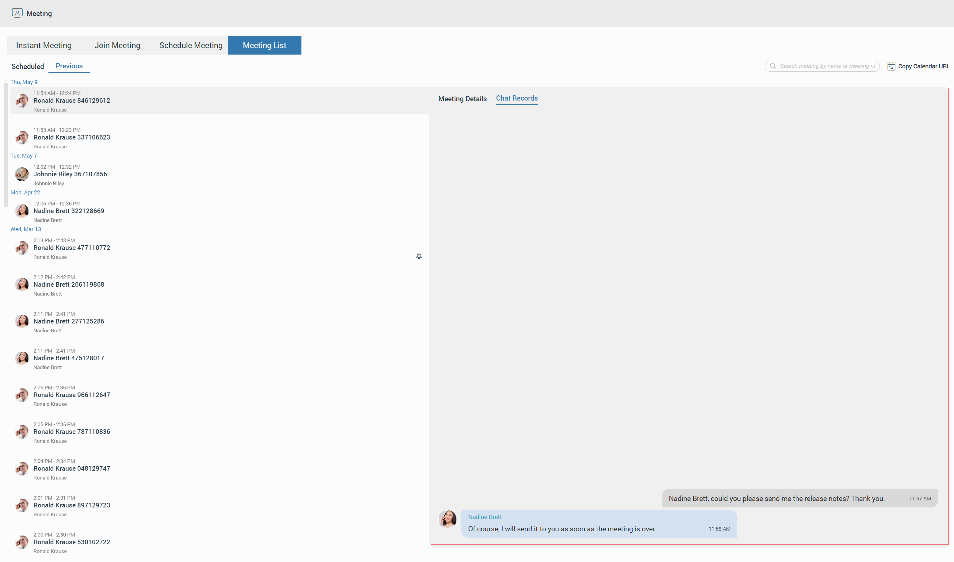
Meeting List
Meeting List provides information about Scheduled and Previous meetings. Under the Scheduled tab beside scheduled meetings, the user will also find all ongoing meetings at the top of the list. All meetings in the scheduled list are grouped by date and sorted by ASC order. Next to the Scheduled tab is a Previous tab which contains all previously finished meetings grouped and sorted by date and DESC order.
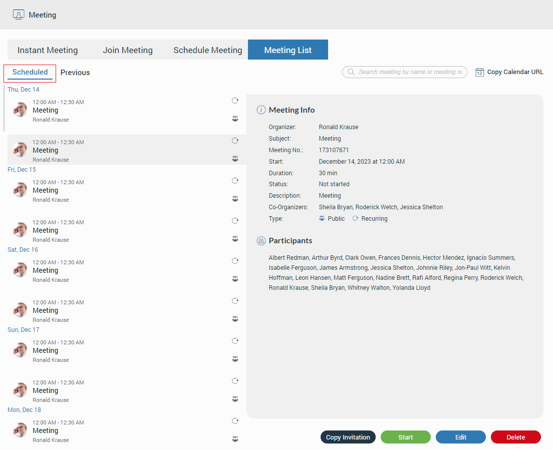
When the user selects the meeting from the list, the Meeting Info section on the right side of the screen displays details about the meeting.
- Chat Records: Shows meeting chat history (if any)
The following list shows those details:
- Organizer: Provides information on who organized the meeting.
- Subject: Provides information on what the given topic for the meeting is.
- Meeting No: The randomly assigned number to distinguish meetings.
- Start: Start time and the day it will occur.
- Duration: How long the meeting will be.
- Status: The state of the meeting (e.g. finished or upcoming).
- Description: Provides the user with a short description of the given topic.
- Co-Organizers: Provides information on who is Co-Organizer of the meeting.
- Type: Provides information that the meeting is recurring, public, or both.
- Participant list: Provides information on who is supposed to attend the meeting.
Additionally, the user has the ability to search for the desired meeting using the search field, which is located above the Meeting Info section. Meetings can be searched by number or by name.
The Copy Calendar URL option is next to the search field, which allows the user to copy the Meeting Calendar into their calendar software.
Depending on the meeting type and meeting status, the user will be presented with different button options.
The following list shows the meaning of those buttons:
- Join button: As the button name says, it allows the user to join the ongoing meeting.
- Copy Invitation button: As the button name says, it allows the user to copy a meeting invitation easily.
- End button: As the button name says, it allows the user to end the meeting. (Only the meeting organizer and Co-Organizers can end the meeting.)
- Start button: As the button name says, it allows the user to start a scheduled meeting. (Only the meeting organizer and Co-Organizers can start the scheduled meeting.)
- Edit button: As the button name says, it allows the user to edit the scheduled meeting. (Only the meeting organizer and Co-Organizers can edit the scheduled meeting.)
- Delete button: As the button name says, it allows the user to delete the meeting. (Only the meeting organizer and Co-Organizers can delete the meeting.)
- Clone button: As the button name says, it allows the user to clone the finished meeting. (Only the meeting organizer and Co-Organizers can clone the meeting).
Meeting Notification
For every meeting invitation, the user will receive a pop-up notification. Additionally, the user will be provided with a pop-up dialog within the gloCOM Web app to access the meeting quickly.
Furthermore, all meeting notifications will be displayed as a red badge with the number that represents the total number of meeting notifications, as shown in the picture above.
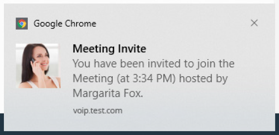
Notifications for the meeting invitations will only be received if the user is logged in to the gloCOM Web app.
Scheduled Meeting Notification
Scheduled Meeting Notification shows the notification for an incoming scheduled meeting N minutes before the meeting starts, allowing the user to start the meeting.
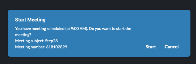
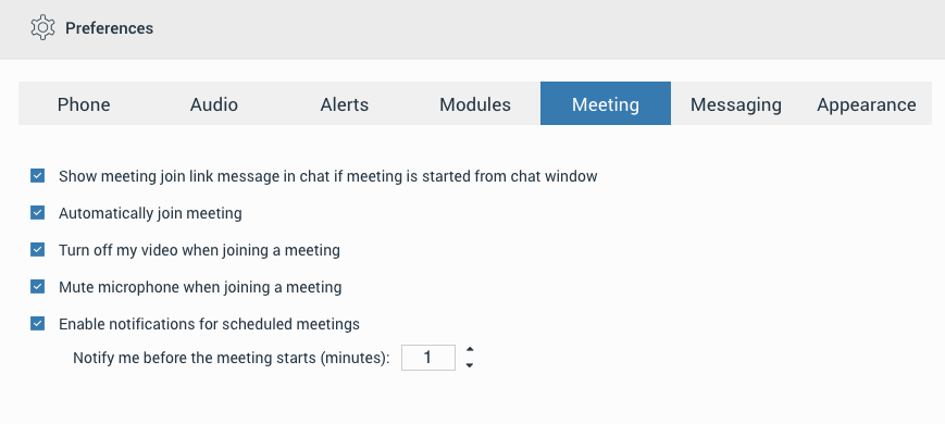
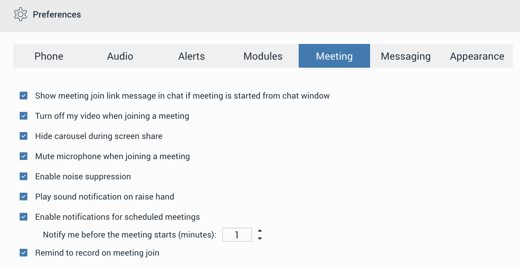
The N represents the value that depends on the settings set within the Preferences -> Meeting tab (for example, 10 minutes, 2 minutes, 1 minute, etc.). To disable this, user needs to uncheck the checkbox next to the “Enable notifications for scheduled meetings” option. By default, this option is enabled.
Meeting interface
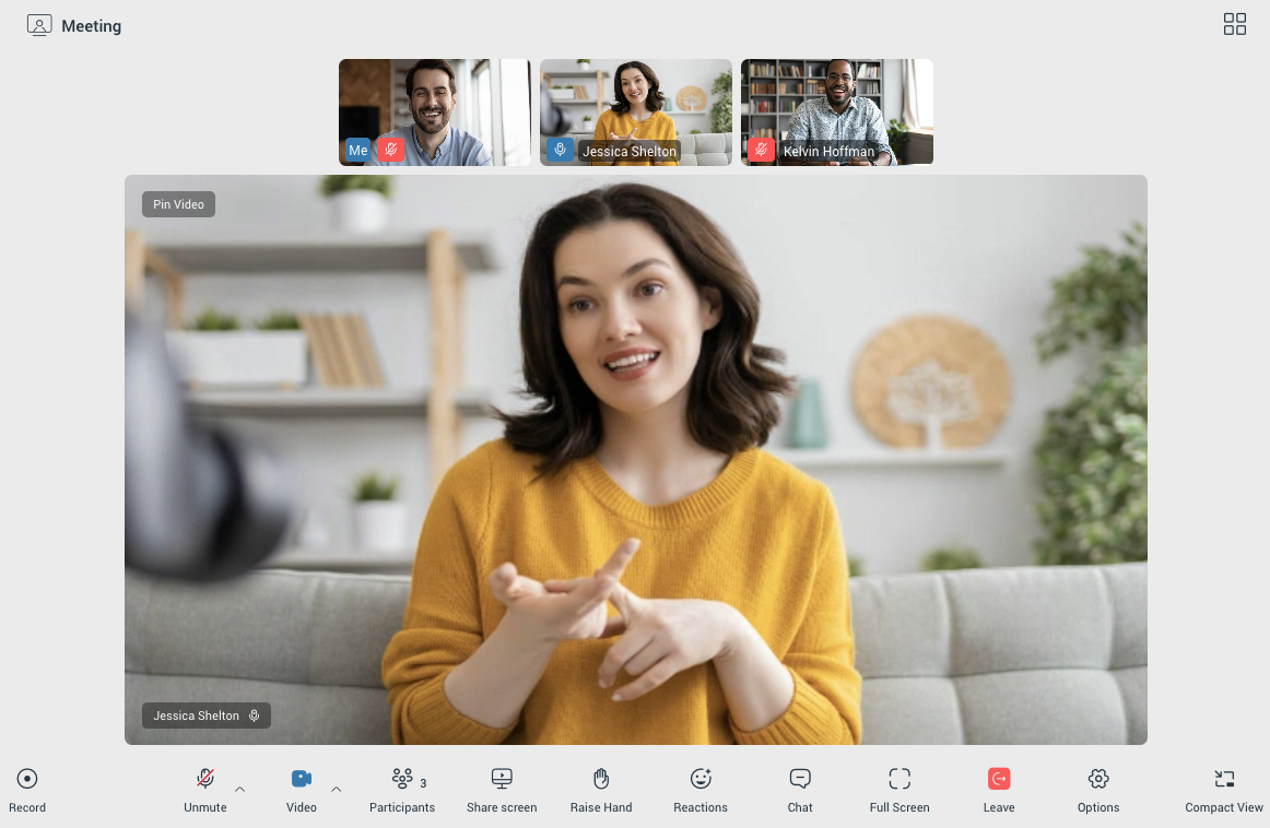
Once a user has successfully joined a meeting, they will be presented with the meeting interface within the Meeting Tab. The meeting interface is designed to provide an intuitive and easy-to-navigate layout, with all the essential tools and controls needed for a smooth meeting experience.
In Speaker View, the meeting interface consists of the following sections:
- Top Section: Contains the Participants Carousel, where users can see the avatars or initials of the active participants, their name and their audio status. The carousel allows quick navigation between participants.
- Main Section: Displays the Pinned Participant or Speaker—the main focus of the meeting, typically the person speaking or sharing content. This area adjusts dynamically depending on who is actively speaking or sharing their screen.
- Meeting Toolbar: Provides various controls for managing the meeting. This includes tools for muting/unmuting, camera control, chat, screen sharing, and other settings related to the meeting.
Grid/Speaker View
The user is able to change their view of the participants, they can either use the grid or Speaker View. The grid view will show more participants in a grid fashion, while the Speaker View will put the focus on one of the participants. The button to switch between Speaker and Grid mode is located in the upper right corner.
When number of participants is greater than 12, user should be able to scroll left and right through participants by clicking on arrow buttons while in grid view.
Pin/Unpin video
If the user is in Speaker View, they can pin a participant to make that participant’s video the primary video in the main section. By pinning, the video of the selected participant will remain visible regardless of who is speaking. To unpin, the user can simply click the unpin option, or double-click on the participant’s video in the Participants Carousel returning the main section to dynamic Speaker View.
Meeting Recordings
The Meeting Recording allows audio, video, and screen sharing to be recorded during meetings. This is a local recording that is processed by the application without interfering with the ongoing meeting performance. This way, the meeting can be held without fear that the converting process will interfere with the ongoing meeting.
To start recording, click the Record button in the far left corner of the toolbar at the bottom of the window.
Once clicked, the button will change its look. Two buttons, Pause and Stop, will appear, allowing users to pause and stop recording.
The recording can be paused and resumed as needed. The final saved file will seamlessly merge the recorded segments, excluding any paused duration.
The recording file is automatically created once the recording is stopped (either manually or automatically) and is then finalized into a single file. The final recording file is automatically saved to the system’s Downloads folder.
The Remind to record on meeting join option is available to prevent important meetings from being held unrecorded, a situation that is often forgotten.
Functionality: When this option is turned on, a pop-up window is presented when a meeting is being joined, asking if the meeting should be recorded.
Default State: This option is turned off by default.
Activation: To turn this reminder on, navigation to Preferences -> Meeting is required, and the box next to the “Remind to record on meeting join” option must be checked.
Mute/Unmute
Once a participant has joined the meeting audio, they can mute or unmute themselves at any time by clicking the Mute/Unmute icon in the meeting toolbar. The current audio state (muted or unmuted) is clearly displayed in the icon.
Additionally, by clicking the up arrow next to the Mute/Unmute button, users can:
- Switch between available audio devices (e.g., microphones or speakers).
- Enable or disable noise suppression to reduce background noise.
- Enable or disable the Push-to-Talk option, allowing the participant to hold the space key to temporarily unmute.
- Leave audio, disconnecting from the meeting’s audio stream.
Video sharing
Participants can share video during the meeting if a video capture device is connected to their computer.. To enable video sharing, the participant must first allow camera permissions in their browser or operating system when prompted. Once permissions are granted, the user can enable or disable the video device during the meeting at any time by clicking on the Video icon.
Additionally, by clicking the upward-pointing arrow next to the video icon, the user can change their video device or enable background effects, allowing them to apply a virtual background.
Participants
The user can view the list of people invited to the meeting by clicking the Participants icon in the meeting toolbar. This icon also includes an indicator showing the total number of participants currently in the meeting.
When clicked, the participant list opens on the right side of the screen.
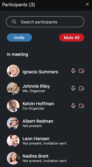
It includes:
- A Search Participants input field for quickly finding specific participants.
- An Invite button to add participants to the meeting.
- A Mute All button (available only to organizers and co-organizers) to mute all participants in the meeting.
The participant list displays:
- Participants’ names
- Audio and video statuses
- Avatars
- Roles (e.g., Presenter, “Organizer” or “Co-Organizer”)
For participants who are not present, a “Not Present” label will be displayed. Audio and video icons will be hidden. Once a participant joins the meeting, the label is removed, and the audio and video icons appear to indicate their status.
Invite participants
The Invite option allows users to add other participants to the meeting. Participants can be added via:
- Contacts (Extension): Select contacts directly from the contact list.
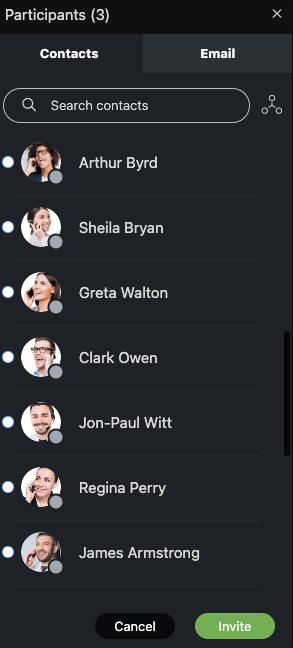
- Email: Invite participants by entering their email addresses.
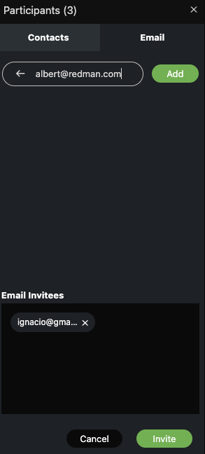
If an external participant is invited but has not yet joined the meeting, their email address will be displayed in the participant list instead of their name.
Assign/Unassign Co-organizer
Organizers can assign or unassign Co-Organizers during a meeting by clicking the additional options button next to a participant’s name or by right-clicking on the participant’s name in the participants list.
A Co-Organizer in a meeting has access to most of the features available to an Organizer:
- Assign Co-Organizer
- Mute specific participant
- Remove a participant from audio
- Remove a participant from the meeting.
Co-Organizers are not allowed to:
- Remove the Organizer or other Co-Organizers from audio or the meeting.
- Demote the Organizer or other Co-Organizers to a User role.
Participants will be notified when they are assigned or removed as a Co-Organizer.
Share screen
The user can press the Share Screen button to share their screen with other participants in the meeting. The user will have the option to share one of the following:
- Their entire screen
- A specific window
- A tab from their browser
To use the screen sharing feature, the user must grant screen recording permissions
When the user starts sharing:
- Other participants will see a label indicating that screen sharing is starting, along with the presenter’s name.
- The meeting toolbar updates to include Pause and Stop Sharing buttons for the presenter.
- By default, the screen-sharing preview is enabled for the presenter and can be toggled via a button in the top-right corner of the app.
- An option to Hide/Show Carousel will appear in the top-right corner of the app allowing users to toggle the carousel visibility while screen sharing is active. The default state of this option can be set in the app’s Preferences under the Meeting section.
Raise Hand
The Raise Hand provides a simple way for participants to get the speaker’s attention without interrupting or disrupting the meeting. Users can access this option from the main Meeting toolbar. Upon clicking the Raise Hand icon in the toolbar, a confirmation popup will appear, requiring the user to confirm their action by clicking on the popup icon.
When participants raise their hands:
- A Raised Hand icon appears in the upper left corner of their video stream on the Meeting screen (visible in both carousel and grid views).
- Their names are added to a separate Raised Hand list, displayed above the Participant List. This list shows raised hands in chronological order.
- Organizers and Co-organizers can lower a participant’s raised hand by clicking the Raised Hand icon next to their name in the Raised Hand list.
Reactions
In-Meeting Reactions allow users to visually express themselves during a meeting using emoticons like laughing, celebrating, applause, and more. Users can access reactions by clicking the Reactions icon in the main Meeting toolbar, which opens a menu of available emoticons.
When a reaction is selected, an animated icon floats upward from the left side of the screen, with the sender’s name displayed below it.
Users can show/hide reactions from others by selecting the Show/Hide Reactions option under the Options button in the main Meeting toolbar. Reactions are enabled by default.
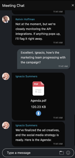
Chat
The in-meeting Chat enables users to send and receive real-time messages with other participants. In addition to text, users can share files and include emojis to enhance their communication.
The chat supports previews for common image formats, such as PNG, SVG, JPG, and others. For unsupported image formats, like ICO, a generic image icon is displayed, while non-image files are represented by a file icon. Users can click on any file within the chat, and the file will be downloaded to their device.
Incoming messages in the chat window will display the sender’s name, avatar (if available), and the time the message was sent, providing clear context for every message.
A visual indicator on the Chat button in the control bar alerts users about unread messages. This indicator only appears when the chat sidebar is closed, ensuring users are notified even if they aren’t actively viewing the chat. After rejoining a meeting, the user will only see the number of unread messages received while they were away. Messages viewed before leaving the meeting will not be included in the count.
Fullscreen
The Fullscreen option in the meeting control bar allows users to toggle fullscreen mode during a meeting. This ensures a flexible viewivng experience, enchaning focus when needed while allowing users to return to the default interface seamlessly.
Leave/End Meeting
The Leave button is available to all participants.
Clicking Leave will prompt the user to confirm their departure from the meeting. Once confirmed, the user will be removed from the meeting.
When an organizer or co-organizer clicks the Leave button in the meeting toolbar, they are presented with a dialog asking whether they want to:
- Leave: Allows the user to exit the meeting without ending it for others.
- End: Ends the meeting for all participants and closes the session. (This option is only available to organizers and co-organizers.)
- Cancel: Closes the dialg box and returns user to the meeting.
Options
Clicking the Options button in the meeting toolbar opens the options menu.
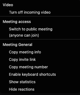
Turn Off Incoming Video
This option disables all active video streams from other participants.
Switch to Public/Private Meeting
Toggle between making the meeting public or private:
- Public Meeting: Anyone with the meeting link can join.
- Private Meeting: Access is restricted to invited participants.
Copy Meeting Info
Copies the meeting details to the clipboard, including:
- Subject: The meeting subject.
- Time: The scheduled time of the meeting, including the time zone.
- Join Meeting Link: A URL to join the meeting.
- Meeting Number: The unique identifier for the meeting.
- Dial: Additional information for joining the meeting via phone (if applicable).
Copy Invite Link
Copies the meeting join link to the user’s clipboard.
Copy Meeting Number
Copies the meeting number to the clipboard.
Enable Keyboard Shortcuts
Users can enable keyboard shortcuts by selecting this option under the Options menu. Once enabled, shortcuts will be displayed when hovering over buttons in the control bar.
Alt + A: Mute/Unmute microphone
Alt + V: Turn camera on/off
Alt + U: Toggle participants list on/off
Ctrl + Alt + H: Raise/Lower hand
Alt + H: Toggle chat on/off
MacOS Note: Use the Option key instead of Alt.
Shortcuts only work when the meeting screen is in focus.
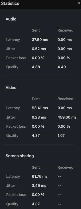
Statistics
Displays the network connection quality.
Hide/Show reactions
Hides/Shows reactions from other participants. By default, reactions are enabled.
Picture-in-Picture (PiP) Mode
The Picture-in-Picture (PiP) mode allows users to minimize the current meeting into a smaller, movable window for convenience.
This feature is activated either manually or automatically based on user actions.
How to Enable PiP Mode
- Manually: Click the Compact View button in the bottom-right corner of the meeting window.
- Automatically: The meeting will switch to PiP mode when navigating to other parts of the app (e.g. Dialer, Chat, etc.).
Features of the PiP Window
- Controls:
- Mute/Unmute microphone.
- Turn video on/off.
- End/Leave meeting.
- Speakers Label: Displays the active speaker’s name and avatar, or their video stream, or screen sharing, depending on the current activity in the meeting.
- Movable Window: The PiP window can be moved freely within the app window but cannot overlap with the sidebar navigation.
- Maximize/Switch Button: Return to the full meeting view by clicking the maximize button within the PiP window.
Behavior in PiP Mode
- Upon activation, the app automatically:
- Switches to the Meeting List tab.
- Disables the Instant Meeting and Join Meeting tabs until the current meeting ends.
- Deactivates the Join Meeting button for all meetings listed in the Meeting List tab
- The PiP layout remains intact even when resizing the app window.
Voicemail
The voicemail section allows the user to listen to their voicemail messages. Clicking on the Voicemail icon within the navigation bar opens the voicemail screen.
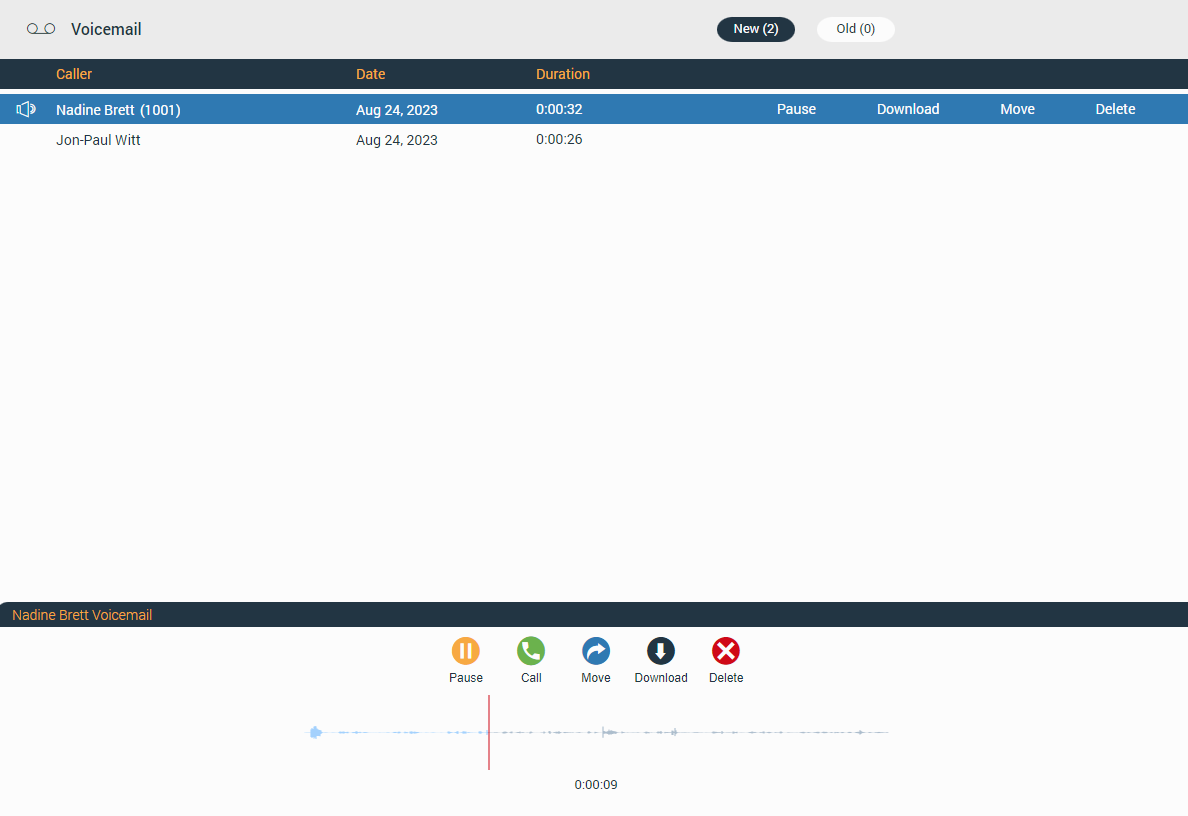
At the top of the voicemail screen is the context bar with two tabs:
- New: Contains new voicemails.
- Old: Contains old voicemails.
Below the context bar is the voicemail list with information like:
- Caller: Displays caller name.
- Date: Displays the date when the voicemail was received.
- Duration: Displays voicemail duration.
Clicking on the desired voicemail message offers additional options like:
- Play: Allows the user to play the voicemail message.
- Call: Allows the user to call the person who left the voicemail.
- Move: Allows the user to move voicemail messages from the New folder to the Old folder and vice versa.
- Download: Allows the user to download the voicemail message to the computer.
- Delete: Allows the user to delete the voicemail message.
gloCOM Web supports only .wav audio format.
Voicemail Notifications
Notifications for all received voicemail messages will be displayed as a red badge with the number that represents the total number of received voicemail messages, as shown in the picture below.
Personal Information
To access the Personal Information, the user needs to click on their avatar image or status icon at the right bottom of the avatar image and select Personal Information from the drop-down menu.
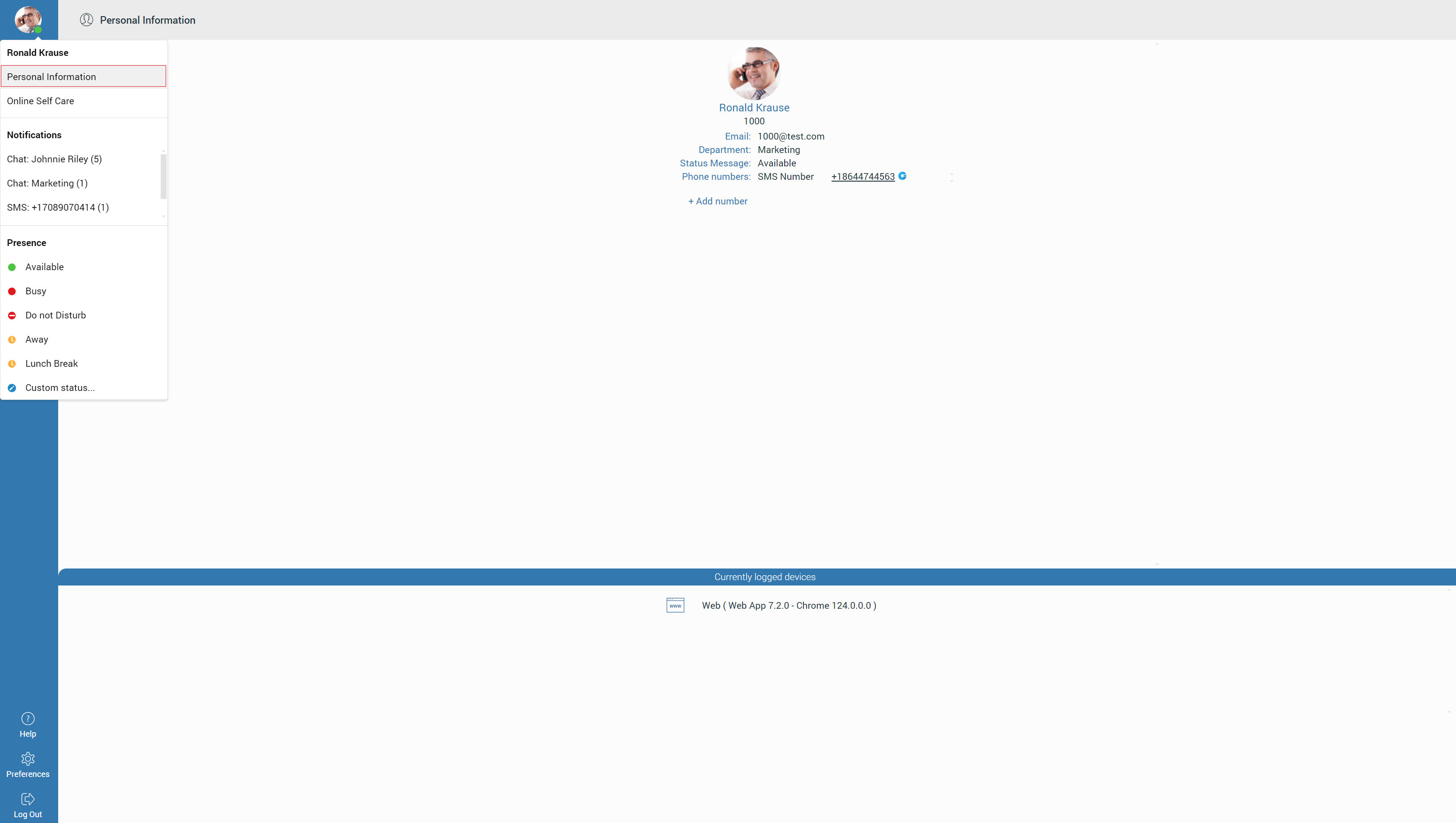
It brings up a Personal Information screen where the user can see their:
- Avatar picture – Clicking on it allows the user to change their avatar picture.
- Extension name
- Extension number
- Department
- Status Message
- Phone numbers – Allows the user to edit and delete their phone numbers.
- Add number – Allows the user to add as many phone numbers as they want.
- Currently logged devices – A list of devices to which the user is currently connected.
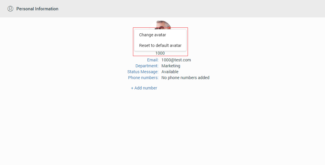
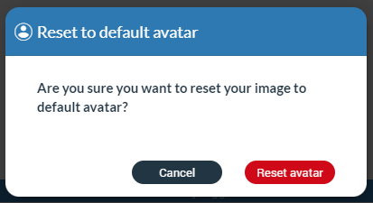
Reset User Avatar
Clicking on the avatar picture within the Personal Information screen opens a drop-down menu with two options:
- Change avatar: Option allows users to change their avatar picture.
- Reset to default avatar: Option resets the avatar picture to its default value.
Online Self Care
To log in to Online Self Care, the user needs to point their browser to http://$IPADDRESS/ (for example http://192.168.1.1/). To access OSC through the gloCOM Web, the user needs to click on their avatar image or status icon at the right bottom of the avatar picture and select Online Self Care from the drop-down menu.
- Email: The email address assigned to the extension (ex. The provided email address is used as a username for logging into Online Self Care (e.g. email@example.com)).
- Password/PIN: The user password assigned to the extension (ex. This field accepts the gloCOM Web password (e.g. n9h*Caq1Icr)).
Help
The help screen contains the About and Feedback sections.
About
The About section gives the user information about the gloCOM Web application and information about the PBX system that gloCOM Web is connected to.
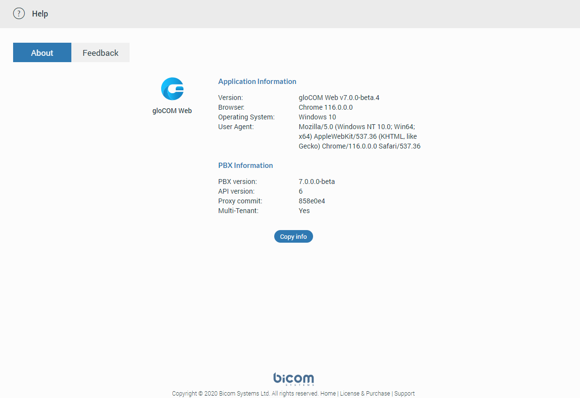
Clicking on the  copies all information from the screen to the clipboard.
Feedback
Users can easily send feedback for the gloCOM Web application. Just navigate to the Help -> Feedback.

Preferences
Within preferences, the user can change their Phone, Audio, Alerts, Modules, Meeting, Messaging and Appearance settings.
Any changes inside these tabs will be automatically saved.
Phone
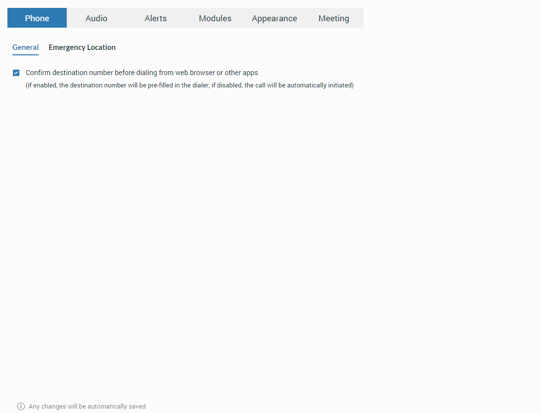
General
Click to Dial
The Click to Dial feature allows the user to select and dial a phone number directly from a web page. Browsers that support this feature are as follows: Google Chrome, Microsoft Edge, and Mozilla Firefox.
In order to work, the Click to Dial extension must be installed on the browser.
Resolving blank page issue with web+gloCOM URL
Upon the initial opening of the web app, it requests permission to handle web+glocom links. A user must grant that permission to be able to use the Click to Dial feature. If the user denies this permission, the browser does not know how to handle the specific protocol (it does not know which web app to open), leading to a blank page. When a blank page appears with the URL web+glocom//123456789, the problem may be due to inadequate permissions granted to the web app.
If this is the case, it is necessary to reset those permissions with the following steps:
- Open Chrome settings.
- Navigate to Privacy and security -> Site settings -> Additional permissions in Permissions section -> Protocol handlers.
- Find the web app in the list of sites that are not allowed to handle protocols and remove that site.
- Clear the web app’s site data and refresh the page.
- A popup asking for permission for the web app to handle the web+glocom protocol will appear, and the user should select “Allow“.
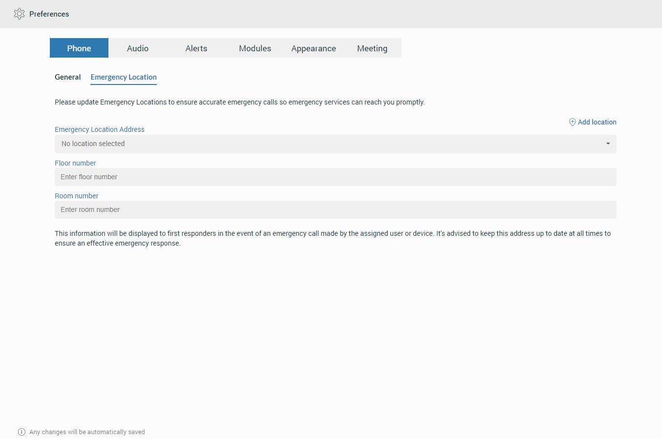
Emergency Location – Ray Baum’s act
Ray Baum’s Act requires that first responders have the necessary information needed to pinpoint the “dispatchable location,” and quickly reach a 911/112 caller regardless of the device they dial from or their exact location inside a large building.
For VoIP trunk testing purposes, please use the number 933.
Regarding the above, the Emergency Location feature will only be available when the server locality is set to the United States.
If the user’s Emergency Location is not set within the app, a pop-up message will appear on login asking them to set their location.
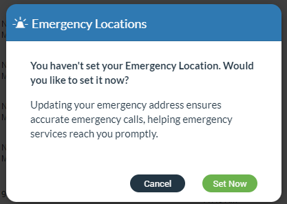
Also, the location can be set by navigating to the Preferences -> Phone -> Emergency Location tab, where the user can set their Emergency Location Address, Floor number, and Room number or add a new location.
Emergency Location will be displayed within the Dialer after entering the 911/112 number, with the possibility to change or set it. Also, it will be displayed within the call window.
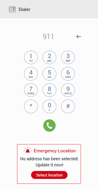
Users should always keep their Emergency Location up to date to ensure an accurate location is provided to the emergency call dispatcher.
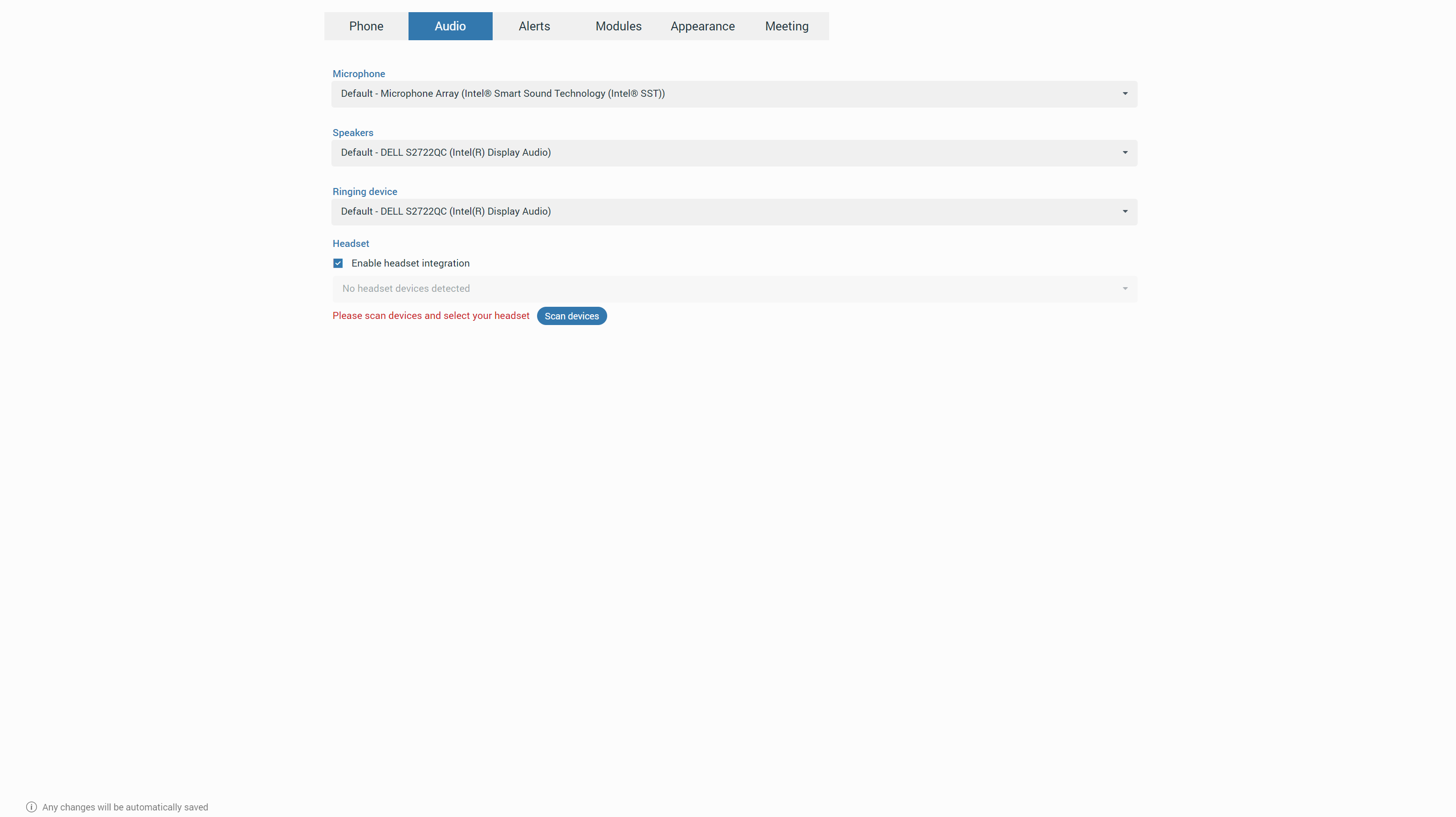
Audio
Users can set their audio devices, such as microphones, speakers, and ringing devices, within the Audio tab or [7.2] enable/disable headset integration. After enabling headset integration, users can use the headset features while using the app.
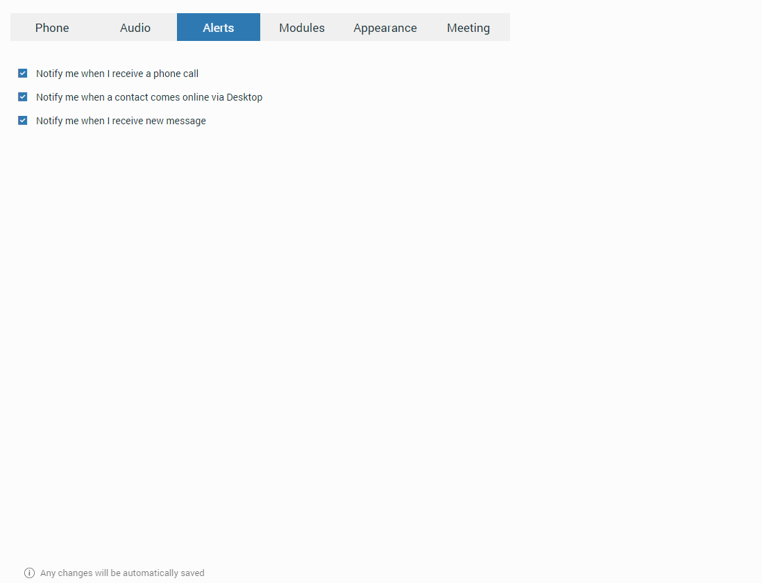
Alerts
Within the Alerts tab, the user can check which kind of notifications they want to receive.
By default the Notify me when a contact comes online via Desktop option is disabled
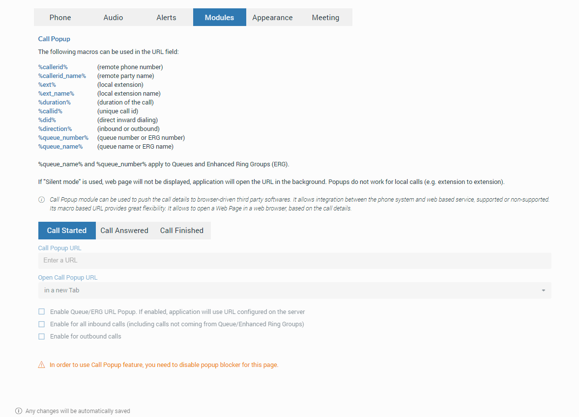
Modules
Call Popup
The Call Popup module can be used to push the call details to the browser-driven third-party software.
It is possible to do a call popup based on the URL, which can be set per Queue and ERG. It can only be done if the option “Enable Queue/ERG URL Popup. If enabled, application will use URL configured on server.” is checked. (Preferences -> Modules -> Call Popup).
Users can set the call popup to open when a call is started, answered, or finished. The user can specify whether to enable each setting for Inbound and/or Outbound calls or turn on the Silent mode. In the Silent mode, a URL request will silently be sent to the server, meaning it will not open a web browser or a new tab.
The Call Popup is macro-based. In the URL field, the user can use the following macros: callerid, callerid_name, ext, ext_name, duration, callid, did, direction, queue_number, and queue_name (e.g., In the Call started URL field, the user may enter yourcrm.com/calls?id=callerid% and check the Inbound calls below. Now, whenever the user receives a call from a customer Call Popup will open a web browser and write the customer’s phone number.).
All this information can be sent silently to the user’s CRM server to create reports such as how many inbound calls the user received, how many outbound calls the user made, average call duration, etc.
Meeting
Within the Meeting tab, the user can enable/disable meeting options by checking/unchecking them.
Messaging
Within the Messaging section, the user can enable/disable Include thread unread count in total unread count option.
This option integrates the thread unread count in total unread count. It ensures that users are promptly notified of all unread messages, whether they are in the main chat or in threads, thus improving user experience and message visibility.
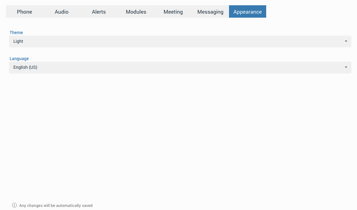
Appearance
Within the Appearance tab, users can customize the look of gloCOM Web. They can select from Light, Navy Blue, and Dark themes, or use the system settings theme. Additionally, users can change the app language, allowing them to use gloCOM Web in their native language.
Presence
gloCOM Web brings a unified presence synced across all user devices (Desktop, Mobile, and Web). For online contacts, the user can see if they are connected: via Desktop, via Mobile, via Web, or even all three. For offline contacts, the user can see when was their last activity in order to have a better understanding of their availability. For example, if you see that the contact was last seen a few minutes ago, you might assume they will probably be able to respond to your calls/messages. On the other hand, if a contact has not been seen for a few days, it might indicate they have limited availability and are out of the office. User’s presence and availability are represented by the icon visible at the bottom right of their avatar.
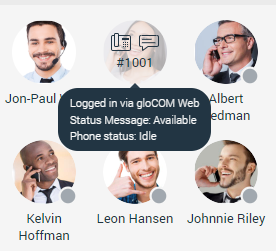
Details about a contact’s presence are shown in a tooltip while hovering over them in both Grid View and List View. The tooltip contains information such as the device that the contact is connected with, their last activity, their status message, and their phone status (idle, on-call, do not disturb, etc.).
Status icon indicator can be any of the following:
 If there is no icon at the bottom right of the user’s avatar, it means that they are currently online and available.
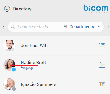
 This icon defines the “Ringing” status of the extensions. It will be displayed when the user is being called, except if the user is already on a call, in which case the status will be “On Call“.
 The user is currently on a phone call.
 The user is currently online, and they’ve set their status to Busy.
 The user is currently online, and they’ve set their status to Do not Disturb.
 This icon has multiple meanings:
- The user is currently online, and they’ve set their status to Away.
- The user is currently connected via Desktop, but they are Away from Desktop.
- The user is not currently connected, but they were last active less than 8 hours ago.
 The user was not active in the last 8 hours.
Status and Status Message
The user can select their status by clicking on the status icon at the right bottom of their avatar. A menu will pop up, and they can choose between:
- Available
- Busy
- Do not Disturb
- Away
- Any of the statuses defined by the PBXware administrator
- Custom Status
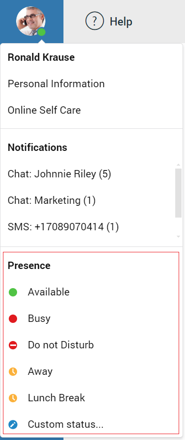
All notifications (chat, sms, call, meeting, voicemail) are displayed within the pop-up menu, as shown in the picture above.
The PBXware administrator can add statuses through PBXware GUI, and those will appear as an option in the menu for all users. For example, an administrator could add Lunch Break status. This way, the user can inform others when they are using their lunch break, and they are not at their desk. Also, they can set their own custom status and write any message to describe their current availability.
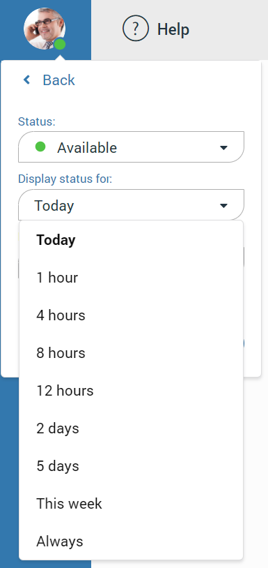
For example, if they have to attend a meeting and they will not be available to respond to calls or messages, they could choose Custom status… from the menu. Select Busy from the dropdown, and type In a meeting as a message. It informs all other users that they are busy, and the reason for that is they are currently attending a meeting. This way, all users can have a better understanding of each other’s availability since each user can type a custom message to describe their current availability. After they select any of the statuses, they also have to specify status expiration. It allows them to let the application revert their status to Available after a certain period of time.
Using the example mentioned above, the user could set their status to Lunch Break with the expiration of 1 hour, so when they come back to the office, they don’t have to remember to change their status back to Available since the application will automatically do that for them.
When setting status expiration the user can choose between
- Today
- 1 hour
- 4 hours
- 8 hours
- 12 hours
- 2 days
- 5 days
- This week
- Always
Chat
gloCOM brings a unified chat between Desktop, Mobile, and Web applications. Chat history is stored on the server and synced between all user devices. For example, if the user needs to leave the office but has a discussion via chat with their colleagues, they can seamlessly continue the discussion using their mobile application. Also, if the user changes their PC or laptop, the entire chat history will sync the first time they log in on the new computer.
Sync Chat History
After every login, the application makes sure that every chat session has synced the last 20 messages, and by scrolling, the user will get older messages.
Chat Server Unavailable
If the chat server is down, the user cannot send nor receive messages until it gets back up. While the chat server is down, there is an indication inside the conversation list to alert the user. As soon as the application detects that the chat server is back up, the warning message disappears, and the user can continue chatting where they left off.
If chat sync has failed, there is a warning inside the conversation list displaying the following message: “Chat server not connected”.
Starting Conversation
There are several ways to start a conversation or to open an existing one.
- Click the chat icon while hovering over a contact within the contact list (only Grid View).
- Right-click on the contact within the contact list and select the Chat option from the drop-down menu.
- Click on a contact within the contact list (only List View).
- Click on a contact within the conversation list to open an existing conversation, or use the search field above the conversation list to find the contact and start a new conversation. The existing conversation can also be found using the search field above the conversation list.
- Click the Create Group icon at the top of the conversation list, select several contacts from the contact list, enter the group name, and click the Create button.
- Start a chat from the regular call (one-to-one chat conversation).
- Start a group chat from the conference (group chat conversation).
Context Bar
At the top of the chat screen area is a context bar. It contains information about the currently selected conversation and also provides various actions available for that conversation. On the far left side is an avatar of the currently selected conversation. Next to it is a user name (or a group name in case of a group conversation). Below the name is information about the user’s presence and status (for example, online status, status message, etc.).

In the case of a group conversation, there is a label indicating the number of participants in the conversation.
One to One Chat Conversations
On the right side of the context bar are buttons for performing actions available for the currently selected conversation.
 – Start or Schedule a meeting from the chat (Start a Meeting from the chat will automatically send an invite link into that chat.).
 – Call the currently selected contact (create a voice conference in case of a group conversation).
 – Add more contacts into the currently selected conversation.
 – Ask the other side for immediate attention (Not available for group conversations.).
 – More options gives options like:
- Call (Ext number)
- Call (Select on which number you want to call the contact.)
- Call With (Select would you like to use softphone or deskphone.)
- Contact Information opens contact information screen
- Send SMS to currently selected contact
- Pin/Unpin chat – Pin/Unpin currently selected conversation
- Send e-mail to the contact
- Voicemail – Leave a voicemail to the contact
- Call Monitor
- Delete Conversation
While adding contacts into the currently selected conversation, the user can filter contacts by searching for a contact’s name or extension number.Also, contacts can be filtered by department or even add a whole department into the conversation. Added contacts cannot read previous messages in the chat conversation.
Group Chat Conversations
On the right side of the context bar are buttons for performing actions available for the currently selected conversation.
- – Start or Schedule a meeting from the chat (Start a Meeting from the chat will automatically send an invite link into that chat.).
- – Place a conference call for the currently selected group conversation.
- – Add more participants into the currently selected conversation.
 – Group info opens a group info screen. The group info screen gives information about the chat admin, participants, and an option to add more participants to the group.
 – Open the thread list for the selected group.
Suppose the user is a group chat administrator. In that case, they can change the group name, remove participants from the group chat, select a new administrator for the group chat, transform the standard group to the shared group, and set the group chat icon up.
Changing the group name can be done by clicking on the group’s name, providing a new name, and pressing the Enter key on the keyboard for the confirmation.
If the user wants to remove a participant from the group chat, they need to go to the Group Info screen, and within the participant list, click on the avatar of the participant they wish to remove.
As a group administrator, the user can select a new group administrator by clicking on their avatar within the Group Info screen, selecting a new one from the participant list, and clicking the Transfer button. As a result, a confirmation dialog pops up asking for the confirmation. Clicking the Cancel button within the Group Info screen will cancel the transfer process.
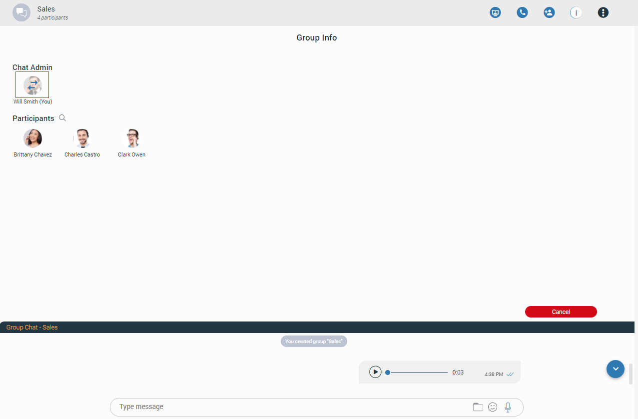
If the group chat does not have an administrator, the user can become an administrator by clicking the Assign myself button next to the No admin assigned label. As a result, a confirmation dialog pops up asking for the confirmation.
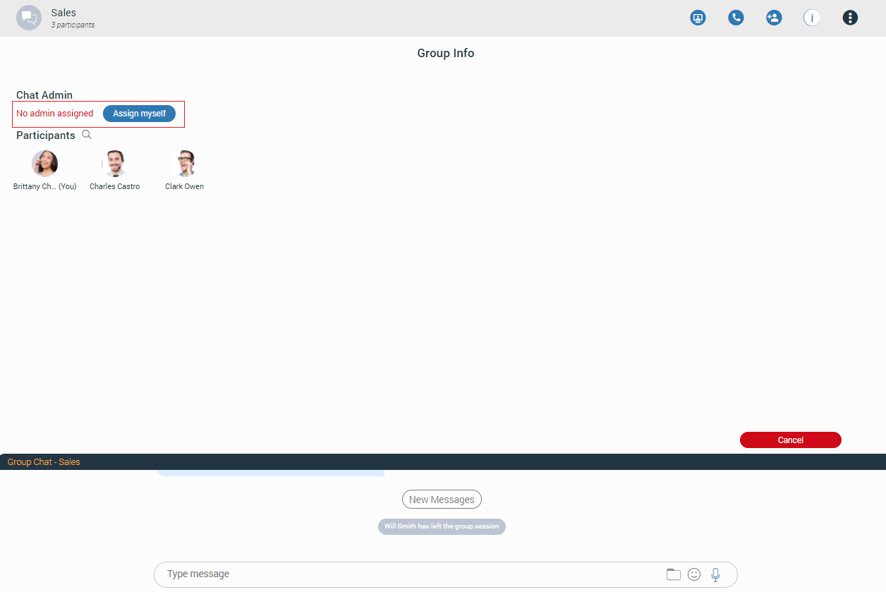
[7.2] The Transform into Shared group option allows the admin to change the existing standard group into a shared group with full history visibility to all existing and newly added participants. Once transformed, it cannot be undone. Caution should be exercised when using this option.
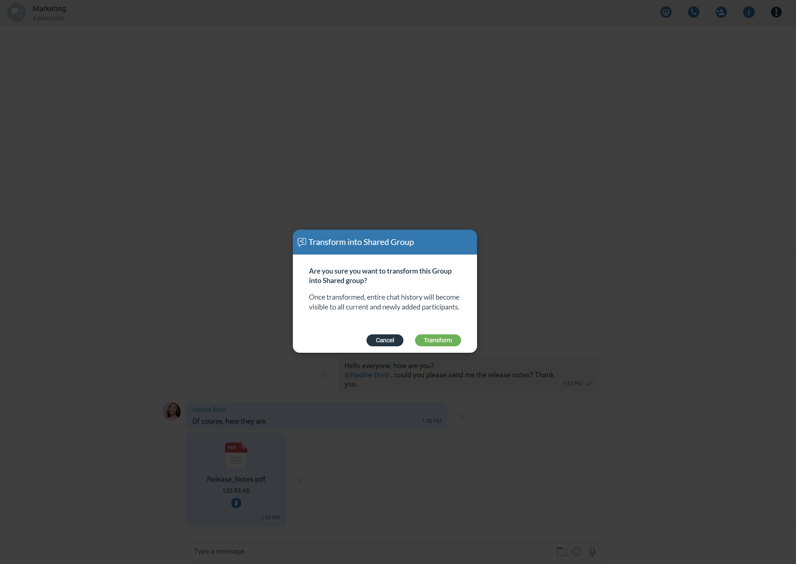
[7.2] The Set group chat icon option allows the admin to set/change the group icon at any time. Clicking on it brings the file explorer window up, where the user can select an image from the computer as the new group icon. In case the group icon has already been set, clicking on it will open a drop-down menu with the following options:
- Change icon: Selecting this option allows the user to change (update) the group’s icon.
- Reset to default: Selecting this option will reset the group’s icon to the default value.
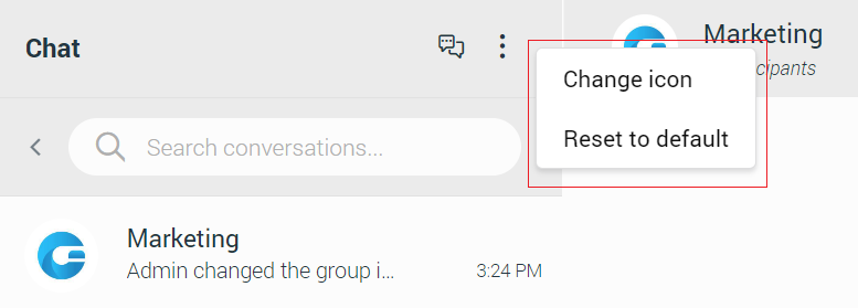
- – More options gives options like:
- Transfer admin – Select a new admin of the group.
- Pin/Unpin chat – Pin/Unpin currently selected conversation.
- Mute/Unmute chat – Mute/Unmute currently selected conversation.
- Transform into Shared Group – Change the existing standard group into a shared group with full history visibility to all existing and newly added participants.
- Leave – Leave currently selected conversation.
- Leave & Delete – Leave & Delete currently selected conversation.
Create Group Chat
Create Group Chat option is used for creating group conversations (as the group creator, you are automatically the group administrator). Two types of groups are available. The first type of groups are ordinary groups, meaning that the chat history will not be available to newly added participants. The second type of groups are groups with visible chat history, meaning that the full chat history will be available to newly added participants.
To create a group with visible chat history, check the option Allow full history visibility.
 – Indicates that the chat history is visible to newly added participants.
The group name may or may not be provided during the group creation. If the user does not provide a group name, the group name will be just Group. However, the user can change the group name at any time after creating the group by clicking on the group name.
Filtering and selecting contacts are the same as described in the conference section. The user can filter contacts by name, extension number, and department. Created groups are permanent, meaning the user will remain a group member after closing the application.
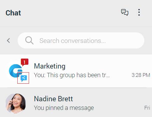
It is possible to have multiple groups with the same participants and the same or different names. For example, you could create Sales Reports and New Release groups. Both groups can have the same participants, and the user can use them for various topics, so unrelated matters are not mixed up in a single conversation.
Group chat can be created from one-on-one conversations and conference calls.
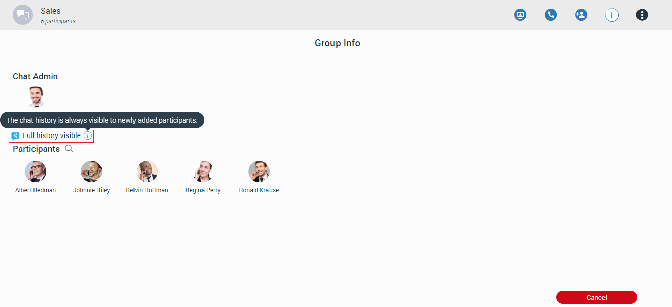
Mention participants in group chat conversations
The mention as a feature represents a good way to get someone’s attention within the group conversation. It allows the user to mention one or more participants and provide the context of their mentioning within the message. The mentioned participants will receive a notification even in the group conversations they have currently muted.

To mention a participant, the user needs to enter the @ sign followed by the name of the desired participant. Immediately after entering the @ sign, the list of the participants who can be mentioned will be displayed above the input field.
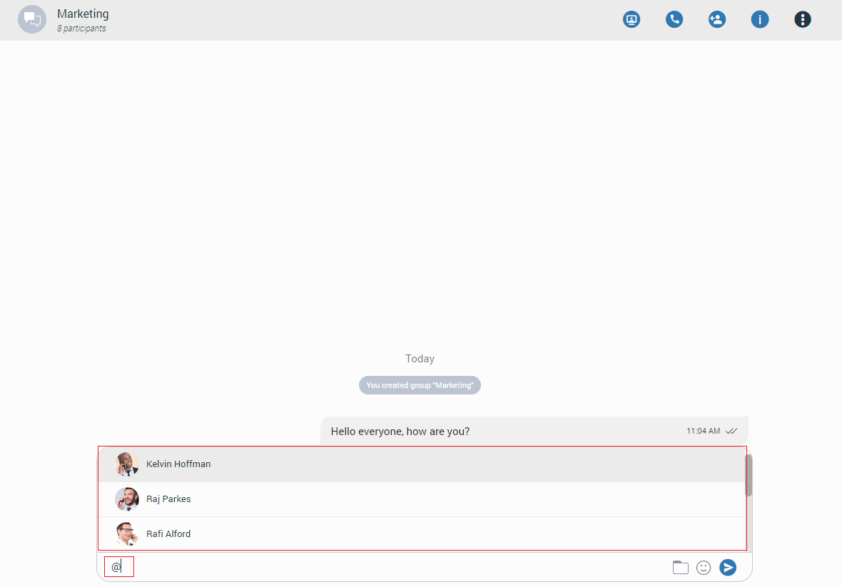
Only participants from the group chat conversation can be mentioned.
The user has a few possibilities for selecting participants:
- The first includes scrolling through the list using the up and down arrow keys and selecting the participant by pressing the Enter (Return) key on their keyboard or using the mouse wheel and clicking on the participant.
- The second is to continue entering the participant’s name after the @ sign. In that case, the list above the input field will only display participants whose names match the entry.
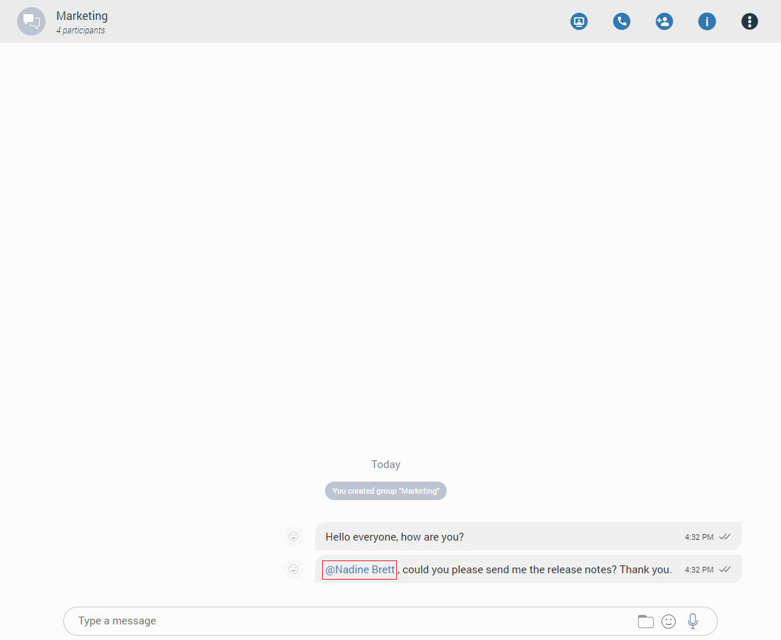
The mentioned participant will be colored in blue within the conversation.
Clicking on the mentioned participant within the conversation brings a pop-up menu with the following options:
- Call: Call the participant directly.
- Chat: Start a one-to-one conversation with the participant or open the existing one.
- Send SMS: Start an SMS conversation with the participant or open the existing one.
- Contact information: Show the contact information.
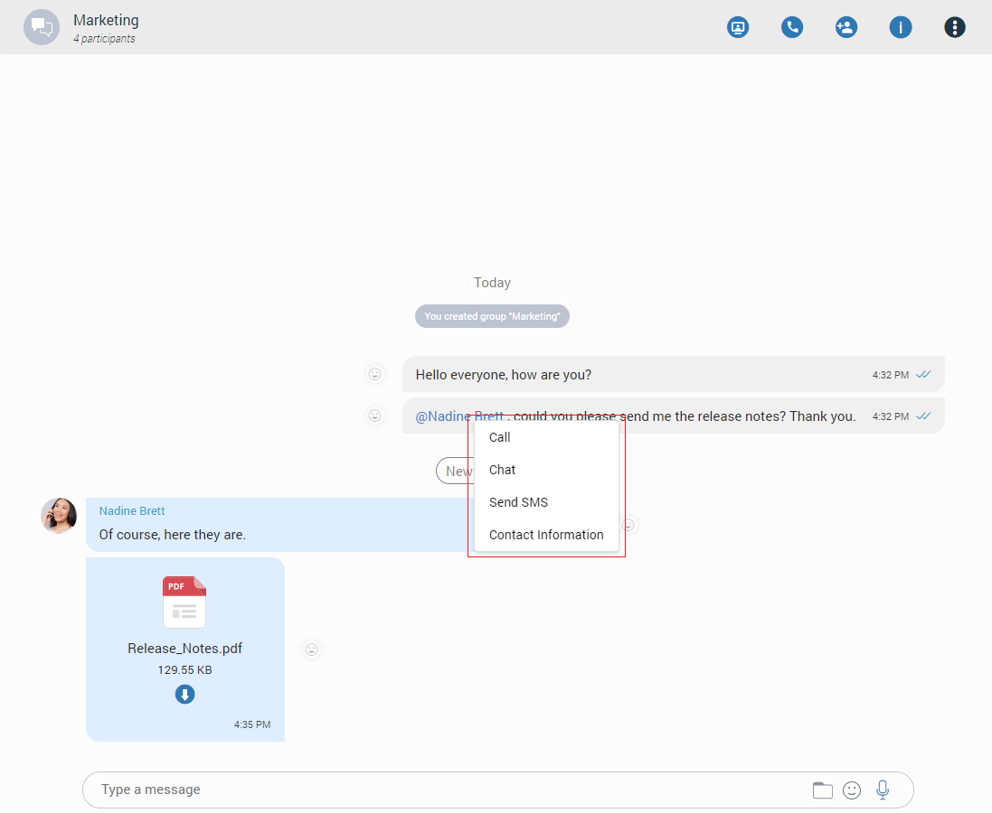
Messages View
Messages of the currently selected conversation can be seen in the middle of the screen. If there are no unread messages, the application loads the last 20 messages and place the scrollbar at the bottom of the messages view area. The user needs to scroll up if they want to see older messages. This way, they can scroll to the beginning of the conversation.
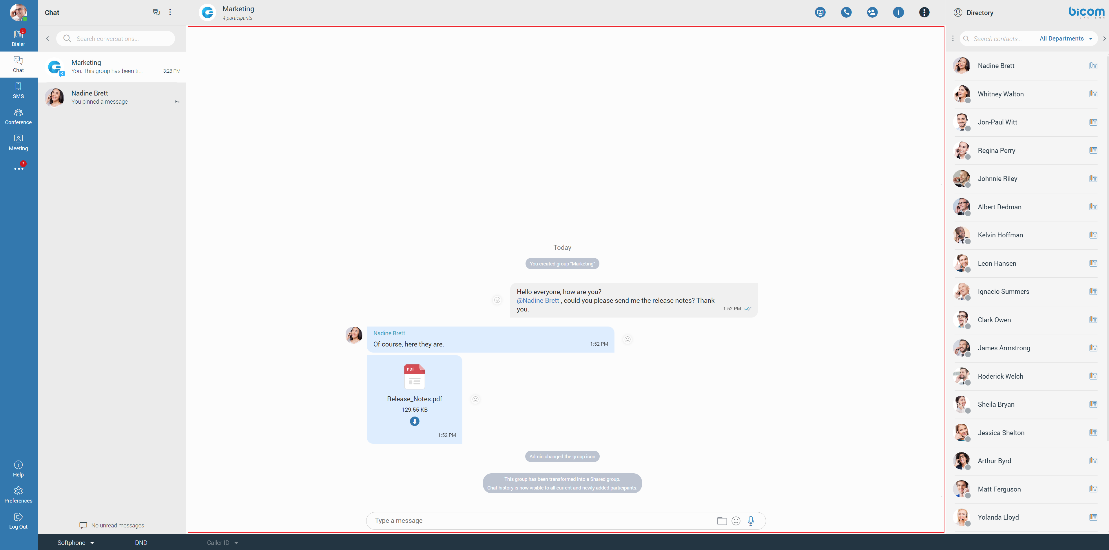
On the other hand, the scrollbar will be positioned on the first unread message (if any) with the  indicator to inform the user where new messages start.
Also, the user can see when the other party is typing. The typing indicator can be seen above the input field and within the conversation list. For a group conversation, if more than one participant is typing, at the time, the typing indicator will take the form of N participants are typing where N represents the number of typing participants.
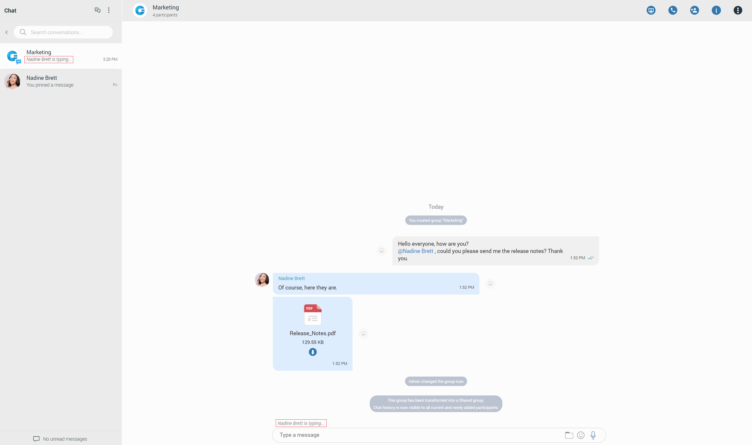
While scrolling up, within the currently selected conversation, a Jump to the newest message button appears at the bottom right corner of the message’s view so the user can easily move to the end of the conversation. In case new messages are received while scrolling, the Jump to the newest message button shows the number of received messages. Clicking on it leads to the first received message.
Furthermore, while you are inside of a group chat conversation, left-click on the participant’s avatar inside the messages area will show a popup menu with the following options:
- Call: Call the participant directly.
- Chat: Start a one-to-one conversation with the participant or open the existing one.
- Send SMS: Start an SMS conversation with the participant or open the existing one.
- Contact information: Show the contact information.
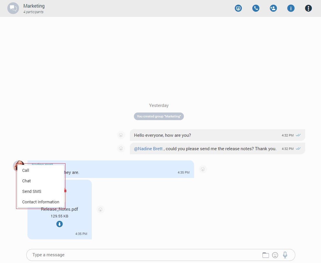
Message States
For outgoing messages, there is an indicator explaining the current state of the message:
- Sending: The message is on its way to the server.
- Sent: The message is sent and has reached the server.
- Delivered: The message is delivered to the other user(s).
- Seen: The message has been read by the other user(s).
- Failed: The message could not reach the server.
Message Reactions
As the picture shows, every outgoing/incoming message has a reaction button on the left/right side of the message that allows users to react to a message.
Hovering over it brings up a pop-up window containing a list of reactions that can be used to react to a message. After selecting one of the reactions, the same will be displayed next to the message instead of the reaction button, along with the last reaction (if any) and the total count of reactions.
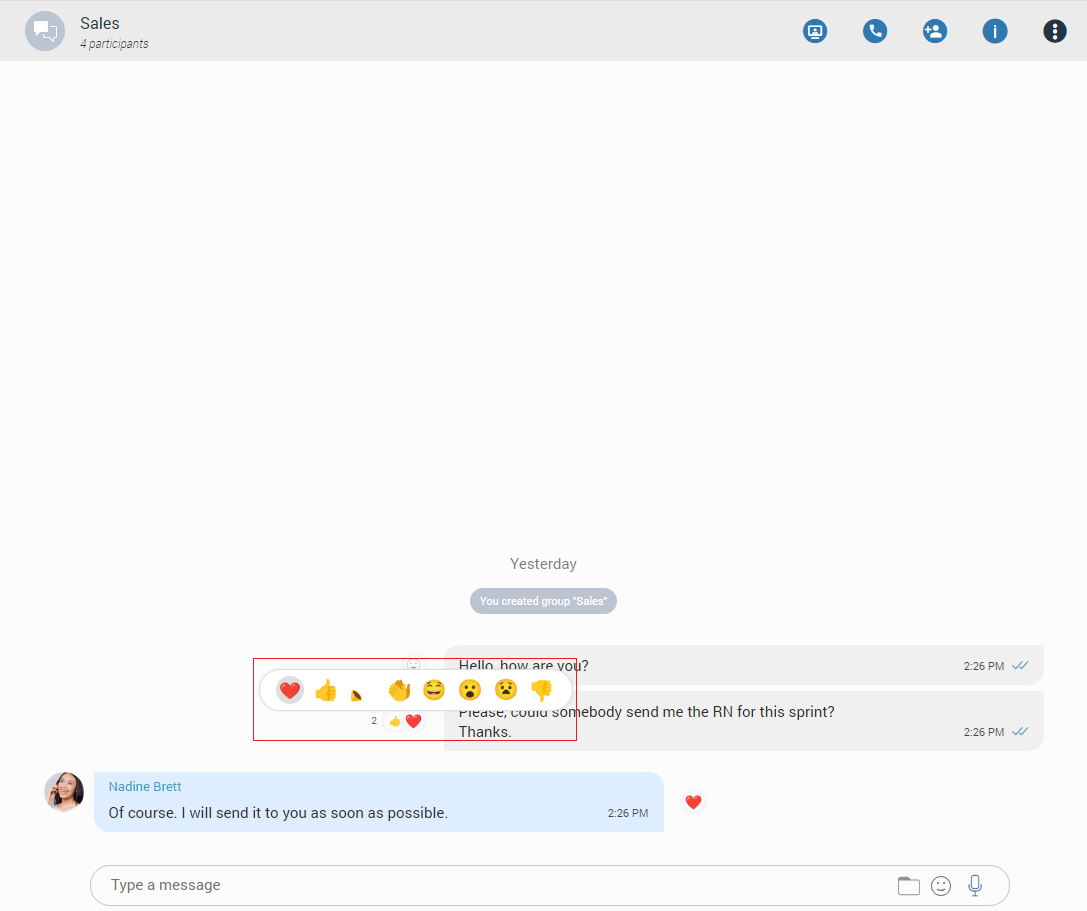
The user will receive a notification for every outgoing message when somebody reacts to it.
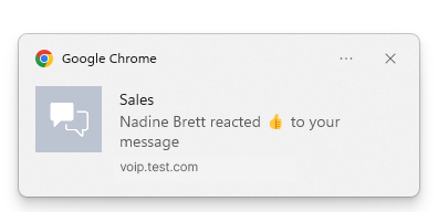
The selected reaction will be highlighted within the reactions pop-up.
If a user has already reacted to a message, re-opening the reactions pop-up will present their reaction as selected. Clicking on the same reaction will remove it, and clicking on a different one will change it.
Besides the information about the delivery and seen status, the message Info contains information about reaction tabs (if any).
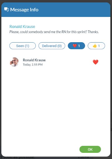
Message info options is available only for group chat conversations.
Threads
Threads as a feature allows users to start multiple conversations within group chat conversations, enabling parallel discussions within groups.
Threads can only be created from text messages.
To create a thread, right-click on the text message within the group chat conversation, select the Create Thread option from the drop-down menu, and send a message to create a thread.
All message types are supported in threads.
To delete a thread, right-click on the thread message within a chat conversation and select the Delete option from the drop-down menu. Alternatively, a thread can be deleted by clicking on the three dots within the thread panel context bar and selecting the Delete option from the drop-down menu.
Only the group admin can delete threads.
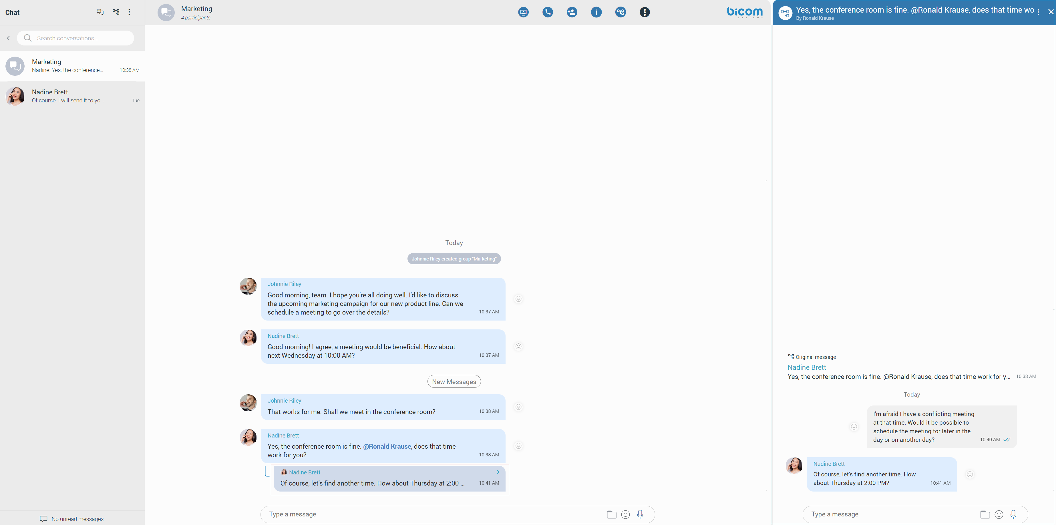
Notifications for all unread thread messages will be displayed as a red badge with the number that represents the total number of unread messages.

Furthermore, notifications for unread thread messages for a single thread will be displayed within the thread list, which can be opened by clicking the thread icon.
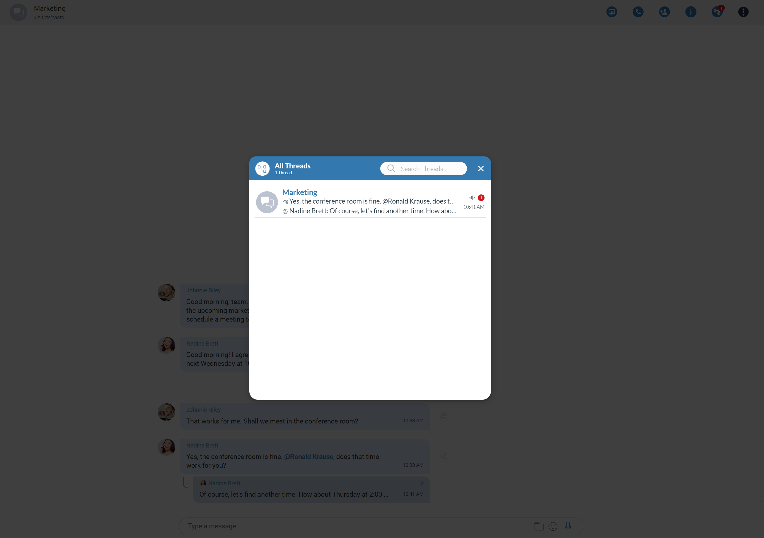
All newly created threads will be muted for all users except the creator until they send a message, unmute it manually, or until another participant mentions them.
Please note that this feature must first be enabled in a license before it can be used.
Text Selection and Context Menu
The user can select text by pressing and dragging the mouse across the messages area. Clicking anywhere within the messages area deselects all previously selected messages.
While there is selected text in the messages area, right-clicking brings a context menu with the Copy option to copy all selected messages in the clipboard. Also, the user can press CTRL+C on Windows or Command ( ) + C on macOS to copy all selected messages in the clipboard.
If the user hovers over a message bubble (gray or blue rectangle), the three dots will appear.
Click on them brings a context menu with these options:
- Reply: Allows the user to reply to a specific message. The user has a few ways to reply to a message. The first way is to click on the Reply button that appears within the message while hovering over it. The second way is by clicking on the three dots menu, which appears on the right side of the message while hovering over it, and from the drop-down menu, select the Reply option. As a result, the message that the user wants to reply to will appear above the input field. Clicking on the replied message inside the chat will take the user to the original message.
- Edit: Allows the user to modify outgoing text messages (including messages that contain mentions). To edit a message, the user must either:
- Right-click on the message and select the Edit option from the drop-down menu, which will open the message in edit mode. In this mode, the original message will be displayed above the input field for editing.
- Press the Up Arrow key while the chat window is focused to quickly edit the last message they sent. This keyboard shortcut provides a faster, more efficient way to access the edit feature.
Edited messages will have an Edited indicator displayed within their bubble.
- Create Thread: Allows the user to create thread.
- Copy: Allows the user to copy message content to the clipboard.
- Show Plain Text: Allows the user to disable all message formatting (links, emojis, etc.) to see the original message source. If the user right-clicks on the message again after pressing the Show plain text option, a Show rich text option will be displayed within the drop-down menu. This way, the user can revert to the previous message state and see the formatted message with links and emojis.
- Forward: Allows the user to forward messages and files from one conversation to another. The user can forward the messages or files up to 10 conversations at once.
- Pin/Unpin Message: Allows the user to Pin/Unpin an important message or file message at the top of the conversation. Anyone can Pin/Unpin the message within the conversation. Clicking on the pinned message leads to that message within the conversation. It is possible to have only one pinned message at a time.
- Info: Allows the user to see the information about the delivery and seen status of a single message within a group chat conversation.
- Delete Message: Allows users to delete text and file messages.
Following the deletion action, the confirmation dialog will show up with two options for outgoing messages:
- Delete for myself with the following sub-content: This message will be deleted only for you. Other chat members will still be able to see it. Are you sure you want to proceed?
- Delete for everyone with the following sub-content: This message will be deleted for all participants. Are you sure you want to proceed?
And for incoming messages, there is only one option:
- Delete for myself with the following sub-content: This message will be deleted only for you. Other chat members will still be able to see it. Are you sure you want to proceed?
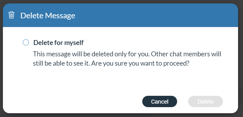
In addition to the options mentioned above, the confirmation dialog contains the Delete and Cancel buttons.
After deleting the message, the Message deleted indicator shows up.
File Message
Besides regular text messages, the user can use the chat in gloCOM Web to share files.
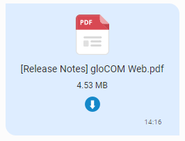
For media and other file types, there is a thumbnail. Under the thumbnail, there is information about the file name and the file size. At the bottom of the file message is an icon used to download, shows upload/download progress, or retry file upload/download depending on the file status. If the browser supports the file type, clicking on the thumbnail opens the file in a new tab. Otherwise, it downloads it to the computer so the user can open it with some other program.
Clipboard
gloCOM Web supports clipboard functionality for images and files. It means that the clipboard now can be used for copying/pasting images from the external app (such as image viewer, browsers, etc.) or copying/pasting images and files from the File Explorer (Finder on macOS) directly into the chat session. With this at their disposal, users are no longer limited to just using an image/file picker and drag & drop feature for sending images and files.
While using clipboard functionality for sending images and files, instead of sending them immediately after pasting into the chat, the application creates an attachment list that includes thumbnails within the selected chat session. If possible, clicking on the thumbnail opens the file in a separate tab within the browser. Otherwise, the application downloads it to the computer. This way, users have the opportunity to double-check selected files and images before sending.
Adding files to the attachment list while using the clipboard can be done in two ways:
- Using CTRL (Cmd on macOS) + C/V for copying/pasting files or
- Using the mouse right-clicking to copy/paste files.
Furthermore, hovering over the file inside the attachment list displays a blue circle with the white dash at the thumbnail’s upper right corner. Click on it to discard the file from the list.
While the attachment list is active and the user selects files using a file picker or drags them into the chat, they will be attached to the attachment list. Otherwise, the application will send them immediately.
In addition, while the attachment list is present within the selected chat conversation, the user can write a text message simultaneously. In that case, the application will send the text message first and then the attached files one by one.
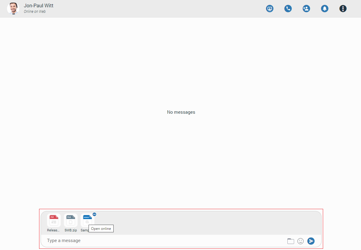
The maximum number of files attached to the attachment list at once is limited to five (5). Once the limit is reached, a pop-up message will appear displaying the following: You cannot upload more than 5 files simultaneously.
For larger images, the copy operation will take a while. During this time, the application will change the cursor type to loading, indicating that the file is being copied.
Input Field
Input field at the bottom of the chat is used to send messages to the currently selected conversation. After typing a message, press the Enter (Return) key on your keyboard to send a message. To type in a new line, press Shift+Enter. The length of the message that can be sent is limited to 10 000 characters.

 A folder icon allows the user to send files. Clicking on it opens up a dialog where the user can pick up to 5 files to be sent to the currently selected conversation. Also, the user can send files by dragging them from File Explorer (Finder on macOS) to the messages area within the chat.
 An emoji icon allows the user to send emojis. Clicking on it shows an emojis window where the user can browse through emojis separated into categories. On the top of the emojis window is a list of the most recently used emojis.
 A microphone icon allows the user to record voice messages for up to 2 minutes.
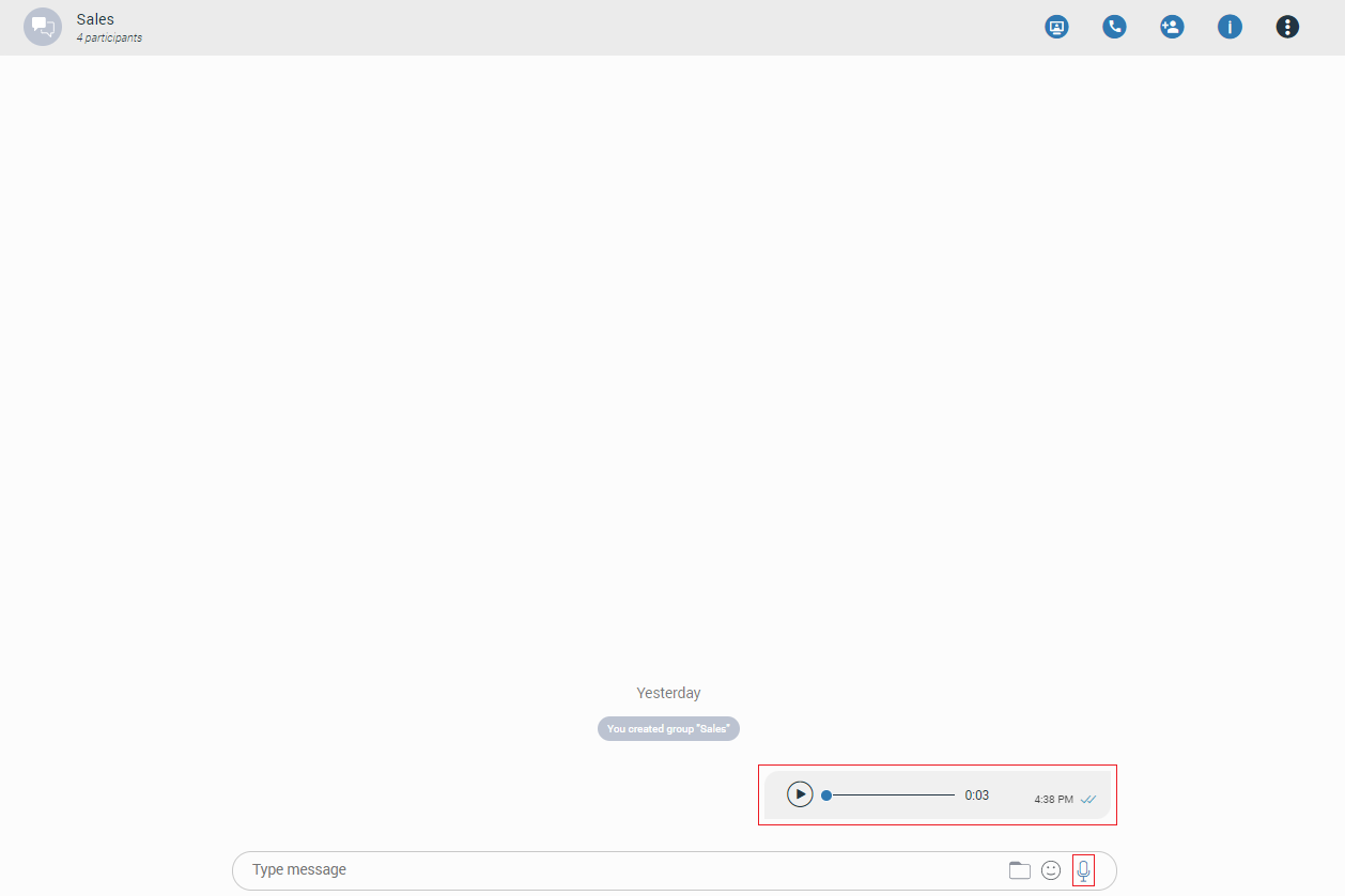
While recording, the user has the ability to use the following options:
- Discard recording: It will discard a voice message.
- Stop recording: It will stop recording. This way, the user can listen to the voice message before sending or discarding it.
- Send: It will stop the voice message and send it immediately without the chance to listen to it.

While recording is active, sending text and file messages will be disabled until the user sends or discards the voice message.
Playing voice messages is possible within a chat by pressing the play button. It is possible to go back and forth through a selected voice message by clicking on the waveform.
Some chat features that are described above can be enabled/disabled depending on the server settings.
SMS/MMS
Introduction
An SMS feature allows users to send/receive SMS/MMS messages.
The MMS message is an enhancement to the standard SMS message.
The MMS feature can be enabled/disabled depending on the server settings.
The main difference between SMS and MMS messages is that the user can send multimedia and other files in their messages. It includes media such as videos, pictures, audio clips, GIFs, etc. The maximum size of uploaded files is 500 KB or up to ten (10) files per message. MMS also allows up to 1000 text characters in a message.
The gloCOM Web app allows users to synchronize their SMS conversations and messages across multiple devices, ensuring they can access their messages from any device they use.
SMS Number
If a user has associated an SMS number with their Extension, they can see it by opening the Personal Information screen.
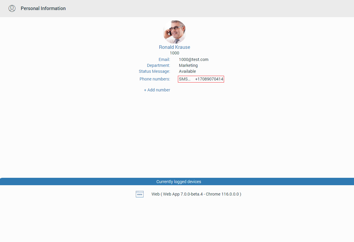
To see the SMS number of the contact, open the Contact Information screen.
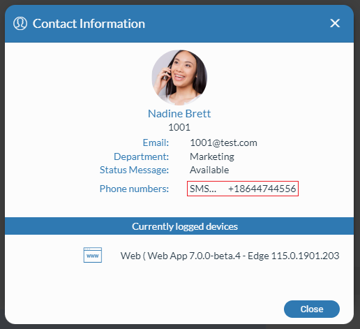
Shared SMS Number
An SMS number can be shared between multiple extensions. In that case, if the user receives a message from a number used by multiple extensions, the SMS conversation will be displayed as in the picture.
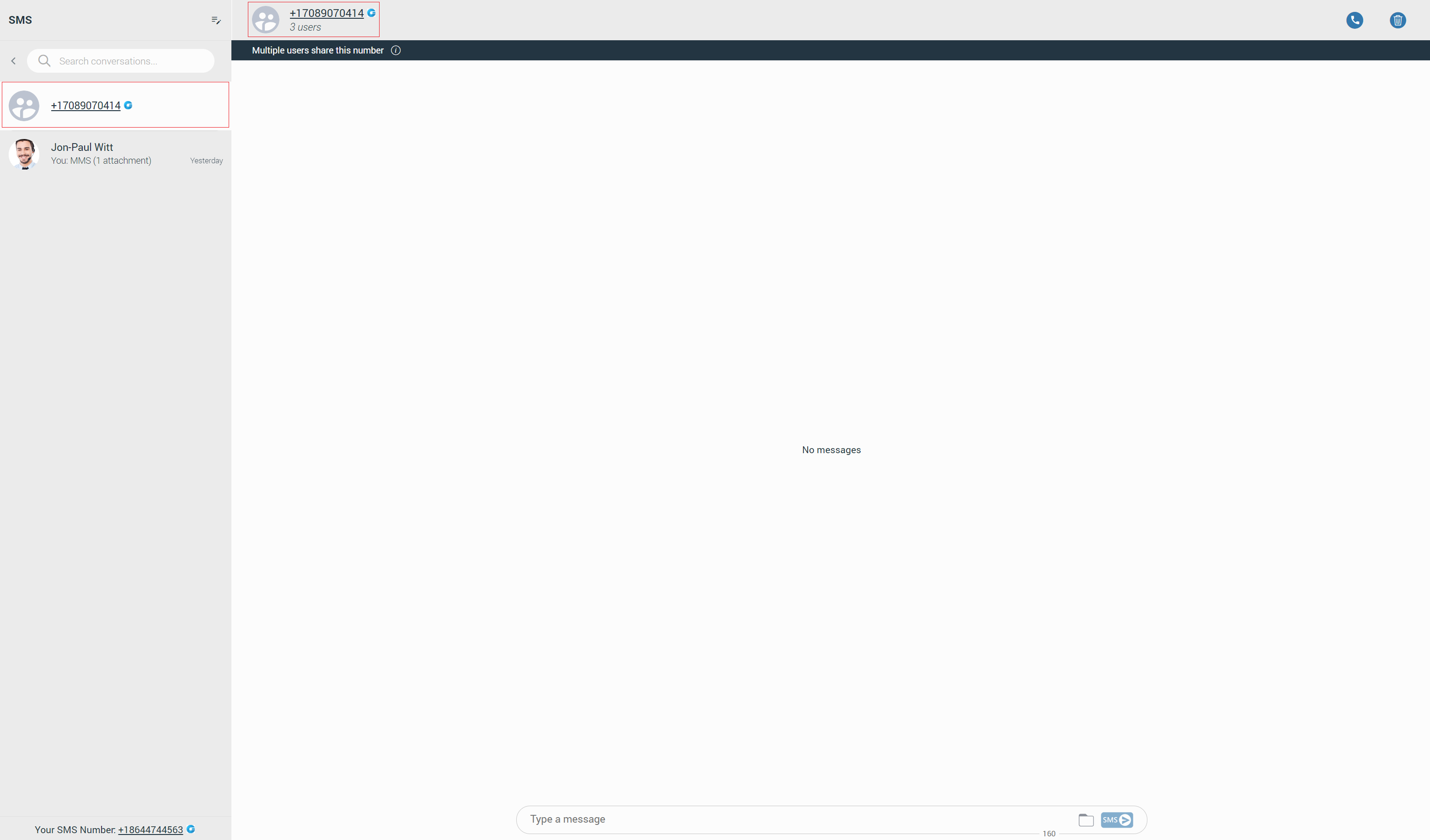
All extensions using this number can see all sent/received messages.
Furthermore, within the conversation, click the label below the context bar to see who uses this SMS number.
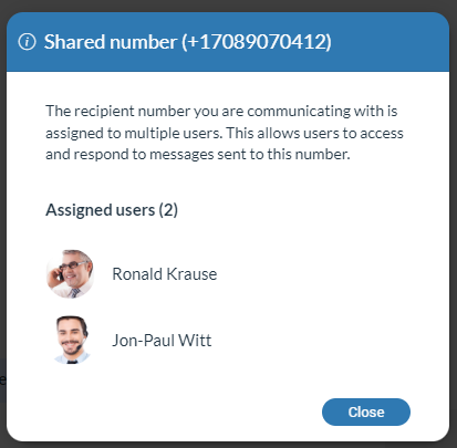
Your messages and messages of the other users you share the number with will have a header with their name and avatar as in the picture.
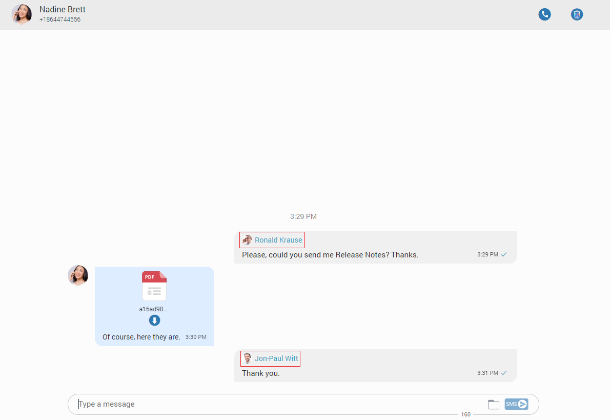
Start an SMS Conversation
To start an SMS conversation, right-click on the contact within the contact list, and select the Send SMS option from the drop-down menu.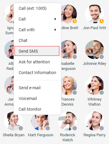
The second way is starting the SMS conversation from the group chat. To do this, click on the contact’s avatar within the group conversation, and from the drop-down menu, select the Send SMS option.
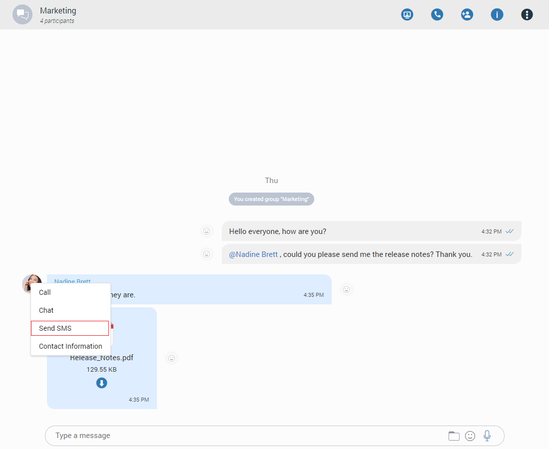
The third way is by clicking on the SMS tab.
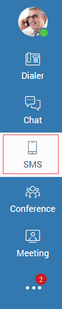
If an SMS feature is enabled, the Chat and SMS tabs are displayed next to the avatar image. Otherwise, only the chat conversation list will be available.
By clicking on the “Create new SMS” button, a list of contacts to whom the SMS message can be sent will open.
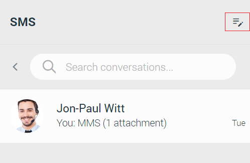
The list contains only the extensions associated with the SMS number and the contacts from the local and central phone book.
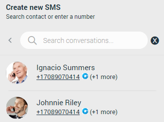
After selecting the desired contact, the SMS conversation will be created and displayed in the middle of the screen and within the conversation list.

However, if the contact has multiple phone numbers, a modal dialog will be displayed, asking the user to choose the number to which they want to send an SMS message.
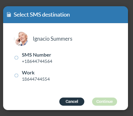
If the number is not written in the +E164 format, a modal dialog will be displayed, asking the user to correct the number format.
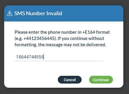
Additionally, instead of selecting a contact from a list, users can enter the number to which they want to send an SMS message.
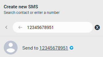
SMS Messages View
The SMS messages view is positioned in the middle of the screen.
At the top of the view is a context bar with two options:
- Call the currently selected user.
- Delete the current conversation.
All exchanged SMS/MMS messages will be displayed within the area below the context bar.
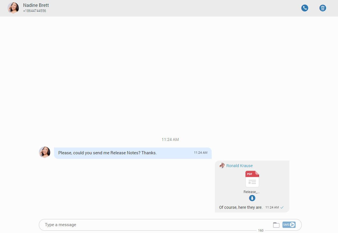
The gray rectangle represents outgoing messages, and the blue represents incoming messages.
Right-clicking within the gray or blue rectangle brings the delete options for deleting messages. Additionally, clicking on the three dots on the right side of the rectangle gives the same result.
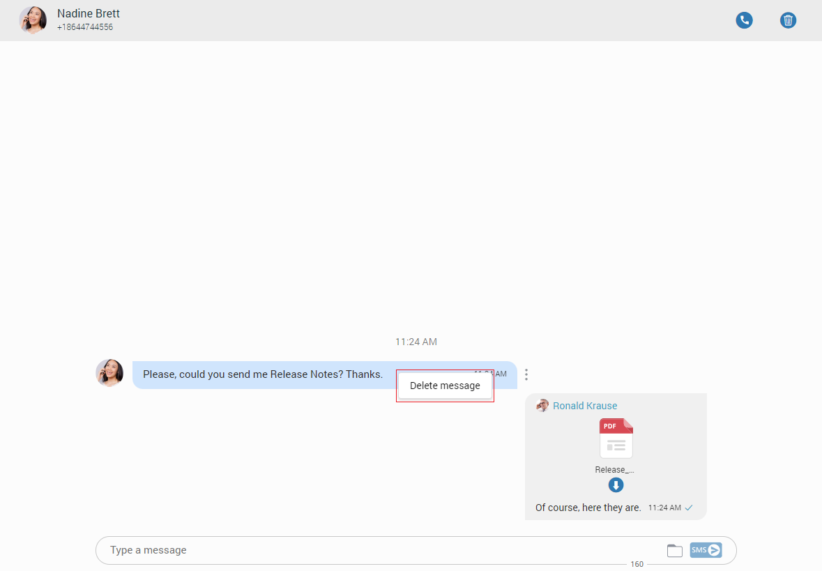
The SMS/MMS messages can be sent using the input field at the bottom of the SMS conversation. After entering the text message or uploading the media files to send a message, press the SMS/MMS button on the right side of the input field (Pressing the Enter key on the keyboard represents a new line.). While writing the SMS message, the counter at the bottom of the input shows the remaining number of characters that can be entered.

It is not possible to send more than four (4) messages at a time.
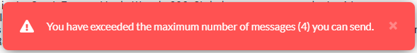
If the administrator turns on SMS footer messaging on PBXware, an SMS footer text will be displayed at the bottom of the input field. This text will be added at the end of every SMS/MMS message, and its length is included in the length of SMS/MMS messages.
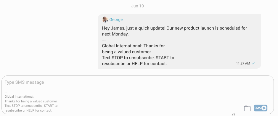
A folder icon which is used for sending files, can be found next to the Send SMS icon. Clicking the icon opens up a dialog where the user can select up to ten (10) files to be sent to the currently selected conversation.
The user can upload a max of 500 KB of multimedia data.
Additionally, the user can send files by dragging them from File Explorer (Finder on macOS) to the message area. If the amount of the selected data is larger than 500 KB or more than ten (10) files are selected, a pop-up message will appear displaying the following: “N file(s) were not added since they exceeded the maximum size. Maximum size for MMS attachment is 500KB”.
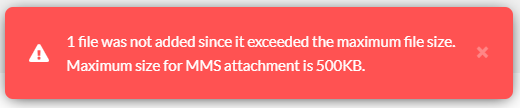
Please note that supported MMS files are as follows:
- Image Files: jpeg, png, gif
- Audio Files: MP3, OGG, AMR
- Text Files: PDF, Vcard, txt
- Video Files: mp4
The application will compress images (jpeg and png) before sending, allowing the user to send images larger than 500 KB. The application will preserve the quality as much as possible and adjust the resolution as needed.
If a file is selected, an SMS message becomes an MMS message, and the counter of the remaining kilobytes is displayed instead of the counter of characters.
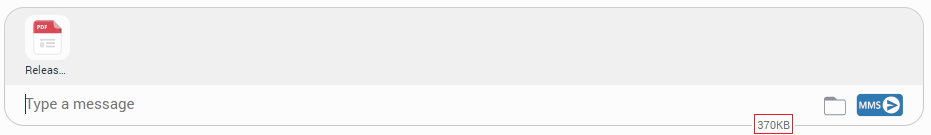
After selecting files, a thumbnail with the file name for each selected file will be displayed above the text area within the input field. Removing chosen files from the MMS message is possible by hovering over them and selecting the blue circle with a white dash at the top right corner of the thumbnail.
Clicking the thumbnail will try to open the file in the browser.
SMS Messages States
The SMS/MMS message has only three states:
- Sending
- Sent (It does not mean that the message is delivered.)
- Failed (When the SMS/MMS message is in this state, click the Retry option to send it again.)
SMS/MMS Notifications
SMS/MMS notifications have the same behavior as chat notifications. When the SMS/MMS message is received, a notification pops up.
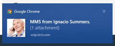
The app will display the number of unread SMS messages.