Feedback Forms
The feedback forms allow users to create forms, queries, or requests to capture additional information from their customers. This feature allows users to create as many custom feedback forms as they want using different tools and options.
Displaying feedback forms within the Agent Panel can be set up whenever a new call comes into the Queue, or there is a dialed record through the Campaign.
This feature allows the agents to select and store the answers from the callers/end-users to relevant and important questions. After collecting the answers, feedback(s) can be downloaded and analyzed.
How does it work?
Feedback forms combine different tools and options with an easy-to-use form builder.
Users can create responsive custom forms with just a few clicks and a user-friendly interface by dragging, dropping, and building. They can add options like showing/hiding fields inside the form, adding custom headers and placeholders, creating a paragraph/text area, designing a smart list using a select, checkbox, and radio buttons, using custom URLs, etc.
These options empower users to build custom forms and begin collecting data ASAP.
After creating, setting up the configuration, and allowing feedback forms to work with Dialer and Queues, agents will see the feedback form within the Agent panel. There, they will be able to start populating the feedback form, capture customers’ answers, submit a feedback form, and, most importantly, export that data later.
What can be done with Feedback Forms?
Feedback forms are used for Queues and Campaigns. The main goal is to capture information from customers and use that collected information to gain a better understanding of the overall customer experience, which can help in improving products or services.
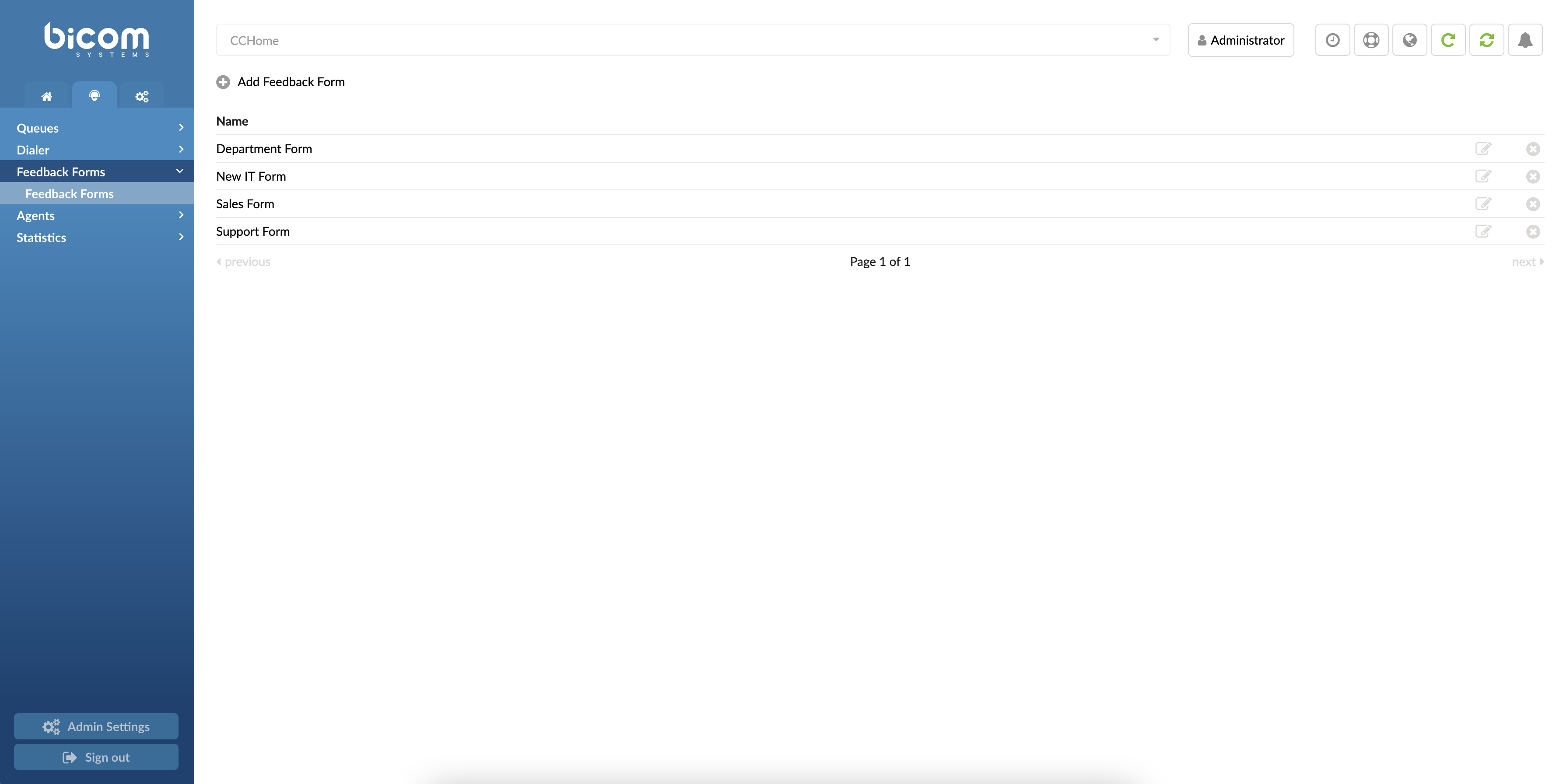
Add Feedback Forms
The Feedback forms can be accessed by navigating the Contact Center menu and selecting ‘Feedback Forms’. From this menu, users can access all currently available Feedback forms. Also, here users can add new or edit and delete existing Feedback forms.
Create/Edit Feedback Forms
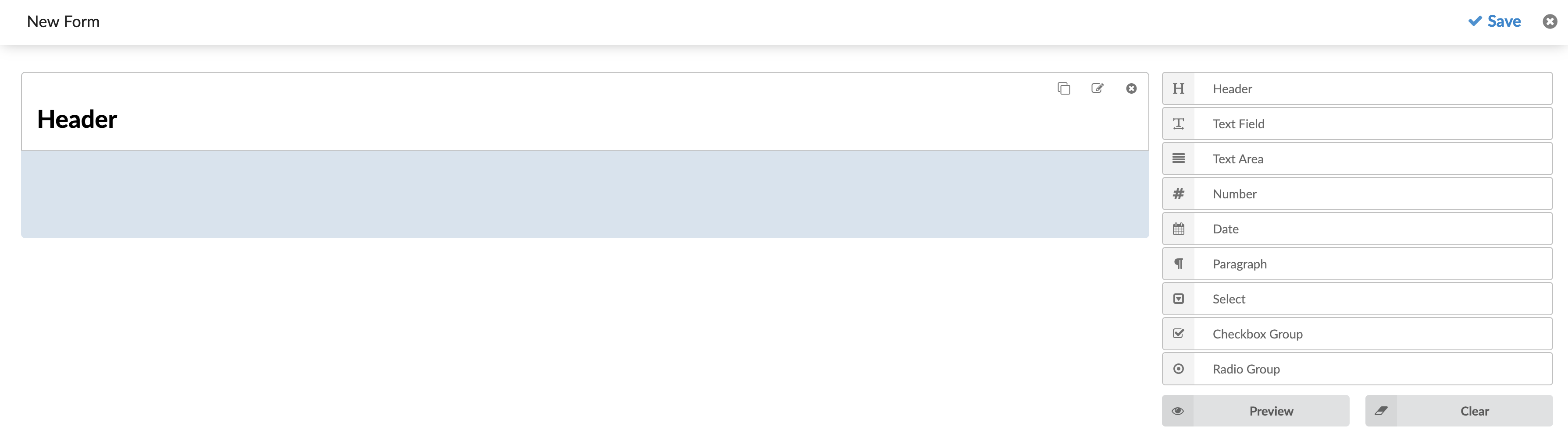
Click the “Add Feedback Form” button. This action opens a new dialog where users can customize their Feedback forms.
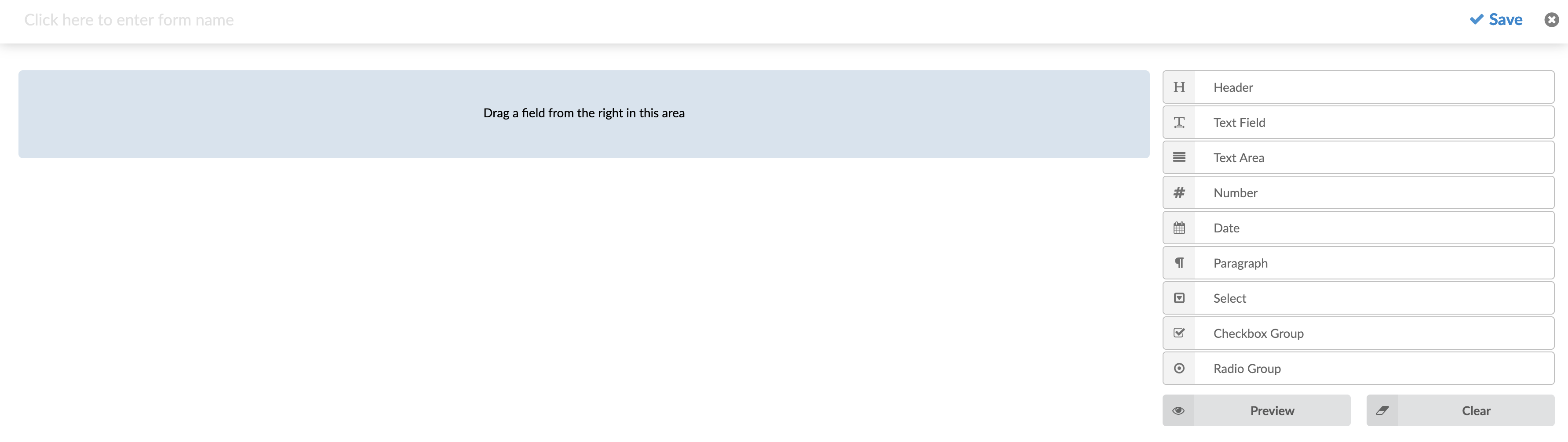
At the top of the Feedback form, users can enter a name for their form. This name will be displayed when assigning the feedback form to a specific queue or campaign.
To start creating the body of the Feedback Form, users can add fields by dragging them from the menu on the right side and dropping them into the designated area on the form. The designated area is marked in blue within the Feedback Form.
After creating the desired body for the Feedback Form, users have the following options:
- Save button:
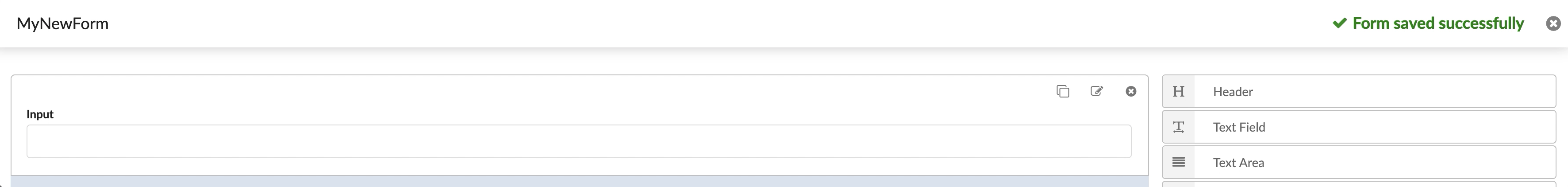
Click the Save button to save your customized Feedback Form.
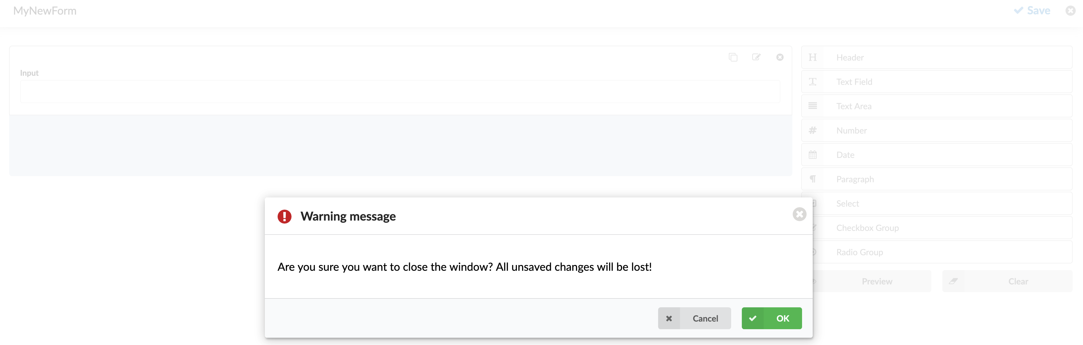
- Close button:
Click the Close button to exit the Feedback Form editing area. Be aware that any unsaved changes will be lost if you close the window. A corresponding warning message will be displayed when attempting to close the Feedback Form creation.
- Preview button:
Click the Preview button to see how the form will look when the application opens. Note that the scaling may differ, as the application window size can vary. The preview will open in a new browser tab.
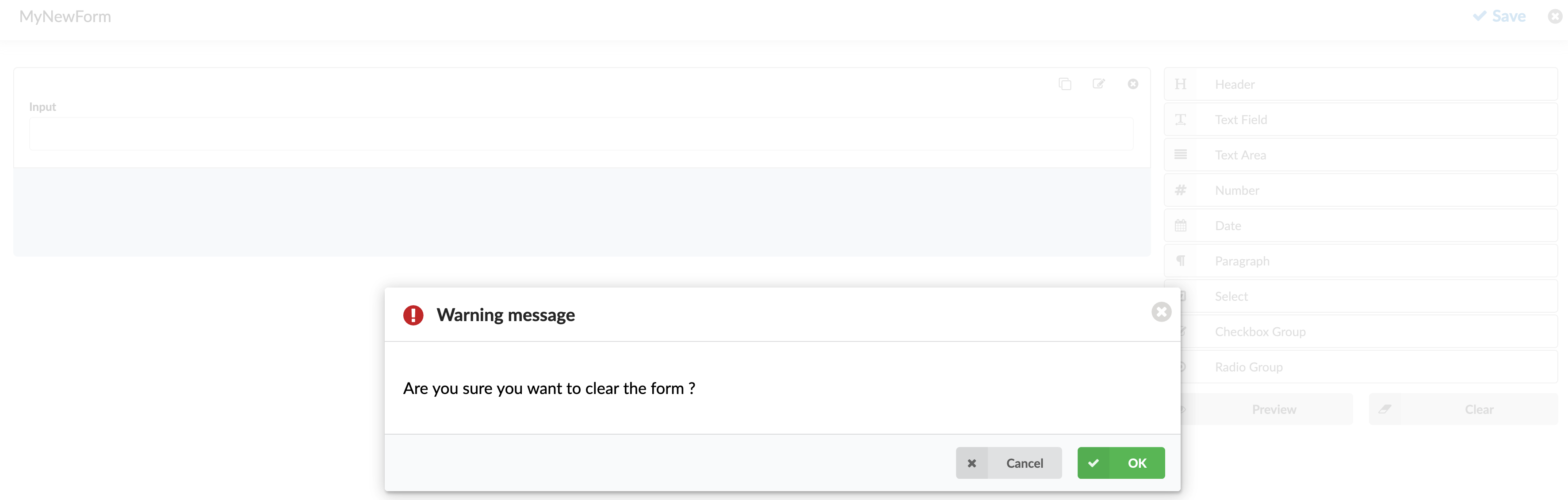
- Clear button:
If users are not satisfied with the body of the Feedback Form, they can click the Clear button to remove all fields from the form. A warning message will appear to confirm this action before proceeding.
Fields in Feedback Forms
Header
The header defines the title or label and reminds the Agent about the feedback form. It does not imply an answer/input entry by the Agent.
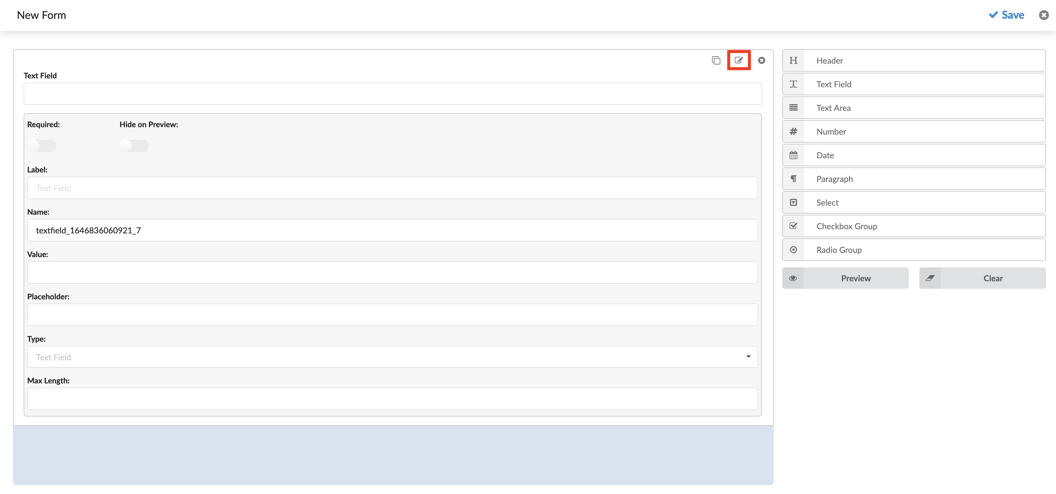
Text Field
This field allows users to enter text, which will be submitted when the Feedback Form is displayed in the Agent’s window.
Text Field Options:
- Required: A toggle checkbox that determines if the field is mandatory. If checked, the form will not be submitted unless a value is entered in this field.
- Label: Text displayed above the input field to describe what should be entered. This helps users understand the purpose of the input.
- Name: A unique identifier for the field that will be used after the form is submitted.
- Value: The default value pre-filled in the field.
- Placeholder: Text that appears in the input field before the user enters a value, providing a hint about what should be entered.
- Type: A select field with 4 different options:
- Text Field: A regular text input
- Password: The entered value will be hidden and shown as ‘******.’
- Email: The input value will represent an e-mail and be validated. The form cannot be submitted if an invalid email address is entered.
- URL: The input value will represent a URL and be validated. If an invalid URL is entered, the form can not be submitted.
- Max Length: Set the maximum number of characters that can be entered.
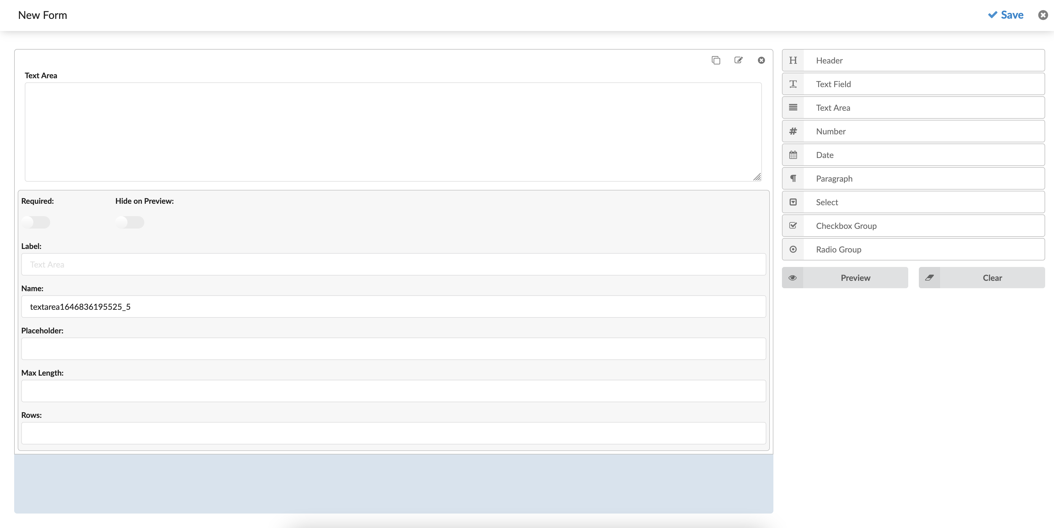
Text Area
A multi-row input area can be used to enter a larger amount of text.
Text Area Options:
- Required: A toggle checkbox that says should the field be required or optional. The form will not be submitted if no value is entered if the checkbox is checked.
- Label: Text is shown above the input area. It can be used to describe what the input value should represent.
- Name: A field name that will identify the field after the form is submitted.
- Placeholder: Sets the placeholder text for the input.
- Max Length: Set the maximum number of characters that can be entered.
- Rows: Sets the number of rows that can be seen before a scroll bar is shown. It also affects the area size.
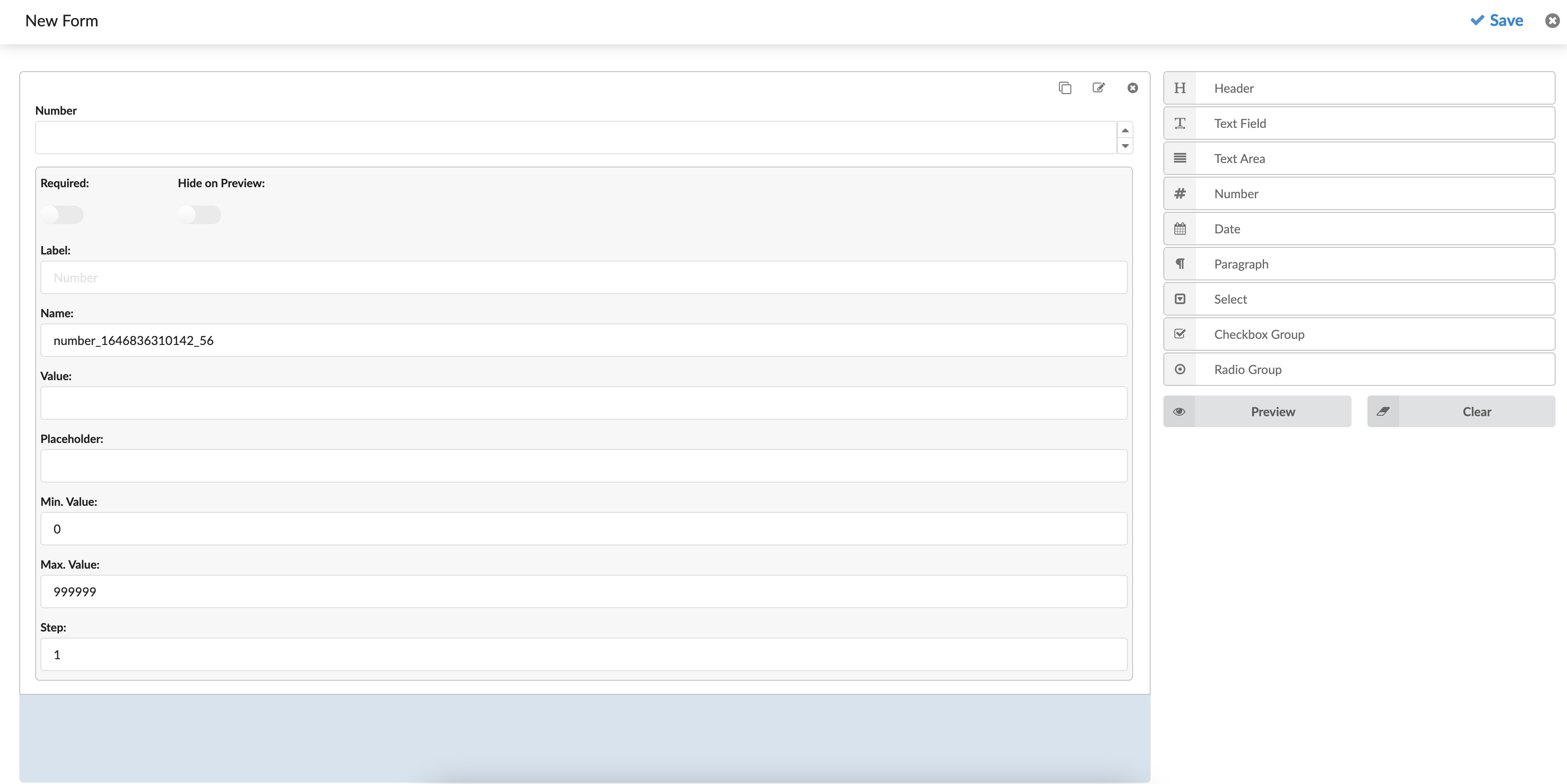
Number
A field that can only have a numeric value. On the right side of the input, an option can be used to increase/decrease the value.
Number Edit Options:
- Required: A toggle checkbox that says should the field be required or optional. The form will not be submitted if no value is entered if the checkbox is checked.
- Label: Text is shown above the input area. It can be used to describe what the input value should represent.
- Name: A field name that will identify the field after the form is submitted.
- Value: Set a default value for the field.
- Placeholder: Sets the placeholder text for the input.
- Min. Value: Sets the minimum value that can be entered.
- Max. Value: Sets the maximum value that can be entered.
- Step: Represents the amount that will increase/decrease by clicking the buttons on the right side of the input field.
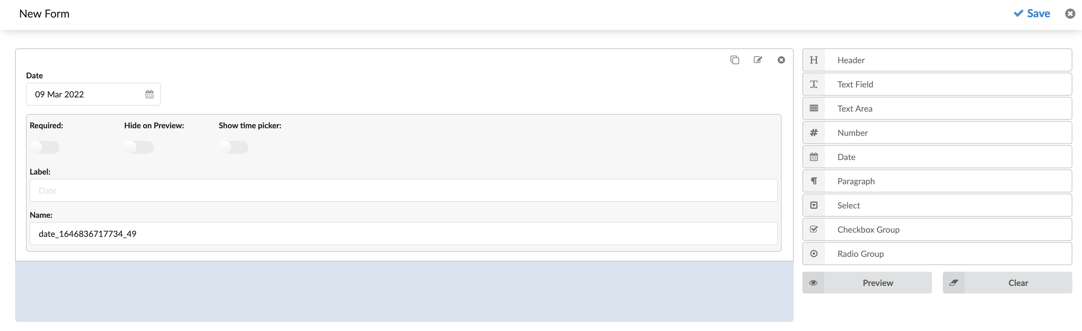
Date
A simple date picker field. The Date/Time format will be the default system format (chosen in Admin Settings -> Date/Time). The date shown while editing the field will be the current date.
Date Edit Options:
- Required: A toggle checkbox that says should the field be required or optional. The form will not be submitted if no value is entered if the checkbox is checked.
- Show time picker: A checkbox that enables a time picker. Checking this field will show another input field where time can be picked. The default time is the current time.
- Label: Text that will be shown above the date area. It can be used to describe what the date value should represent.
- Name: A field name that will identify the field after the form is submitted.
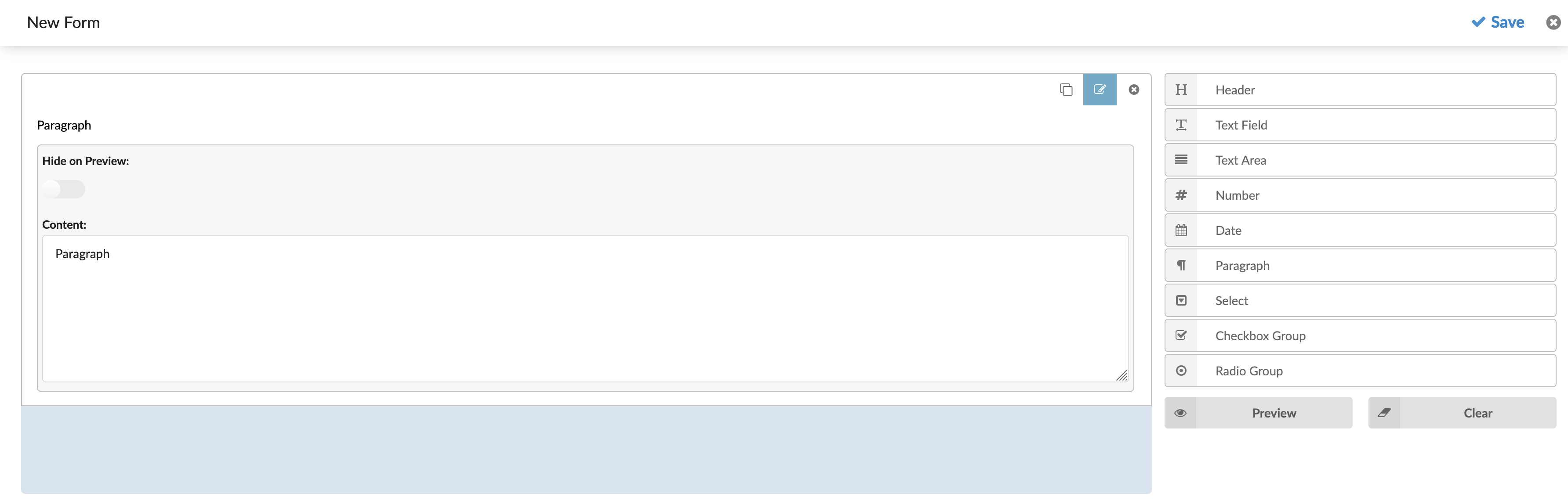
Paragraph
A multi-line text field. It does not have an input, so the user will not be able to change its value. This field can be used to make notes for the Agents who will be shown when the Feedback form is loaded.
Paragraph Edit Options:
- Hide on Preview: Hide the paragraph on the preview.
- Content: Specify the text content that will be shown.
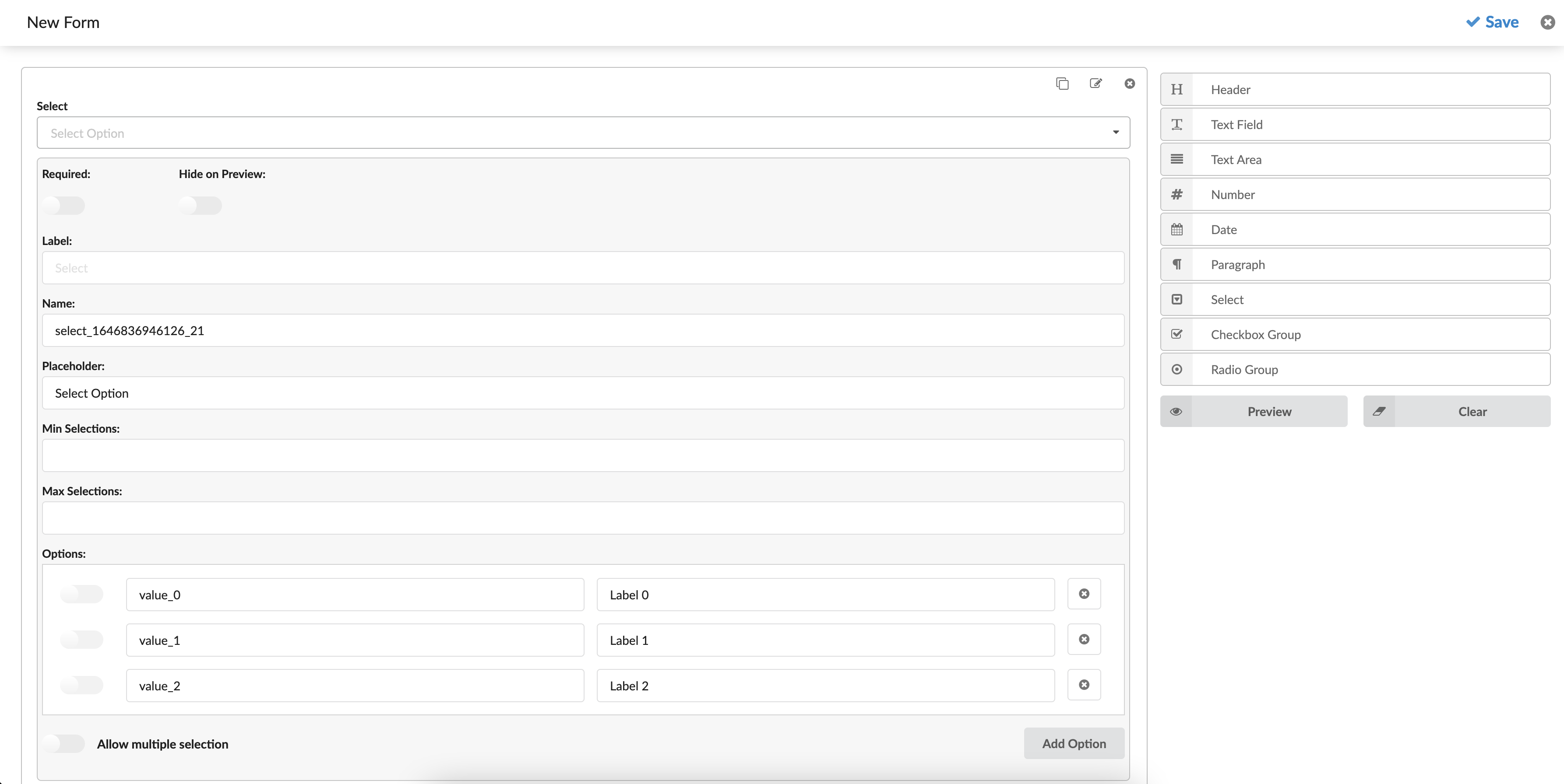
Select
A drop-down field where users can select one or multiple values.
Select Edit Options:
- Required: A toggle checkbox that says should the field be required or optional. If the checkbox is checked, the form will not be submitted if no value is selected.
- Label: Text is shown above the input area. It can be used to describe what the input value should represent.
- Name: A field name used to identify the field after the form has been submitted.
- Placeholder: Sets the placeholder text for the input.
- Min. Selections: Sets the minimum number of values that can be selected.
- Max. Selections: Sets the maximum number of values that can be selected.
- Options: Define the selectable values. Every option has four actions.
- Allow multiple selection: Defines if the Agent can select multiple values or just one. Checked refers to numerous unchecked for one value only.
- Add option: Used to add multiple values to the Options field.
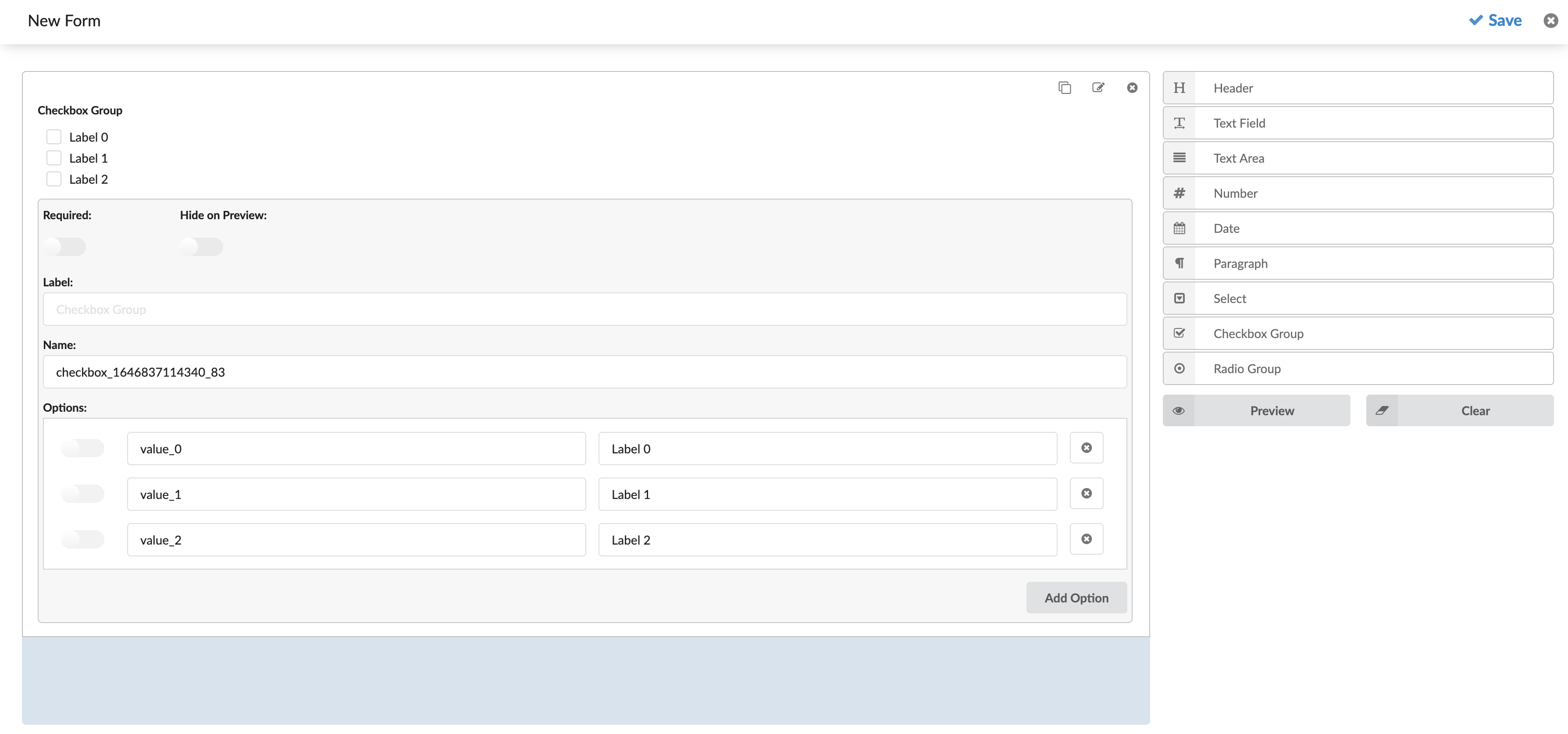
Checkbox group
A multiple options field where users can check one or multiple values.
Checkbox Group Edit Options:
- Required: A toggle checkbox that says should the field be required or optional. If the checkbox is checked, the form will not be submitted if no value is selected.
- Label: Text is shown above the input area. It can be used to describe what the input value should represent.
- Name: A field name that will identify the field after the form is submitted.
- Options: Define the values which will be checkable. Every option has four actions for itself.
- Add option: Used to add options to the field.
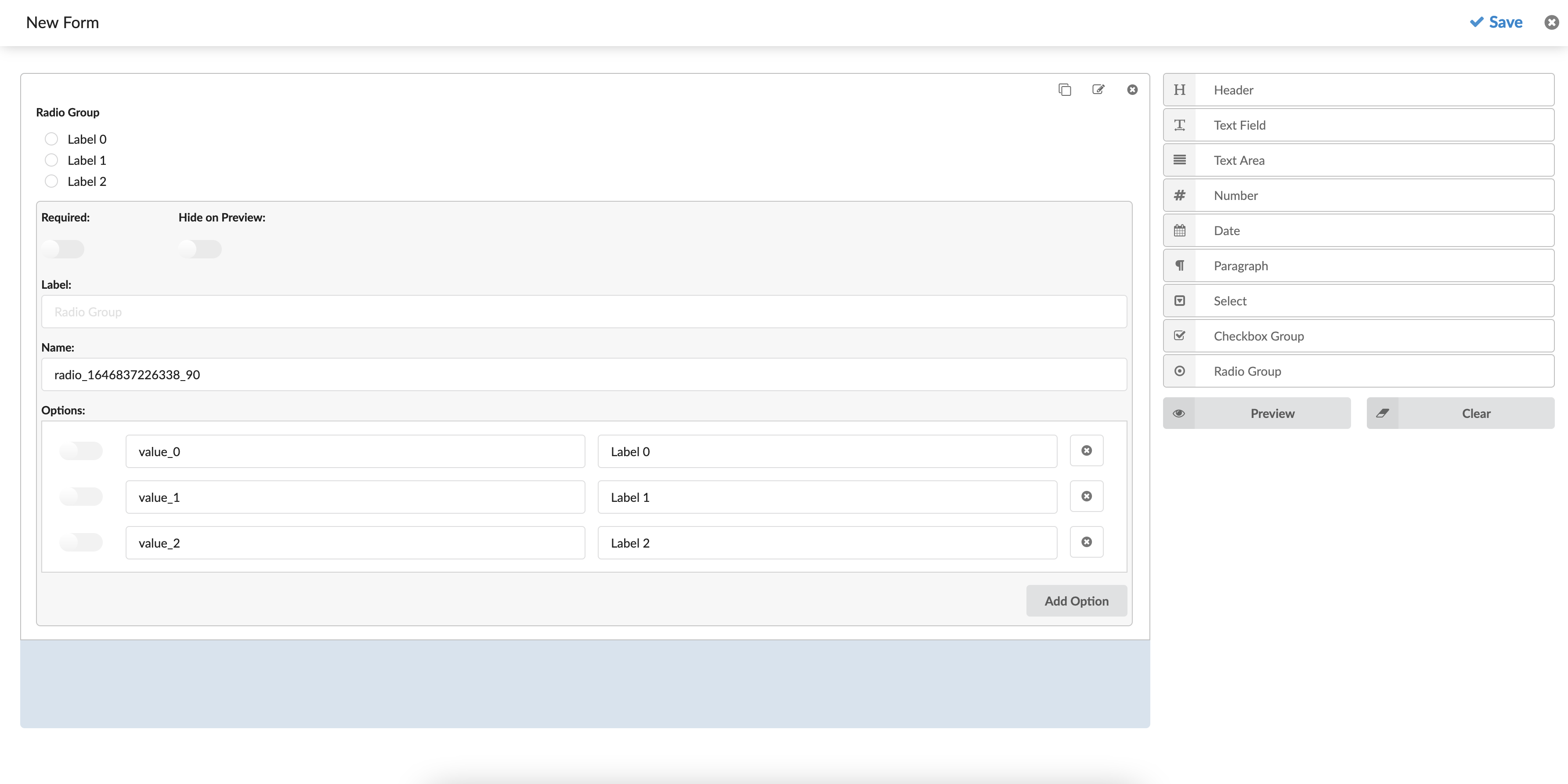
Radio Group
A multiple options field where users can check one of the given values.
Radio Group Edit Options:
- Required: A toggle checkbox that says should the field be required or optional. If the checkbox is checked, the form will not be submitted if no value is selected.
- Label: Text is shown above the input area. It can be used to describe what the input value should represent.
- Name: A field name that will identify the field after the form is submitted.
- Options: Define the values which will be checkable. Every option has four actions for itself:
- The checkbox on the left defines if the value should be selected by default.
- The left input represents the value that will be submitted.
- The right input represents the label text that will be visible to the user.
- The button to the right is used to remove the option.
- Add option: Used to add options to the field.
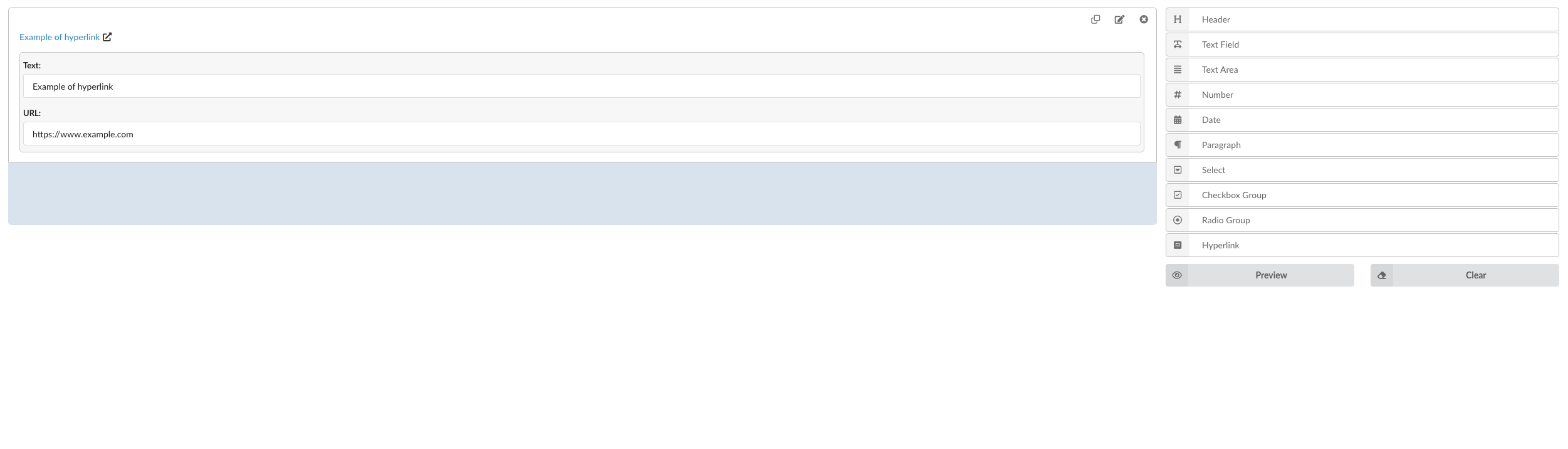
Hyperlink
Hyperlink Edit Options:
- Text: This field is where you provide the label for the hyperlink. For example, in this case, “Example of hyperlink” will appear as the clickable text.
- URL: This field is where you enter the web address (link) that the hyperlink will point to. For example, “https://www.example.com” is the URL. When the text is clicked, the user will be directed to this address.
Using a Feedback Forms
After creating a Feedback form, users can set any Queues or Campaigns to use this form.
For Queues (Inbound Feedback Forms)
Under every ‘Queue’, there is a gloCOM section that contains two options. Within those two options, users can set if they want to use the ‘Feedback Forms’ inside the application.
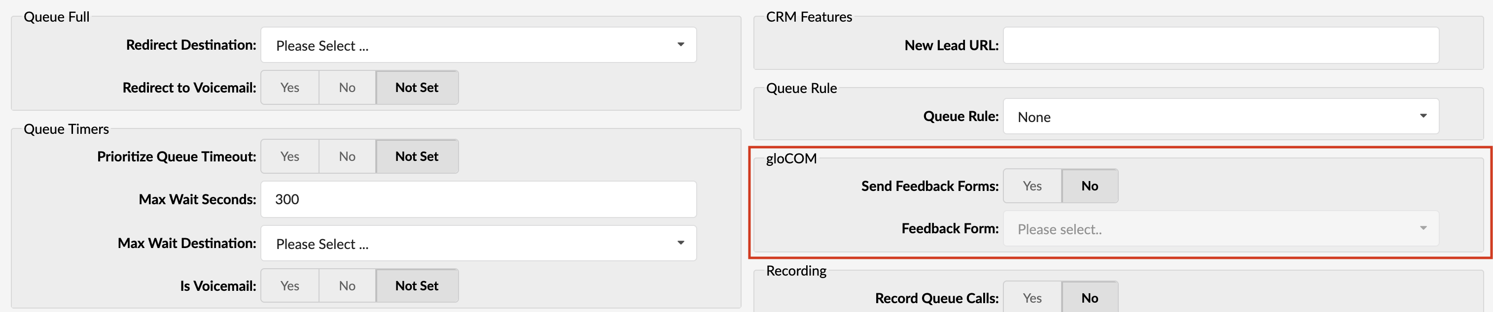
To open ‘Feedback Forms’ inside the application, the user should set the option ‘Send Feedback Forms’ to ‘Yes’ and select which Feedback form they want to use.
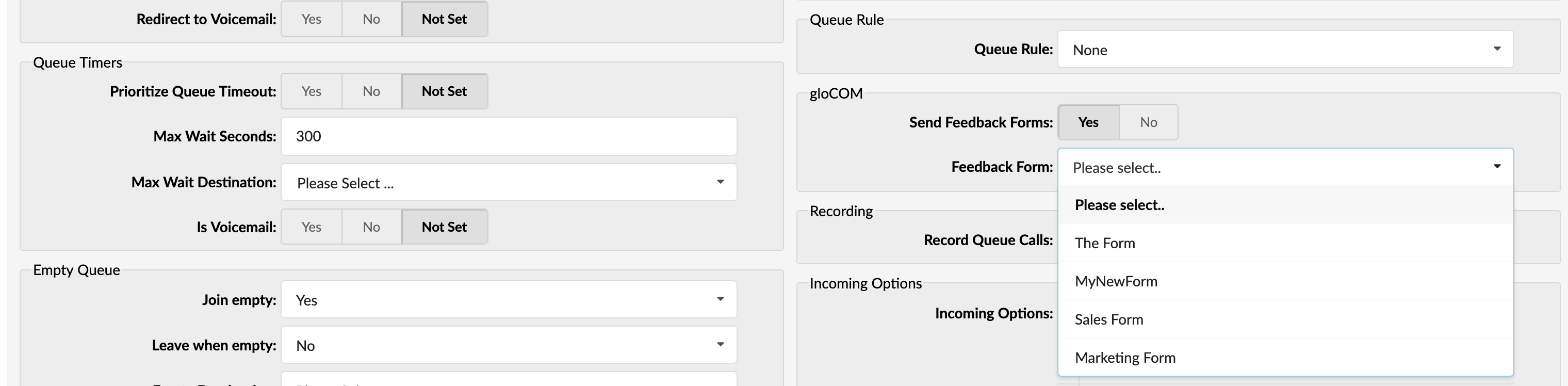
If this option is set to ‘No’ or a single Feedback form is not selected (even if this option is set to ‘Yes’ ) application will not open any Feedback Forms.
Submitting Feedback Forms
After opening the Feedback form inside the application, the Agent should be able to submit that Feedback form. Submitted data will be saved in a CSV file.
Delete Feedback Forms
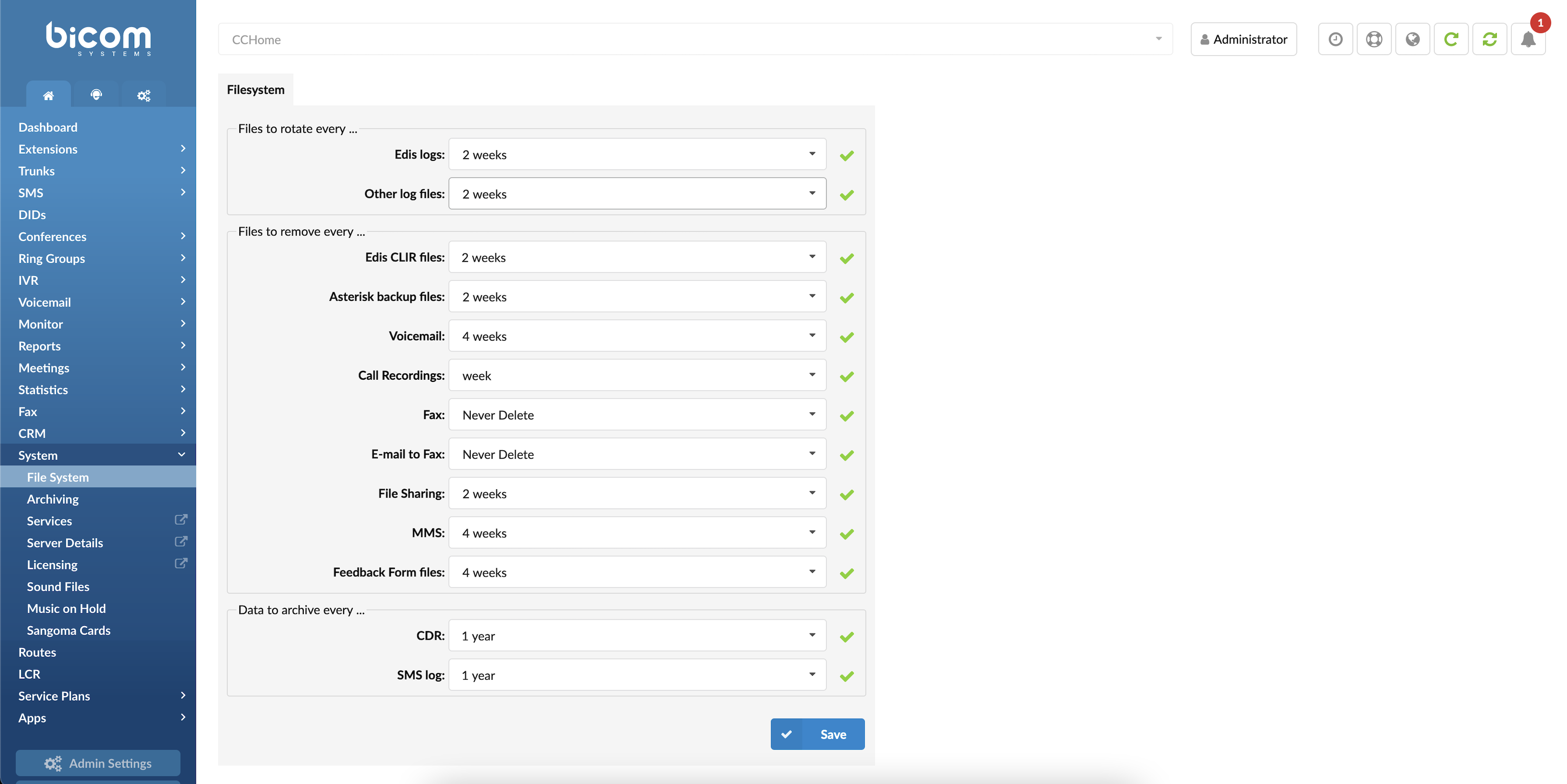
Within the GUI, under the System section on the Home tab, users can configure the retention period for CSV files containing Feedback Form data. By default, these files are retained for 4 weeks before being automatically removed. Users can adjust this setting as needed.
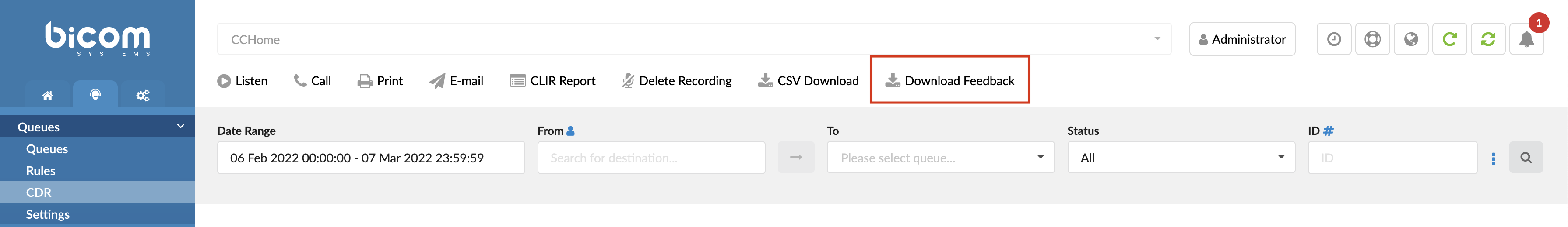
Downloading Feedback Forms
To download Feedback Forms, navigate to the Queues section and then to the CDR page, then select the checkboxes next to the CDRs for which you want to download Feedback Forms and click on the Download Feedback button to initiate the download process.
For Dialer (Outbound Feedback Forms)
To set up Feedback forms for the Campaign, please follow the next steps:
Navigate to Dialer -> Campaigns -> Edit.
Click the Numbers button in the Campaign Data group.
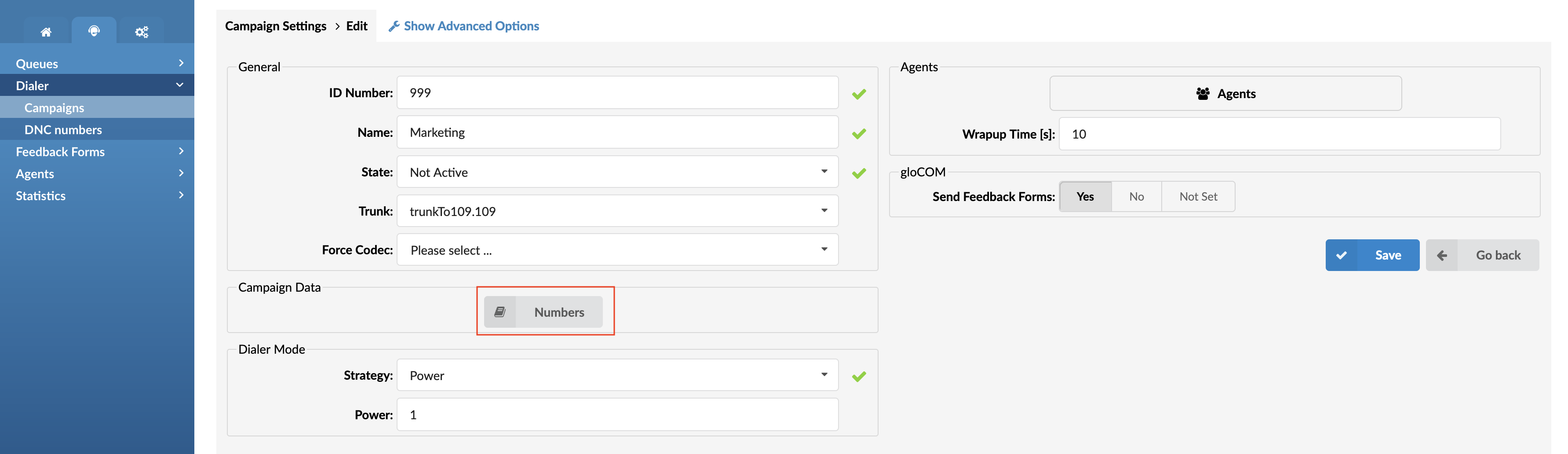
Click Edit on one of the CSVs.
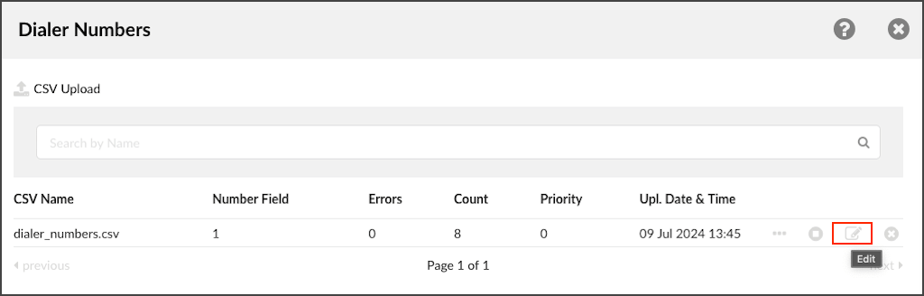
Select one of the previously created Feedback forms.
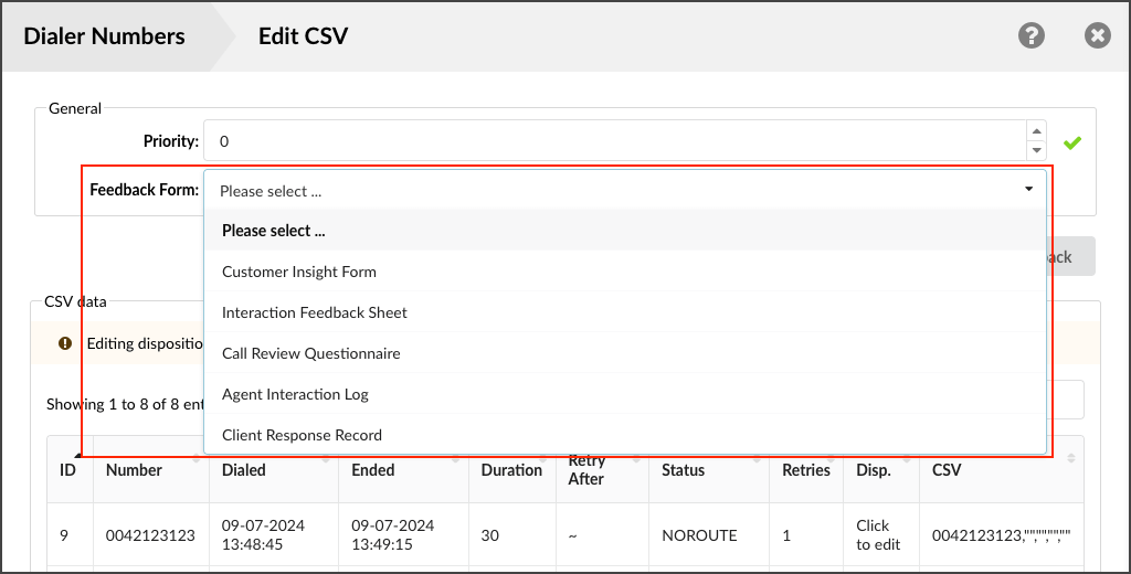
NOTE: If there are no previously created Feedback forms, the users will not be able to select anything from this field.
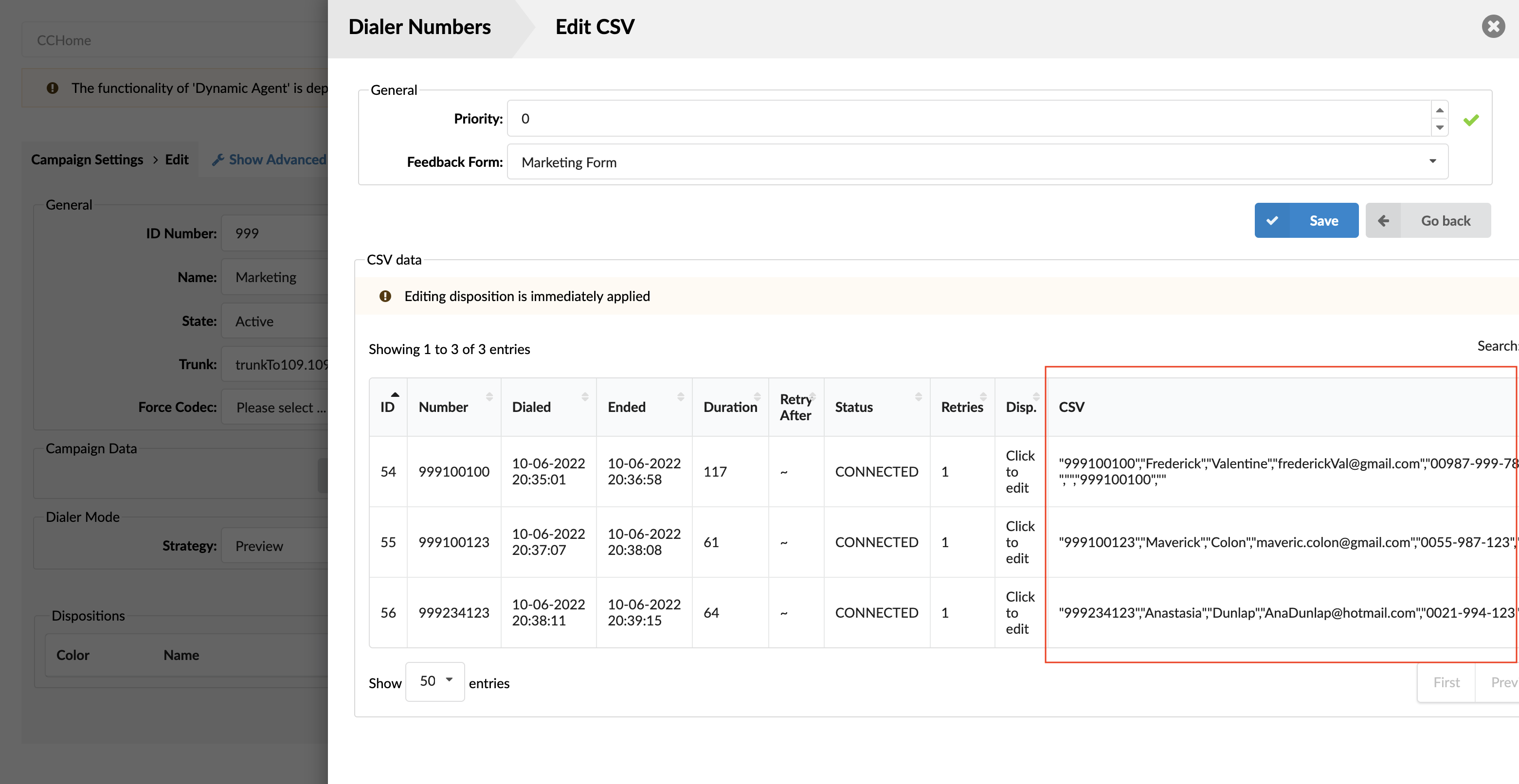
Matching Headers
To set Feedback forms to work with Campaign, the user has to create the same headers inside the Feedback form and upload a CSV file. This is important because if header mismatches, data submitted through the Feedback form will not be displayed inside the CSV file.
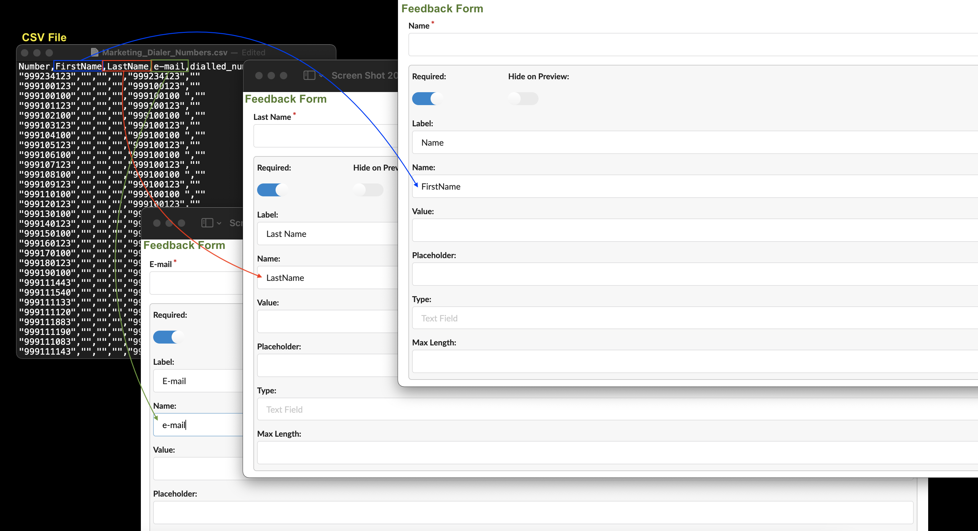
For example, if the CSV file has a header named “LastName”, there has to be the same header “LastName” inside the Feedback form. Otherwise, data will not be populated at all inside the CSV file.
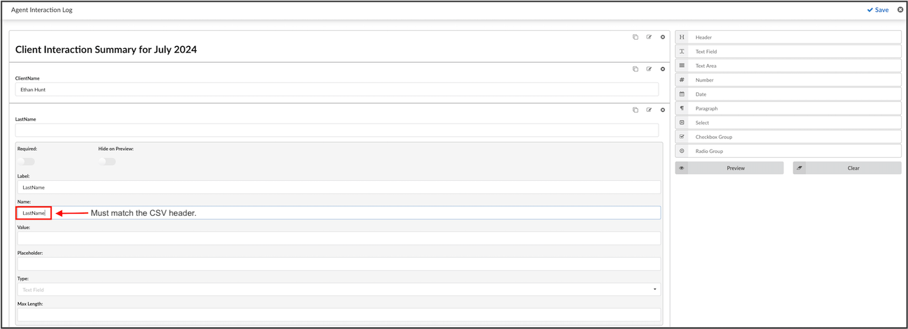
NOTE: The field that has to be edited inside the Feedback form is called ‘Name’. By default, this field is populated in a format textfield_1654954… / textarea1654958… / number_1654957… . This format depends on the field’s name users use to create Feedback forms (TextField, TextArea, Number).
Submitting Feedback Forms
After opening the Feedback form inside the application, the Agent should be able to submit that Feedback form. Submitted data will be saved inside a CSV file.
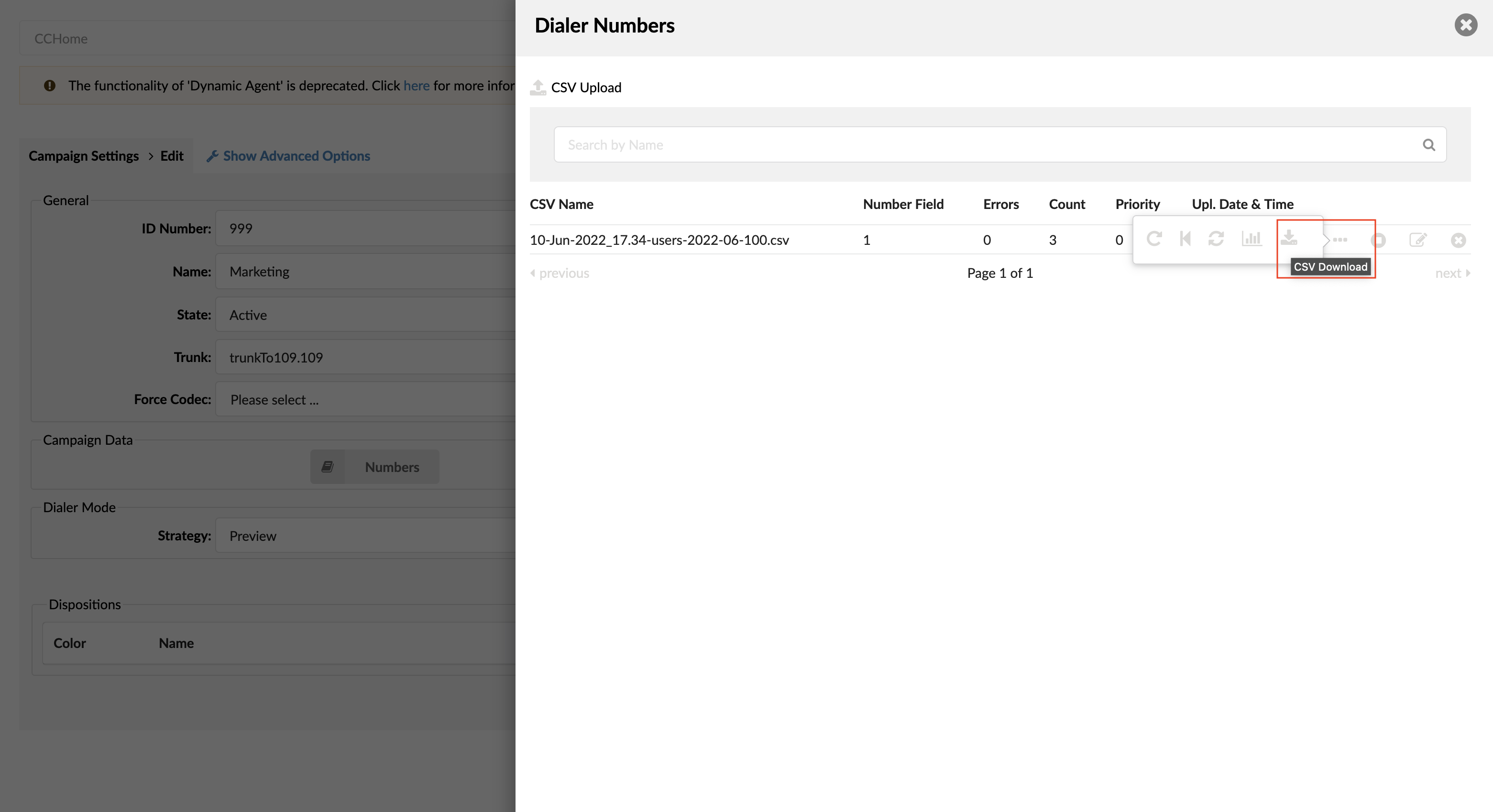
Downloading Feedback Forms
The users can download a CSV file by clicking on three dots inside ‘Dialer Numbers’ and selecting ‘ Download CSV File’.
Making Feedback Forms into Templates
The Feedback Form fields can be made into templates so that some values are imported from CSV into the field inputs. This can be done by inserting CSV header values between %% symbols. A simple CSV file is uploaded, and it contains two rows. The first row represents CSV headers, and the second one displays information about Number.
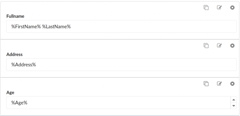
Example:
Number, First Name, Last Name, Address, Age
100, John, Doe, Somewhere Some Street, 22
To make a template, please follow the instructions below.
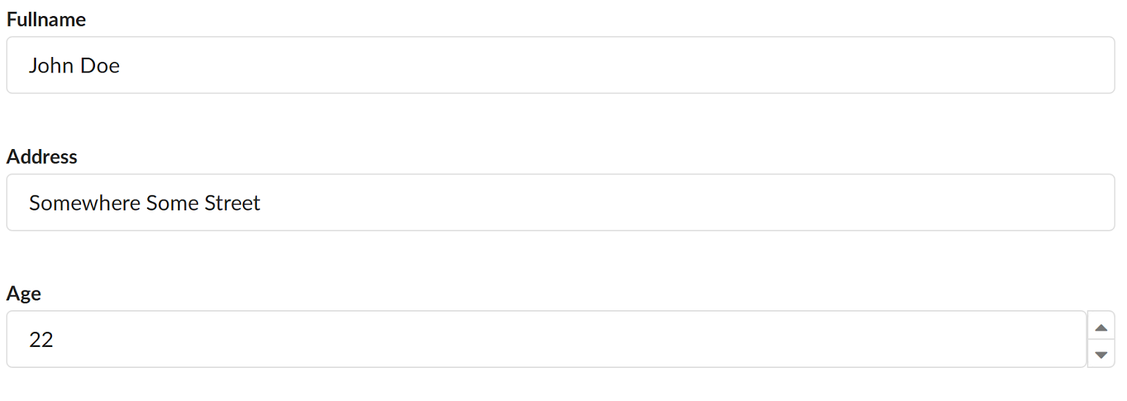
Once this form is opened in gloCOM, the fields with values or labels between %% will be replaced with matching values from the CSV file.
Example (please refer to the screenshots):
- %FirstName% will be replaced with John.
- %LastName% will be replaced with Doe.
- %Address% will be replaced with Somewhere Some Street.
Each field has different parameters that can be made into a template.
- Header: Label
- Text Field: Label, Value
- Text Area: Label, Value
- Number: Label, Value
- Date: Label
- Paragraph: Content
- Select: Label, Option Value (left input), Option Label (right input)
- Checkbox Group: Label, Option Value (left input), Option Label (right input)
- Radio Group: Label, Option Value (left input), Option Label (right input)
NOTE: This process is case-sensitive, which means that the value inserted between %% must completely match the CSV header.
Submitting
The Name of each field to be submitted will be used to identify that same field after the form has been submitted. If the Name of the field matches one of the headers, then the value of that field in the CSV file will be changed to the value submitted.
CAUTION:
CSV Headers should not contain any of the following characters if they are going to be used in the Feedback Form template.
- chr(46) . (dot)
- chr(91) [ (open square bracket)
- chr(128) – chr(159) (various)
TIP: Avoid creating CSV Headers with those characters.
The submission will fail if the fields are named as follows:
- Include.Invoice.Tax
- Check[open]
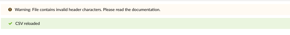
Suppose any of the characters mentioned above are included. The warning message will be shown in that case, saying “Warning: File contains invalid header characters. Please read the documentation.”
Once the form for the Feedback Form Templating example is loaded and the template values are filled in, it is possible to change them before submitting the form.
Example (please refer to the screenshot):
Suppose users set the Name of the Number field (representing the age input) to Age to match the same CSV header Age. In that case, the submitted value will be filled in the Number field of the CSV file.
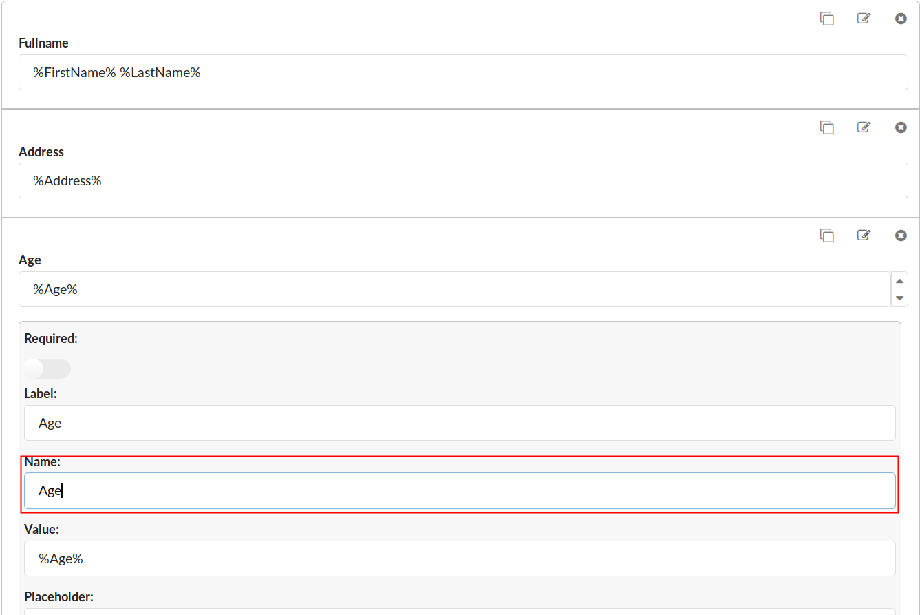
After the form has been filled out with preferred values, it is time to change the Age Value to 30 and submit the form. If the same CSV file is loaded in this form again or downloaded, the Age input will have Value: 30, and the CSV file will contain the following:
- Number: 100
- First Name: John
- Last Name: Doe
- Address: Somewhere Some Street
- Age: 30
NOTE: If multiple values need to be selected, they must be put under double quotes due to the comma delimiter.